added 80 characters in body
Source Link
wildpeaks
  • 745
  • 4
  • 14

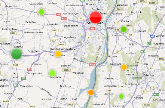
How about dots ? Placed at the position of the aggregation, you can use the average (or one of the stats you described) as radius of the dot (you can even go one step further and make the color match the good/bad status and its saturation match the stength of the radius).

That way, users can see visually where things are right/wrong at a glance.

Example:
enter image description here

Personally I use a variant of this on a map with a few hundred thousands points and instead of a simple dot, it uses a composite of the icons of the main categories of points the cluster contains.


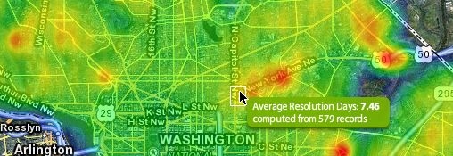
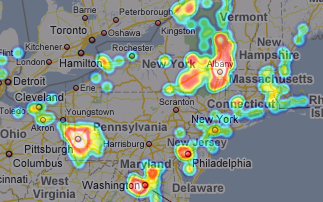
If you only need to visualize, heatmaps would be even better: it's very explicit for users to understand where the hotspots are, exampleexamples:
enter image description here enter image description here

Here's a library for Google Maps.

How about dots ? Placed at the position of the aggregation, you can use the average (or one of the stats you described) as radius of the dot (you can even go one step further and make the color match the good/bad status and its saturation match the stength of the radius).

That way, users can see visually where things are right/wrong at a glance.

Example:

enter image description here

Personally I use a variant of this on a map with a few hundred thousands points and instead of a simple dot, it uses a composite of the icons of the main categories of points the cluster contains.


If you only need to visualize, heatmaps would be even better: it's very explicit for users to understand where the hotspots are, example:

enter image description here

Here's a library for Google Maps.

How about dots ? Placed at the position of the aggregation, you can use the average (or one of the stats you described) as radius of the dot (you can even go one step further and make the color match the good/bad status and its saturation match the stength of the radius).

That way, users can see visually where things are right/wrong at a glance.

Example:

enter image description here

Personally I use a variant of this on a map with a few hundred thousands points and instead of a simple dot, it uses a composite of the icons of the main categories of points the cluster contains.


If you only need to visualize, heatmaps would be even better: it's very explicit for users to understand where the hotspots are, examples:

enter image description here enter image description here

Here's a library for Google Maps.

added 45 characters in body
Source Link
wildpeaks
  • 745
  • 4
  • 14

How about dots ? Placed at the position of the aggregation, you can use the average (or one of the stats you described) as radius of the dot (you can even go one step further and make the color ofmatch the dotgood/bad status and its saturation match the importancestength of the radius).

That way, users can see visually where things are right/wrong at a glance.

Example:

enter image description here

Personally I use a variant of this on a map with a few hundred thousands points and instead of a simple dot, it uses a composite of the icons of the main categories of points the cluster contains.


If you only need to visualize, heatmaps would be even better: it's very explicit for users to understand where the hotspots are, example:

enter image description here

Here's a library for Google Maps.

How about dots ? Placed at the position of the aggregation, you can use the average (or one of the stats you described) as radius of the dot (you can even go one step further and make the color of the dot match the importance).

That way, users can see visually where things are right/wrong at a glance.

Example:

enter image description here

Personally I use a variant of this on a map with a few hundred thousands points and instead of a simple dot, it uses a composite of the icons of the main categories of points the cluster contains.


If you only need to visualize, heatmaps would be even better: it's very explicit for users to understand where the hotspots are, example:

enter image description here

Here's a library for Google Maps.

How about dots ? Placed at the position of the aggregation, you can use the average (or one of the stats you described) as radius of the dot (you can even go one step further and make the color match the good/bad status and its saturation match the stength of the radius).

That way, users can see visually where things are right/wrong at a glance.

Example:

enter image description here

Personally I use a variant of this on a map with a few hundred thousands points and instead of a simple dot, it uses a composite of the icons of the main categories of points the cluster contains.


If you only need to visualize, heatmaps would be even better: it's very explicit for users to understand where the hotspots are, example:

enter image description here

Here's a library for Google Maps.

added 238 characters in body
Source Link
wildpeaks
  • 745
  • 4
  • 14

How about dotsdots ? Placed at the position of the aggregation, you can use the average (or one of the stats you described) as radius of the dot (you can even go one step further and make the color of the dot match the importance).

That way, users can see visually where things are right/wrong at a glance.

Example:

enter image description here

Personally I use a variant of this on a map with a few hundred thousands points and instead of a simple dot, it uses a composite of the icons of the main categories of points the cluster contains.


If you only need to visualize, heatmaps would be even better: it's very explicit for users to understand where the hotspots are, example:

enter image description here

Here's a library for Google Maps.

How about dots ? Placed at the position of the aggregation, you can use the average (or one of the stats you described) as radius of the dot (you can even go one step further and make the color of the dot match the importance).

That way, users can see visually where things are right/wrong at a glance.

Personally I use a variant of this on a map with a few hundred thousands points and instead of a simple dot, it uses a composite of the icons of the main categories of points the cluster contains.

How about dots ? Placed at the position of the aggregation, you can use the average (or one of the stats you described) as radius of the dot (you can even go one step further and make the color of the dot match the importance).

That way, users can see visually where things are right/wrong at a glance.

Example:

enter image description here

Personally I use a variant of this on a map with a few hundred thousands points and instead of a simple dot, it uses a composite of the icons of the main categories of points the cluster contains.


If you only need to visualize, heatmaps would be even better: it's very explicit for users to understand where the hotspots are, example:

enter image description here

Here's a library for Google Maps.

Source Link
wildpeaks
  • 745
  • 4
  • 14
Loading