Commonmark migration
Source Link

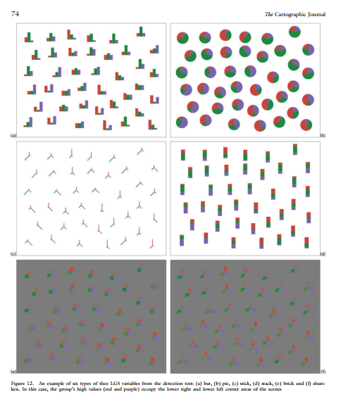
I would call them glyphs although I'm skeptical it is such an established adjective that it will be immediate to many audiences. Vasan et al. (2013) is a great review of different types of glyphs used in the literature (plus an experimental study for the differences between bricks like you show and clustered bars, pies, and sticks). The image below is from the cited paper and shows the different experimental stimulus:
enter image description here

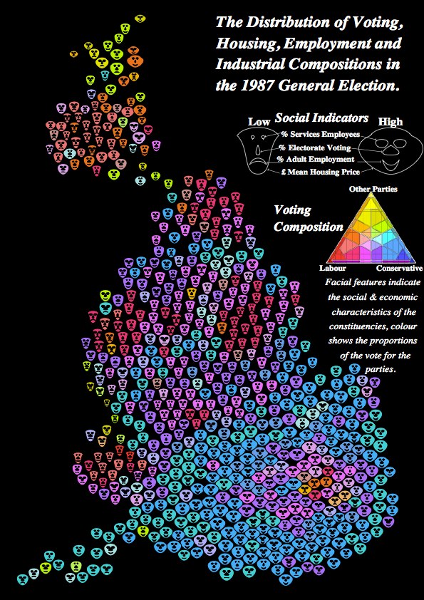
Other ones I am familiar with are Chernoff faces and population pyramids (Dorling, 2012), filled rectangles to replace univariate choropleth maps (Cleveland & McGill 1984), star plots (Friendly, 2007; Wickham et al. 2012) and more complicated stick glyph variants (Maddox et al. 2013). Below is an example of Chernoff faces taken from Dorling (2012) (of course positioned according to a circular Dorling cartogram - I'm reading the Dorling book now and it has a ton of different types of glyphs I haven't seen elsewhere).
Dorling Chernoff Faces
(source: dannydorling.org)

Some notes on their use:

  • Irregularly spaced data are typically more difficult to visualize and have problems of glyphs overlapping and being occluded (Wickham et al. 2012).
  • Glyphs tend to generate extremely complicated maps. Because of this, it is often more effective use of space to make several small multiple maps as oppossed to one map will all of the information superimposed. See Effectively displaying demographic data on a printed map for related discussion.

#References

References

I would call them glyphs although I'm skeptical it is such an established adjective that it will be immediate to many audiences. Vasan et al. (2013) is a great review of different types of glyphs used in the literature (plus an experimental study for the differences between bricks like you show and clustered bars, pies, and sticks). The image below is from the cited paper and shows the different experimental stimulus:

enter image description here

Other ones I am familiar with are Chernoff faces and population pyramids (Dorling, 2012), filled rectangles to replace univariate choropleth maps (Cleveland & McGill 1984), star plots (Friendly, 2007; Wickham et al. 2012) and more complicated stick glyph variants (Maddox et al. 2013). Below is an example of Chernoff faces taken from Dorling (2012) (of course positioned according to a circular Dorling cartogram - I'm reading the Dorling book now and it has a ton of different types of glyphs I haven't seen elsewhere).

Dorling Chernoff Faces
(source: dannydorling.org)

Some notes on their use:

  • Irregularly spaced data are typically more difficult to visualize and have problems of glyphs overlapping and being occluded (Wickham et al. 2012).
  • Glyphs tend to generate extremely complicated maps. Because of this, it is often more effective use of space to make several small multiple maps as oppossed to one map will all of the information superimposed. See Effectively displaying demographic data on a printed map for related discussion.

#References

I would call them glyphs although I'm skeptical it is such an established adjective that it will be immediate to many audiences. Vasan et al. (2013) is a great review of different types of glyphs used in the literature (plus an experimental study for the differences between bricks like you show and clustered bars, pies, and sticks). The image below is from the cited paper and shows the different experimental stimulus:

enter image description here

Other ones I am familiar with are Chernoff faces and population pyramids (Dorling, 2012), filled rectangles to replace univariate choropleth maps (Cleveland & McGill 1984), star plots (Friendly, 2007; Wickham et al. 2012) and more complicated stick glyph variants (Maddox et al. 2013). Below is an example of Chernoff faces taken from Dorling (2012) (of course positioned according to a circular Dorling cartogram - I'm reading the Dorling book now and it has a ton of different types of glyphs I haven't seen elsewhere).

Dorling Chernoff Faces
(source: dannydorling.org)

Some notes on their use:

  • Irregularly spaced data are typically more difficult to visualize and have problems of glyphs overlapping and being occluded (Wickham et al. 2012).
  • Glyphs tend to generate extremely complicated maps. Because of this, it is often more effective use of space to make several small multiple maps as oppossed to one map will all of the information superimposed. See Effectively displaying demographic data on a printed map for related discussion.

References

broken image fixed (click 'rendered output' or 'side-by-side' to see the difference); for more info, see https://gist.github.com/Glorfindel83/9d954d34385d2ac2597bbe864466259f
Source Link

I would call them glyphs although I'm skeptical it is such an established adjective that it will be immediate to many audiences. Vasan et al. (2013) is a great review of different types of glyphs used in the literature (plus an experimental study for the differences between bricks like you show and clustered bars, pies, and sticks). The image below is from the cited paper and shows the different experimental stimulus:

enter image description here

Other ones I am familiar with are Chernoff faces and population pyramids (Dorling, 2012), filled rectangles to replace univariate choropleth maps (Cleveland & McGill 1984), star plots (Friendly, 2007; Wickham et al. 2012) and more complicated stick glyph variants (Maddox et al. 2013). Below is an example of Chernoff faces taken from Dorling (2012) (of course positioned according to a circular Dorling cartogram - I'm reading the Dorling book now and it has a ton of different types of glyphs I haven't seen elsewhere).

Dorling Chernoff Faces http://www.dannydorling.org/books/visualisation/Graphics/Pages/Figures_files/Media/Figure%208.10/Figure%208.10.jpg?disposition=downloadDorling Chernoff Faces
(source: dannydorling.org)

Some notes on their use:

  • Irregularly spaced data are typically more difficult to visualize and have problems of glyphs overlapping and being occluded (Wickham et al. 2012).
  • Glyphs tend to generate extremely complicated maps. Because of this, it is often more effective use of space to make several small multiple maps as oppossed to one map will all of the information superimposed. See Effectively displaying demographic data on a printed map for related discussion.

#References

I would call them glyphs although I'm skeptical it is such an established adjective that it will be immediate to many audiences. Vasan et al. (2013) is a great review of different types of glyphs used in the literature (plus an experimental study for the differences between bricks like you show and clustered bars, pies, and sticks). The image below is from the cited paper and shows the different experimental stimulus:

enter image description here

Other ones I am familiar with are Chernoff faces and population pyramids (Dorling, 2012), filled rectangles to replace univariate choropleth maps (Cleveland & McGill 1984), star plots (Friendly, 2007; Wickham et al. 2012) and more complicated stick glyph variants (Maddox et al. 2013). Below is an example of Chernoff faces taken from Dorling (2012) (of course positioned according to a circular Dorling cartogram - I'm reading the Dorling book now and it has a ton of different types of glyphs I haven't seen elsewhere).

Dorling Chernoff Faces http://www.dannydorling.org/books/visualisation/Graphics/Pages/Figures_files/Media/Figure%208.10/Figure%208.10.jpg?disposition=download

Some notes on their use:

  • Irregularly spaced data are typically more difficult to visualize and have problems of glyphs overlapping and being occluded (Wickham et al. 2012).
  • Glyphs tend to generate extremely complicated maps. Because of this, it is often more effective use of space to make several small multiple maps as oppossed to one map will all of the information superimposed. See Effectively displaying demographic data on a printed map for related discussion.

#References

I would call them glyphs although I'm skeptical it is such an established adjective that it will be immediate to many audiences. Vasan et al. (2013) is a great review of different types of glyphs used in the literature (plus an experimental study for the differences between bricks like you show and clustered bars, pies, and sticks). The image below is from the cited paper and shows the different experimental stimulus:

enter image description here

Other ones I am familiar with are Chernoff faces and population pyramids (Dorling, 2012), filled rectangles to replace univariate choropleth maps (Cleveland & McGill 1984), star plots (Friendly, 2007; Wickham et al. 2012) and more complicated stick glyph variants (Maddox et al. 2013). Below is an example of Chernoff faces taken from Dorling (2012) (of course positioned according to a circular Dorling cartogram - I'm reading the Dorling book now and it has a ton of different types of glyphs I haven't seen elsewhere).

Dorling Chernoff Faces
(source: dannydorling.org)

Some notes on their use:

  • Irregularly spaced data are typically more difficult to visualize and have problems of glyphs overlapping and being occluded (Wickham et al. 2012).
  • Glyphs tend to generate extremely complicated maps. Because of this, it is often more effective use of space to make several small multiple maps as oppossed to one map will all of the information superimposed. See Effectively displaying demographic data on a printed map for related discussion.

#References

replaced http://gis.stackexchange.com/ with https://gis.stackexchange.com/
Source Link

I would call them glyphs although I'm skeptical it is such an established adjective that it will be immediate to many audiences. Vasan et al. (2013) is a great review of different types of glyphs used in the literature (plus an experimental study for the differences between bricks like you show and clustered bars, pies, and sticks). The image below is from the cited paper and shows the different experimental stimulus:

enter image description here

Other ones I am familiar with are Chernoff faces and population pyramids (Dorling, 2012), filled rectangles to replace univariate choropleth maps (Cleveland & McGill 1984), star plots (Friendly, 2007; Wickham et al. 2012) and more complicated stick glyph variants (Maddox et al. 2013). Below is an example of Chernoff faces taken from Dorling (2012) (of course positioned according to a circular Dorling cartogram - I'm reading the Dorling book now and it has a ton of different types of glyphs I haven't seen elsewhere).

Dorling Chernoff Faces http://www.dannydorling.org/books/visualisation/Graphics/Pages/Figures_files/Media/Figure%208.10/Figure%208.10.jpg?disposition=download

Some notes on their use:


#References

I would call them glyphs although I'm skeptical it is such an established adjective that it will be immediate to many audiences. Vasan et al. (2013) is a great review of different types of glyphs used in the literature (plus an experimental study for the differences between bricks like you show and clustered bars, pies, and sticks). The image below is from the cited paper and shows the different experimental stimulus:

enter image description here

Other ones I am familiar with are Chernoff faces and population pyramids (Dorling, 2012), filled rectangles to replace univariate choropleth maps (Cleveland & McGill 1984), star plots (Friendly, 2007; Wickham et al. 2012) and more complicated stick glyph variants (Maddox et al. 2013). Below is an example of Chernoff faces taken from Dorling (2012) (of course positioned according to a circular Dorling cartogram - I'm reading the Dorling book now and it has a ton of different types of glyphs I haven't seen elsewhere).

Dorling Chernoff Faces http://www.dannydorling.org/books/visualisation/Graphics/Pages/Figures_files/Media/Figure%208.10/Figure%208.10.jpg?disposition=download

Some notes on their use:

  • Irregularly spaced data are typically more difficult to visualize and have problems of glyphs overlapping and being occluded (Wickham et al. 2012).
  • Glyphs tend to generate extremely complicated maps. Because of this, it is often more effective use of space to make several small multiple maps as oppossed to one map will all of the information superimposed. See Effectively displaying demographic data on a printed map for related discussion.

#References

Source Link
Andy W
  • 4.3k
  • 5
  • 48
  • 70
Loading