2

I have searched for this answer online for 4-5 hours and am not finding the specific topic or solution to my problem.

I am creating a data driven pages mapbook of the state parks, state gamelands and state forests in Pennsylvania, with each page representing a county. The problem that I am having is the locator (inset) map highlights a red border around the current extent of the main data frame in the locator map, rather than the individual county that the page is being created for.

I have clicked on the properties for the counties layer in the locator map's data frame, gone to the "Definition Query" tab and clicked on the "Page Definition" button, then checked the enabled checkbox, chosen "County_Nam" from the "Page Name Field:" dropdown and then clicked the "Match" bubble for "Show Features That," but this has not altered anything on my maps. The locator continues to highlight the extent, rather than the county.

Is there something that I am missing or another way to go about correcting this seemingly straightforward step in the data driven pages creation process?

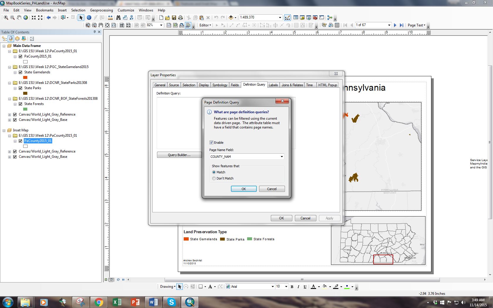
My arcmap data driven pages map for Adams County showing red highlighted border and page Definition Query completion

1
  • Is COUNTY_NAM the attribute used in the Main Data Frame's data drive page setup?
    – Erica
    Commented Nov 19, 2015 at 13:01

1 Answer 1

2

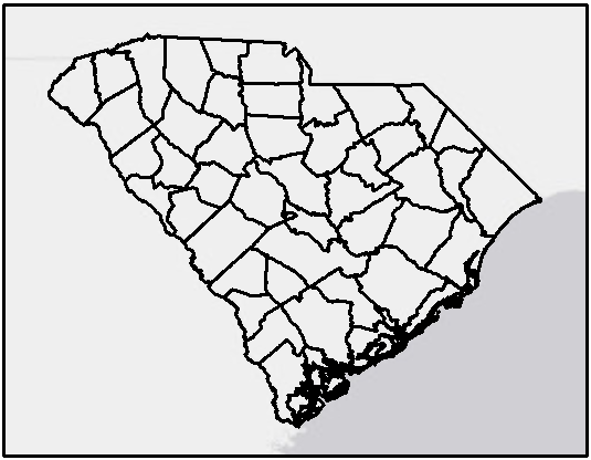
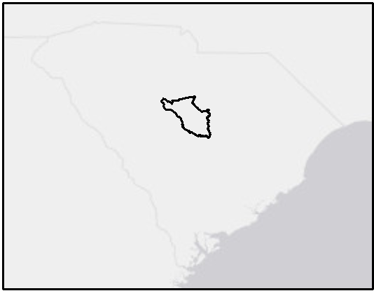
There are two ways to work with Data Driven Pages to highlight part of an inset map. One, which you're trying, is a page definition query.

left map: no definition query applied, right map: page definition query applied

Make sure that the "Page Name Field" selected in the inset map layer matches the "Name Field" (not the "Sort Field", "Page Number", or anything else) set in the data driven pages definition of your main data frame. (This is by far my biggest stumbling block, especially when the index layer and other layers are different feature classes and there are typos in the data, or one has something like "Richland County" and the other "Richland"...)


However, it looks like what you're really wanting is to highlight the selected county rather than show only that polygon. This can be accomplished two ways:

  1. Brute force: Add the layer in twice. Apply a page definition query (and different symbology) to the top one.
  2. More elegant: Use extent indicators. You can find the tab in the data frame properties (right-click on your "Inset Map" data frame).

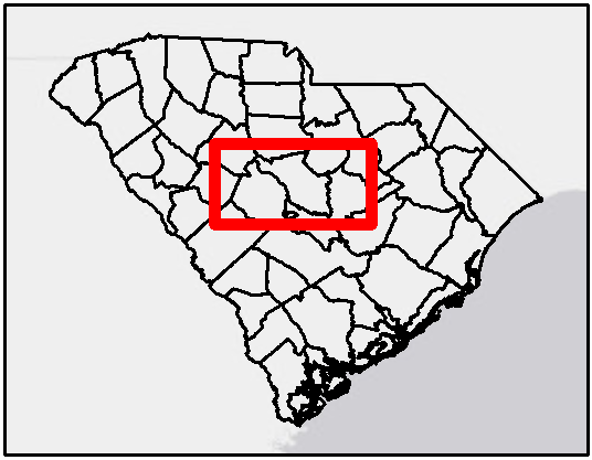
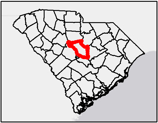
It looks like you're already using extent indicators (there's no other way you'd get that rectangle on your map). What you need to do is customize that a little bit: in this case, un-check "Use simple extent." If you want a different symbology for the highlighted county, click the "Frame..." button and customize.

left map: extent indicator when "use simple extent" is checked, right map: default extent indicator

1
  • Thank you very much Erica. That was so simple, but unchecking the use simple extent did the trick! Gracias,
    – andrews
    Commented Nov 20, 2015 at 12:04

Your Answer

By clicking “Post Your Answer”, you agree to our terms of service and acknowledge you have read our privacy policy.