8

I am still new to QGIS. I have seen several tutorials but they seem to be concerned with earlier versions.

The problem I have is that my heat map obscured any map beneath. I can see why this is, the places that are distant from points of data are still being rendered with white (or whatever the leftmost colour is on the colour ramp)

What I need to achieve is:

(1) have the geographical map show through under the heat map layer (2) tighten up the heat map "blobs" to look less wishy-washy.

enter image description here

1
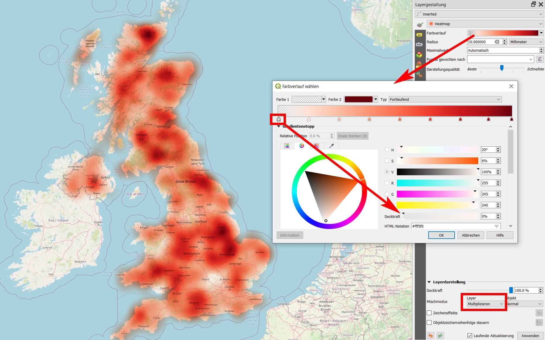
  • For anyone interested I just found one way to do it. Clicking on the colour ramp, then select the colour on the far left. Then alter its opacity bar (the bottoms slider on the right) Commented Sep 11, 2019 at 7:55

2 Answers 2

9

It looks like your heatmap is a raster-layer, isn't it (heatmaps can be rendered from point-layers as well)? A more elegant way to achieve transparency here: in the layer properties, go to transparency, select white (or any other background-color) to transparent. Use the add values tool to select the color you want to be transparent directly from the image (or add add values manually). You can add as many colors as you wish to be transparent.

You might want to use layer blending modes (layer properties, symbolisation tab, blending modes) to make your background map to be visible (show through) where your heatmap "peaks" are - try e.g. blending-mode multiply and adjust brightness, saturation, contrast.

Screenshot: Heatmap, created with a heatmap symbol rendering of a point layer. Select the color ramp and reduce the transparency of the leftmost color to complete transparency (above, red arrows). Also set the layer blending mode to muliply (below):

enter image description here

5
  • Babel, I am not entirely sure here if my heat map is a raster layer or not (that's how much of a beginner I am!). It was generated from a layer of CSV values, then by choosing Heatap rather than the default 'Single Symbol'. If a vector heat map were possible, something like a weather map's isobars I would be very interested in that. Commented Sep 11, 2019 at 13:52
  • If you created the heatmap from from CSV values, that means you have a point-layer that has rendering-style "heatmap" - it's thus a vector-layer, not a raster layer, but rendered in a raster-like style. In this case, however, most of my suggestions don't work the same way - transparency-tab e.g. does not exist in the layer properties. You can still set a global layer-transpyrency, use different layer-blending modes etc. Also try different color-ramps and just set transparency manually to the colors you want to suppress (as you suggested)
    – Babel
    Commented Sep 11, 2019 at 14:26
  • Ah I see by selecting DISCRETE rather than continuous for heatmaps does 'isobars'. Good stuff Commented Sep 11, 2019 at 14:27
  • If you want to create a raster-layer heatmap, there are different interpolation tools - check the toolbox for "heatmap" or "interpolation" (algorithms for inverse distance wight, kerndel density estimation etc.
    – Babel
    Commented Sep 11, 2019 at 14:33
  • See also this video for a critical approach to heatmaps: media.ccc.de/v/…
    – Babel
    Commented Sep 11, 2019 at 14:36
1

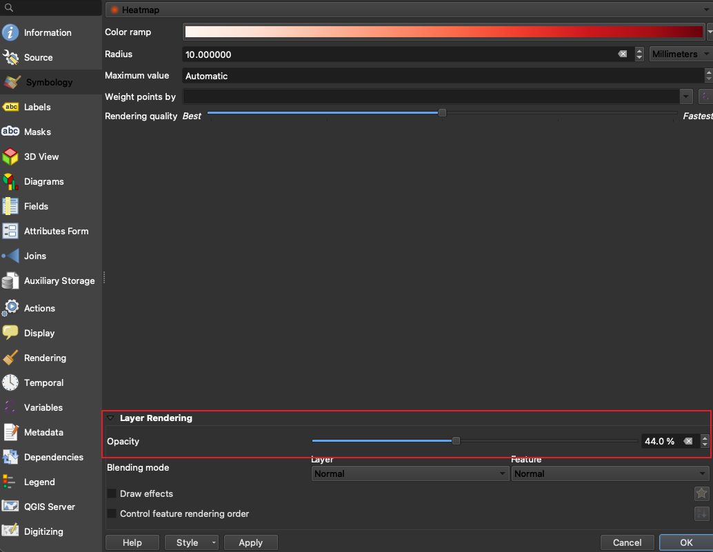
If your heatmap was created from a point layer, you can adjust the Opacity in Layer Rendering. Hope this helps. enter image description here

Your Answer

By clicking “Post Your Answer”, you agree to our terms of service and acknowledge you have read our privacy policy.

Not the answer you're looking for? Browse other questions tagged or ask your own question.