19

I preparing some choropleth election result maps in Geopandas. The assigned color for each electoral district must correspond with the winning party (a color that I pre-determine), and the intensity of the color (opacity, saturation, etc) must be adjusted based some variable such as the margin of victory. Basically your traditional post-election map job.

My GeoDataFrame is structured as such (note there are three or more parties):

district_no   winning_party  color    margin  geom  
0             Conservative   #C62828  .56     POLYGON(599240.6488817427....)
1             Conservative   #C62828  .78     POLYGON(589240.6488427823....)
2             Liberal        #283593  .34     POLYGON(563405.6788424563....)
3             Conservative   #C62828  .08     POLYGON(563405.6488424563....)
4             Labour         #FF9800  .22     POLYGON(583405.6918424563....)
5             Labour         #FF9800  .37     POLYGON(633405.6128424563....)
6             Liberal        #283593  .48     POLYGON(533405.6278424563....)
etc...        etc...         etc...   etc...   etc...

I have not been able to figure out how to achieve this with the .plot() method. The argument 'color' simply applies the inputted color to all rows, and I am unsure how using cmap would help me achieve this, especially given that I must also adapt the color intensity based the margin column.

The only solution I can conceive is to loop through each row in the GeoDataFrame, and one by one plot out each polygon by assigning the color column value to the color argument, and then use the margin value to adjust the alpha level. Then somehow, I would have to merge/append all the plots back together to rebuild a final map (I'm not even sure this is possible).

Surely there is a better way than this. I have scoured the Internet, but surprisingly, I cannot find any solutions for this multi-party choropleth maps. Any ideas?.

3 Answers 3

21

The column= keyword can be used if you have values in a column which need to be mapped to a color (with a certain color map). But if you already have actual color names that you want to use directly, you can use the color keyword.

You can pass a list/array of colors (with the same number of values as the number of rows) to this color keyword. For example when you have 5 rows:

gdf.plot(color=['r', 'g', 'b', y', 'k'])

So in your case, you can pass the the column (but the actual values, not the column name):

gdf.plot(color=gdf['color'])

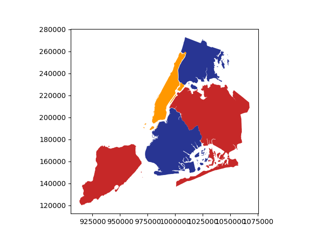
Small example to illustrate:

>>> gdf = geopandas.read_file(geopandas.datasets.get_path('nybb'))
# adding a column with color names (gdf has 5 rows)
>>> gdf['color'] = ['#C62828', '#C62828', '#283593', '#FF9800', '#283593']
>>> gdf.plot(color=gdf['color'])     

enter image description here

Also specifying the alpha based on column values is a bit more complicated, as the alpha keyword does not yet accept an array-like. One possible work-around is to combine the color and alpha in a RGBA tuple (4 floats).
Continuing the same example from above, the following seems to work:

# add a margin column
gdf['margin'] = [.56, .78, .34, .08, .48]

from matplotlib.colors import to_rgba
gdf['color_rgba'] = gdf.apply(
    lambda row: to_rgba(row['color'], alpha=row['margin']), axis=1)
gdf.plot(color=gdf['color_rgba'])  
5
  • This worked perfectly for setting the the color based on the values in my color column. However, the second part of my question -- setting the alpha based on the margin column values -- is not working. It appears, the alpha argument doesn't accept a series/list of alpha float values. Any idea how to overcome this?
    – mattchewy
    Sep 20, 2019 at 17:59
  • Can you open an issue at github.com/geopandas/geopandas/issues about the alpha not accepting an array? A possible work-around is to convert your colors in RGBA values (as 4 floats), this way you can include the alpha inside the color definition.
    – joris
    Sep 20, 2019 at 19:21
  • This is exactly what I ended up doing and it worked flawlessly. Created a function that assigns the 4th float in the tuple based on the values stored in the victory margin column. Thanks for the help.
    – mattchewy
    Sep 20, 2019 at 19:32
  • BTW, you might be interested in pysal.readthedocs.io/en/latest/generated/…
    – joris
    Sep 20, 2019 at 19:34
  • Great solution @joris ... the link in your last comment is broken. BTW do you know of a similar workaround for setting different hatches? (I am afraid hatch does not accept a list either)
    – abu
    Jan 26, 2022 at 20:29
2

You can subset your dataset based on the parties and then plot them one by one and overlap them in the same plot.

import geopandas as gpd
import numpy as np
import matplotlib.pyplot as plt
from mpl_toolkits.axes_grid1 import make_axes_locatable
plt.style.use('seaborn-white')

# map parties with colors
parties = {'conservative': 'Reds',
           'liberal': 'Blues',
           'labour': 'Greens'}

# generate random values
gdf = gpd.read_file(gpd.datasets.get_path('naturalearth_lowres'))
gdf['winning_party'] = np.random.choice(list(parties.keys()), len(gdf))
gdf['margin'] = np.random.random(len(gdf))

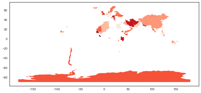
If you only plot one party, you will end up with the following map:

enter image description here

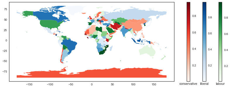
Now, plot three parties together:

fig, ax = plt.subplots(figsize=(15, 5))
divider = make_axes_locatable(ax)

for party, color in parties.items():

    cax = divider.append_axes('right', size='2%', pad=0.6)
    cax.set_xlabel(party)

    gdf[gdf.winning_party == party].plot(column='margin', cmap=color,
                                         legend=True, ax=ax, cax=cax)

enter image description here

1

gdf.plot(column='margin', cmap = "viridis")

1
  • This does not work. It serves only to show the margin of victory by electoral district for which every party won. It does not color coordinate based on which party won.
    – mattchewy
    Sep 20, 2019 at 4:26

Your Answer

By clicking “Post Your Answer”, you agree to our terms of service and acknowledge you have read our privacy policy.

Not the answer you're looking for? Browse other questions tagged or ask your own question.