18

I have been trying to get a good looking shaded relief model out of GRASS and Qgis for a day or so now and just can't seem to get it. The biggest problem I'm having is the valleys look like mountains, but I just can't seem to get the right combination in order to show mountains and valleys look right.

Bellow is a some pictures of the problems:

DEM (Brown is high and Red is low, red is only used for a visual check) DEM
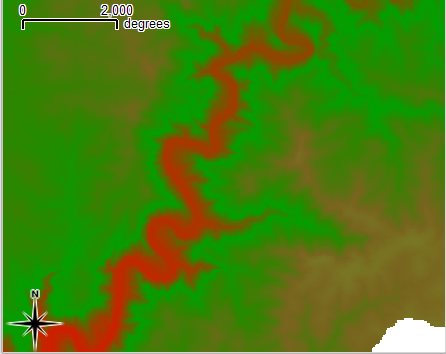
Shaded Model 1 with DEM Sun position 180 degress from North, sun height 80 alt text
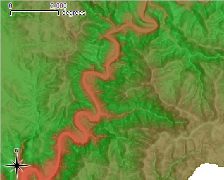
Problem: Hills look good but the river (in red) still looks like a mountain even though it's the lowest point on the map.

Shaded Model 2 with DEM Sun position north west (315 degrees), sun height 60 alt text
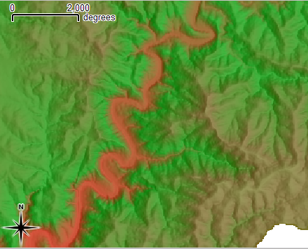
Problem: Again the hills look good but the river (in red) still looks like a mountain even though it's the lowest point on the map.

I have tried all different combinations of angles and sun heights and I just can't seem to get the river to look like a river, it always looks like a hill.

Can anyone point me in the right direction on what I might be doing wrong?

EDIT: So I took the contour data home and ran the process from the start and used the defaults for r.shaded.relief and got this:
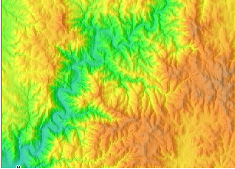
alt text

This looks much better to me, not the greatest colours but we can change that. I think my work install of grass must be busted because even the defaults looked bad.

2
  • Glad it worked better now. Note that there are several predefined terrain/elevation colour tables available which you can choose from; furthermore you can define easily your own.
    – markusN
    Commented Dec 5, 2010 at 15:43
  • Nathan, I've included an additional link in my response you may find helpful, cheers.
    – scw
    Commented Dec 6, 2010 at 21:04

4 Answers 4

12

For relief shading in GRASS, better use r.shaded.relief. It comes by default with light from west to east. Like this (SRTM example):

alt text

For my perception the valley looks ok in this example. The colortable comes from r.colors (there are "terrain" and "srtm", see here for examples of these color tables).

5
  • I did use r.shaded.relief also with the defaults and to me it looked worse then the ones I posted. When I get to work on Monday I will post a screenshot and see what people think. Thanks for the r,colors table link, didn't know about that page.
    – Nathan W
    Commented Nov 27, 2010 at 1:50
  • I dunno if my example above looks bad (for me it is nice), at least it shows the default settings and no special tricks.
    – markusN
    Commented Nov 27, 2010 at 9:10
  • I think it looks good to me too. Maybe the colors in my first one [using the default settings] that I did was wrong.
    – Nathan W
    Commented Nov 28, 2010 at 4:10
  • What worked for me is r.relief followed by r.shade. The r.shaded.relief in your answer doesn't exist in GrassGIS 7.2.1 apparently.
    – Hakim
    Commented Oct 11, 2017 at 15:38
  • Yes, with the publication of GRASS GIS 7 (my answer above refers to G6) we cleaned up a series of modules. For details (including your observation), see trac.osgeo.org/grass/wiki/Grass7/NewFeatures#Renamedmodules
    – markusN
    Commented Oct 12, 2017 at 10:53
9

There's nothing wrong with this hillshading and the coloring certainly is not the problem. We are experiencing a common, well-known phenomenon: our visual processing inverts depth and height when the terrain appears to be illuminated from below. (Look at the image again while standing on your head: it will appear correct.) That's why it's best to place the light near the top (map "north"). A close look at these particular images suggests the sun directions are not what you think they are: the top one seems to be illuminated from the right, not the bottom; and the bottom one seems to be illuminated from the lower right, not the upper left. Adding or subtracting 180 degrees from either of the angles will solve the problem. If the results are usually surprising to you, suspect one or more of the following:

  • The software might be using radians instead of degrees.

  • The angle might be measured counterclockwise from due east (the math/physics convention).

3

On first glance, it seems like the color ramping used is what makes the data look particularly confusing, choosing an appropriate hypsometric tint would make the differences more obvious. You may also want to look at other pre-generated shaded relief datasets for comparison, such as this SRTM-based one.

Another thing that would likely help is to add a stream centerline in an obvious water color, this will make unambiguous which areas are low-lying on the map and prevent the optical trick which makes the river appear as a ridgeline.

You may want to also check out Tim Sutton's guide to making shaded relief DEMs using GDAL for some helpful advice and techniques using only command-line tools.

2

I agree with scw that part of the problem might be caused by the choice of colors. I think people tend to interpret green as "low" and red as "high". Compare:

alt text

http://www.icsm.gov.au/mapping/cartographic.html#tints

On sun positions:

It is based on the convention that an imaginary light source (eg the Sun) is in the northwest corner of the map and the shadows spread out towards the southeast corner.

Source: http://www.icsm.gov.au/mapping/cartographic.html#shading

Your Answer

By clicking “Post Your Answer”, you agree to our terms of service and acknowledge you have read our privacy policy.

Not the answer you're looking for? Browse other questions tagged or ask your own question.