39

This winter I am planning to track my downhill skiing/snowboarding using a GPS. Most of my riding will occur at the same resort. I would like to be able to create a sort of "heatmap" that shows the amount of runs that I have made in a given area. As I add more and more GPS traces to my database, my goal would be to see a sort of linear heatmap of the most traveled areas. Given the nature of downhill skiing, you would expect the uphill chairlift lines will be the "hottest" because it will be the only places visited over-and-over again.

Given that 1) my track will not be the same every time and 2) the area covered by following one "run" may be a few hundred feet wide, what might be the best way to analyze this "linear" data to create a sort of heatmap? My thoughts were to buffer the lines, then intersect the polys to get a sort of Venn Diagram thing going. My preference is to use open-source technologies. I've got QGIS and PostGIS loaded and available.

UPDATE: In regards to @blah238's response, I was thinking of something that might be able to "collect" the number of passes ("runs") through an area, and then symbolize by the count. Conceptually, this would be similar to ArcGIS "Collect Events" (but for lines, not points) or Collapse Dual Lines To Centerline (but for multiple line in roughly the same area).

A more visual example of a similar concept might be a traffic-flow map, where highly-congested areas would equate to "highly-traveled" ski runs/areas:
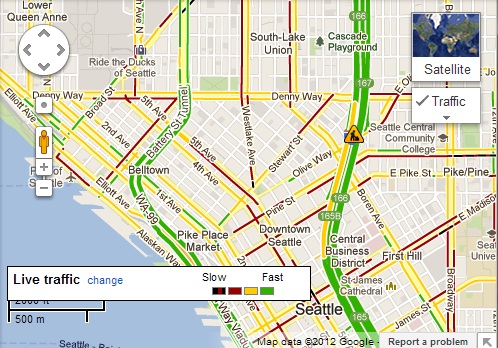
Google Traffic Map

I've read the following questions that may give some ideas, but they don't really address what I am trying to accomplish:

Clustering Trajectories (GPS data of (x,y) points) and Mining the data

Managing error with GPS routes (theoretical framework?)

5
  • Assuming that you would be using GPX data, it should just take lat/long readings at intervals, so it should be already in point features. Would you not be able to then use a heatmap on that? Or are you not using GPX compatable device??
    – RomaH
    Commented Nov 26, 2012 at 20:55
  • Ah, er. I misread what you were wanting.. Nevermind.
    – RomaH
    Commented Nov 26, 2012 at 21:51
  • @RomaH, actually, you very well may be onto something with your idea of using the points to generate a heatmap instead of using the lines. I had not considered using the source points before, so this is something I will definitely investigate. Commented Nov 27, 2012 at 15:18
  • You are dealing with a field, where as a street has well defined edges. If you want to do a line model, you could do several poly overlays, joins, and use the point2one plugin to make a line map with inherited values. But then you need to decide how far away does one need to ski from in order to justify a new line feature. Personally for me I would be happy with a heatmap solution, but again, I am not aware of your needs.
    – RomaH
    Commented Nov 27, 2012 at 17:16
  • I stumbled across this question which is a very cool way to accomplish essentially the same thing, but using the GPS Track Points to create the heat map. Commented Jun 13, 2016 at 19:00

9 Answers 9

21

I've done a bit of work on this in GeoTools/GeoServer by extending the Heatmap Rendering Transformation to support geometries other than points.

Pizza deliveries heatmap

It's not finished yet, but you can get the feature branch from my repository on GitHub.

The screenshot is of GPS tracks from when I worked as a pizza delivery driver.

2
  • It's still not outputting vector geometries, but it is collecting overlap to give a higher value.
    – smithkm
    Commented Nov 27, 2012 at 17:56
  • any ideas how to get this effect with just postgis? or qgis?
    – chrismarx
    Commented Aug 23, 2015 at 19:08
18

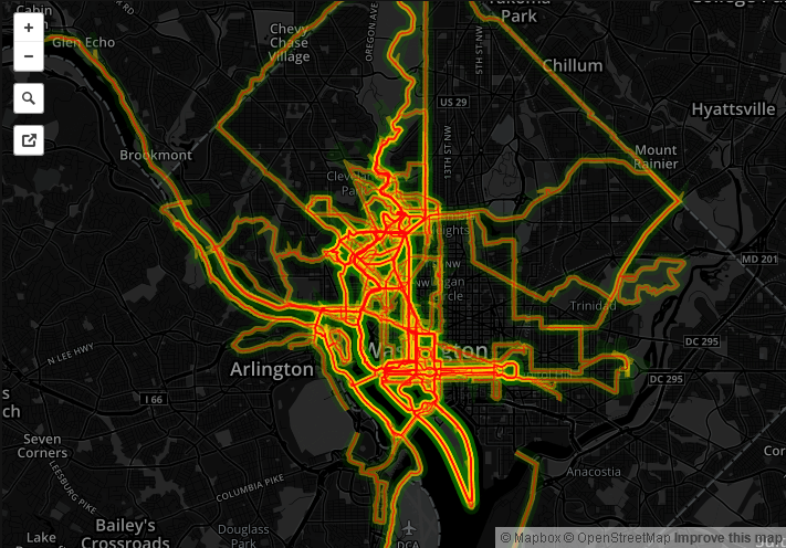
Here is a good tutorial for doing exactly that using MapBox and TileMill:

Screenshot

3
  • 1
    Agreed, this concept is almost identical, and could easily be done in any GIS. But this is basically suggesting "just make all of your tracks red with a light green buffer" and they will stand out on the map? For visual effect, I will definitely work. I guess I was originally thinking of trying for something more "analytical" that could show "counts" of "runs" in this example. I'll keep mulling it over. Commented Nov 27, 2012 at 0:16
  • @blah238 I was looking similar example...thanks a lot !!
    – Sunil
    Commented Nov 27, 2012 at 5:09
  • 1
    @blah238, After thinking on it a little longer, you provided a very valid answer to my initial question. I should have been more clear on my thoughts. Thanks for your answer, and I have updated my question to more accurately reflect what I was trying to achieve. I appreciate the help. Commented Nov 27, 2012 at 15:20
9

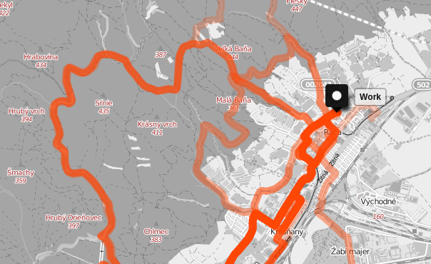
here is my simple approach:

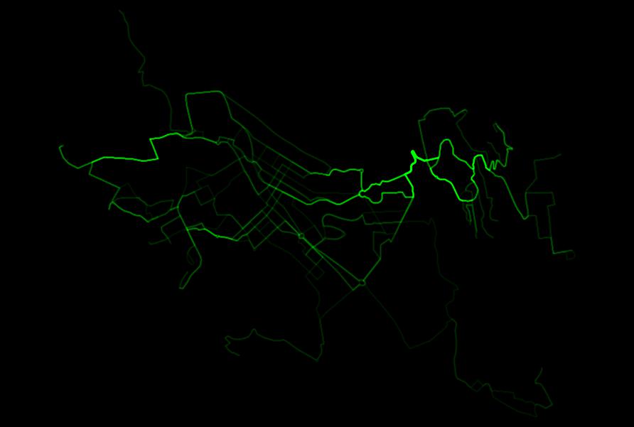
  1. create a new map in umap: http://umap.openstreetmap.fr/en
  2. click Import Data a select all the gpx files you have and upload them into map (you can import all of them at once)
  3. enter Edit map settings > Default properties, choose opacity 0.25, weight 10.

The three steps above will take 5 minutes and here is the result: enter image description here

5

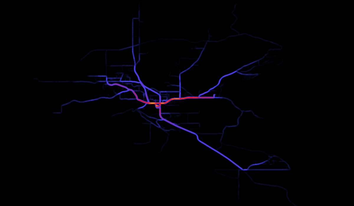
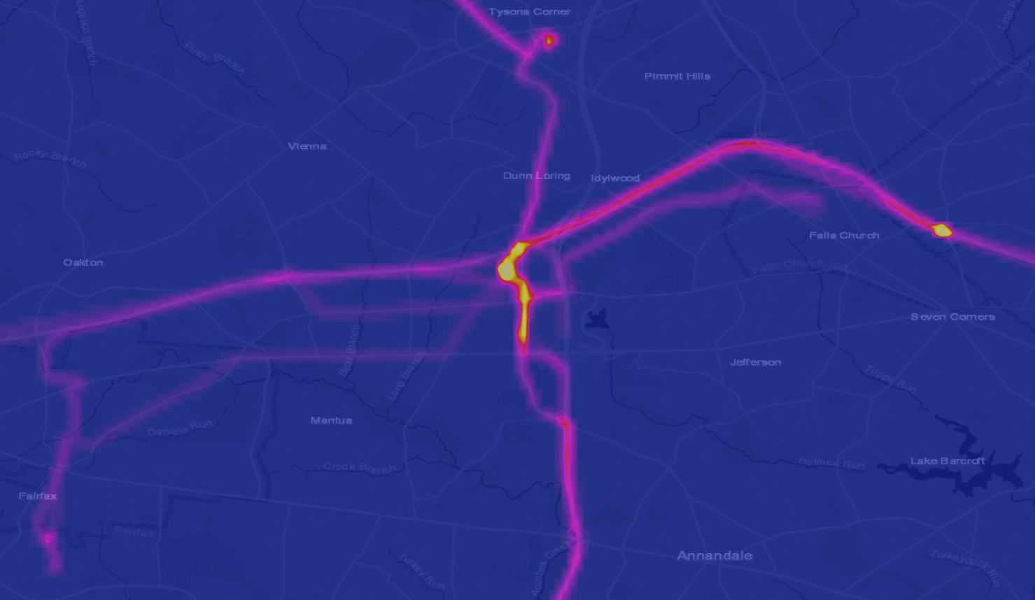
Here is my approach on QGIS. This was for a set of bus routes, and I wanted to identify which roads had the most density of bus routes passing by.

  • Used the Qchainage plugin to convert my lines into points. Tested different scenarios until I produced a lot of points per line (1,500 per line, and lines were about 9kms).
  • Applied the heatmap symbology rendering that Qgis has built-in in the style tab. layer properties > style > heatmap
  • Play with the radius and the maximum value. Make sure to select the best rendering quality.
  • Created a new color ramp (choose continuous) starting from black and any other bright color on the other side.

And voilà.

enter image description here enter image description here

4

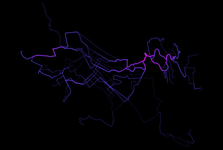
I realize this is quite an old post, however, I came across it doing similar research. I developed a pretty simple model/work flow that can accomplish just this in ArcGIS (possibly QGIS, but I've not yet implemented it there).

If you have a GPX or TCX file specifically (any point file works though), it can simply be opened up in Excel, then converted to a CSV and brought into ArcGIS. Using the Points to Line tool, you convert the GPS points from the CSV, into trajectories by sorting the points by time (you could also group them using a unique identifier, which in this case might be by the resort, route, or specific date of the event - e.g. Day1, 2, etc). This will create a single polyline layer (unless you group them by the unique ID). You then use the Split Line at Vertices tool which creates line segments between each successive point. From there, you use the Line Density tool which counts the number of lines passing through a cell given a specified cell size and search radius, and outputs a raster. This raster can be symbolized as a heat map.

I have, and continue to implement this frequently, and included a sample result below:

enter image description here

2
  • That looks like a really interesting technique. I never completed this idea, so I will investigate this further. Thanks for replying to an old question! Commented Feb 9, 2018 at 19:44
  • No problem! It is a pretty simple model using just those three tools from the Arc Toolbox. Alternately, you could simplify it further to two tools using just the Track Intervals to Line and the Line Density tools
    – mrgeo
    Commented Feb 9, 2018 at 23:05
3

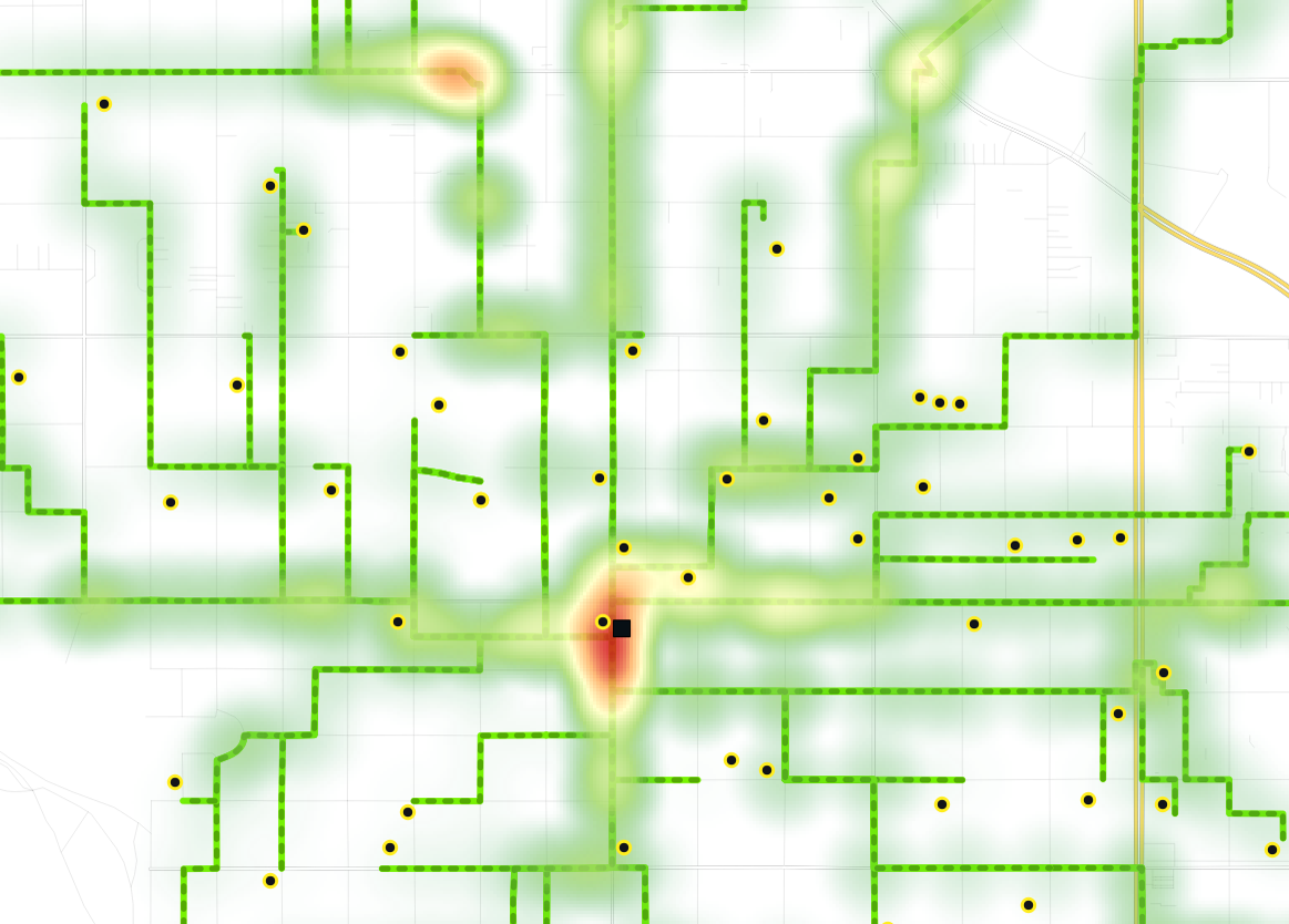
Our use of this involves routing students to their school using PGRouting.

The results of an individual route are at their core a set of nodes (which are turned into lines by optionally joining the related edges).

If you route multiple students to a single school, the output collection of nodes can be then displayed in QGIS using the heatmap renderer, which shows the 'hotspots' of collected routes to the school (see below).

These maps were used to inform areas that should be targeted for further safety infrastructure such as crossings, signals, signs, etc.

enter image description here

1
  • Thanks sharing for the image, I like it. I'll try processing the GPX vertexes instead of the lines to see if the hotspots work within a small Commented Mar 11, 2019 at 22:46
1

Create a graticular gridwork, convert gpsdata to shapefiles, polygonize the lines, extract x,y point data from tables, make a surface density, or heat map using standard practice at this point. You could then merge with linear vector data to get pixel values in a raster display or for further numerical processing.

1

Most people (including myself) look at a GPX file and think of it as a sequence of positions (points), while it can be perfectly seen as a sequence of line segments instead.

Your problem formulation involves a "heat map" so that you can inspect visually your trajectories, so there is a rather simple way to skip the complex numbercrunching part by delegating it directly to a plotting engine.

When you say "buffer the lines", that would be line thickness. When you say "collect the passes" that would mean plotting over and over with transparent lines, thus "building up" more and more color.

So, I suggest you to plot each trajectory as a single polyline with thickness enough that there is some overlap (it depends on zoom, so you'll want to set the thickness in map distance instead of pixels), and with a fairly low opacity, say, 0.05, in black.

It is important not to plot each segment, because if you do so, their extremities will overlap, doubling their opacity and creating a "dot" of stronger color.

In the end, you'll get a grayscale image upon which you can apply the colormap of your choice.

I would probably do it using Python/Cairo, but Python/Matplotlib would do, and Html/Canvas or Html/SVG (or programmatic SVG) certainly would do.

The end result would depend only on resolution of your output media.

1

I'm aware that this is quite an old question, but as this post is one of the top search results for this topic, I thought I'd post a link to a workflow for producing polyline heat maps in ArcGIS that answers this question, as there is currently no solution for ArcGIS in this post.

https://luke-webber.github.io/polyline-heatmap/

1
  • The link is unfortunately dead (six years later). URL rot is a real thing :-(. Commented Jul 17, 2021 at 1:26

Your Answer

By clicking “Post Your Answer”, you agree to our terms of service and acknowledge you have read our privacy policy.

Not the answer you're looking for? Browse other questions tagged or ask your own question.