6

In QGIS, is there a way to change the background setting on a label such that the background "fits" to the text. Here, there is a lot of white space after the second line that I don't want to display (marked by the black crosses).

Please don't recommend separating the labels using rule based labelling. I've tried this, it's tedious to try and fit labels when points are clustered. I will use this style almost every working day to create similar figures, so I want to create a simple style and not have to fiddle with placing and fitting labels independently of one another.

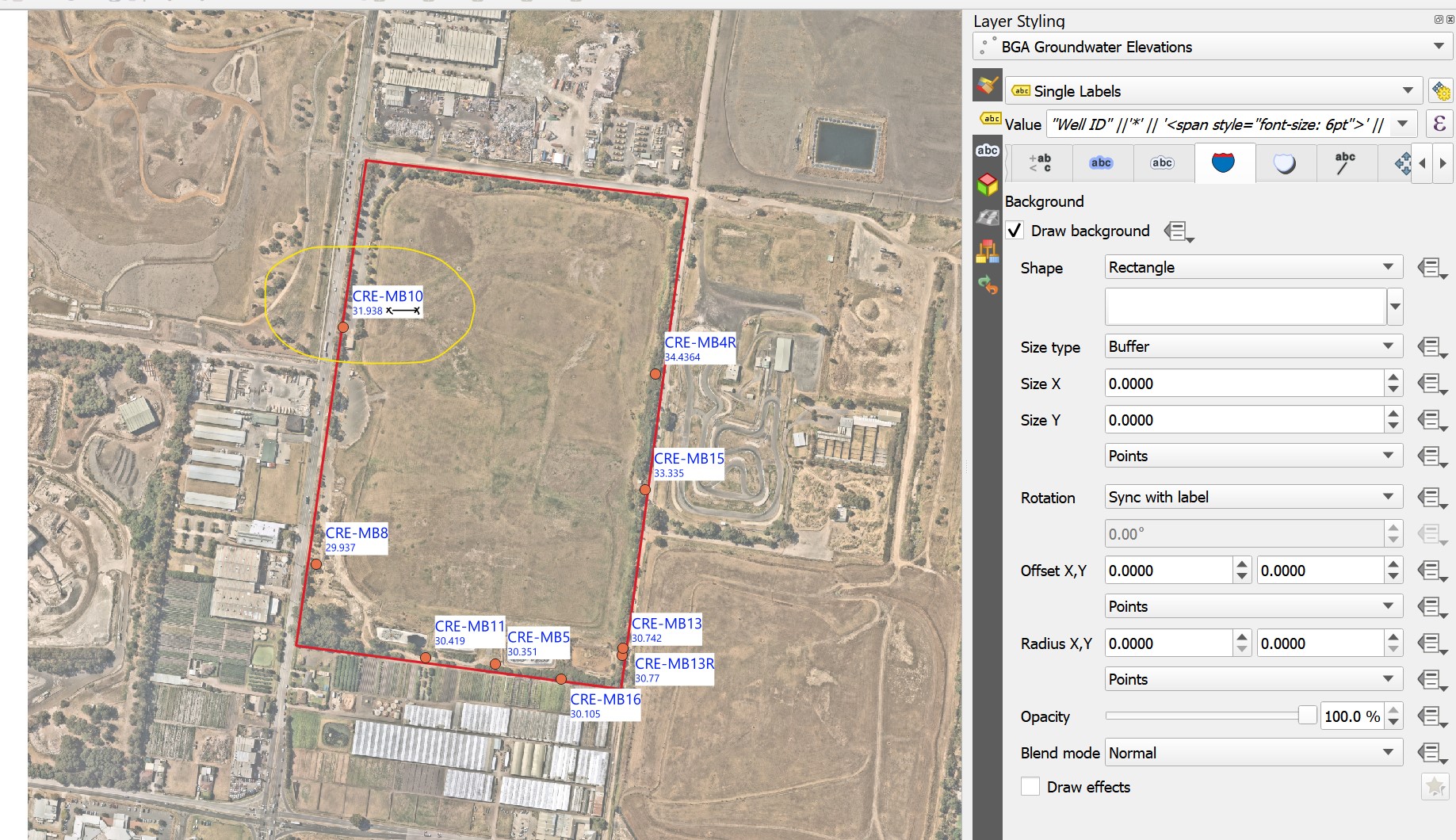
enter image description here

2
  • 1
    The question is why you want to do so? I'm not sure but I guess it is best practice to have rectangular backgrounds and at least to me, what you want does not seem to be optically attractive. So if you provide more information about why you want to get rid of this white space, the might be alternative solutions.
    – Babel
    Commented Apr 1, 2023 at 10:42
  • Theoretically, html formatted labels would be a solution. However, up to now, text boxes are not yet implemented, see: north-road.com/2022/09/09/…
    – Babel
    Commented Apr 1, 2023 at 11:20

2 Answers 2

4

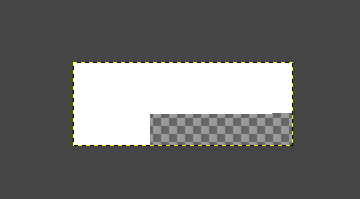
If you know for sure that all your labels will have consistent length, you can make a custom background as an image file.

  1. Use GIMP or another software to create your background

enter image description here

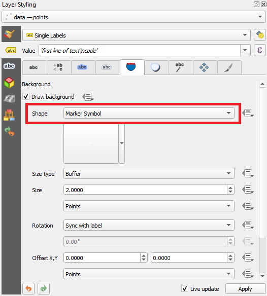
  1. Choose Marker Symbol as the background shape

enter image description here

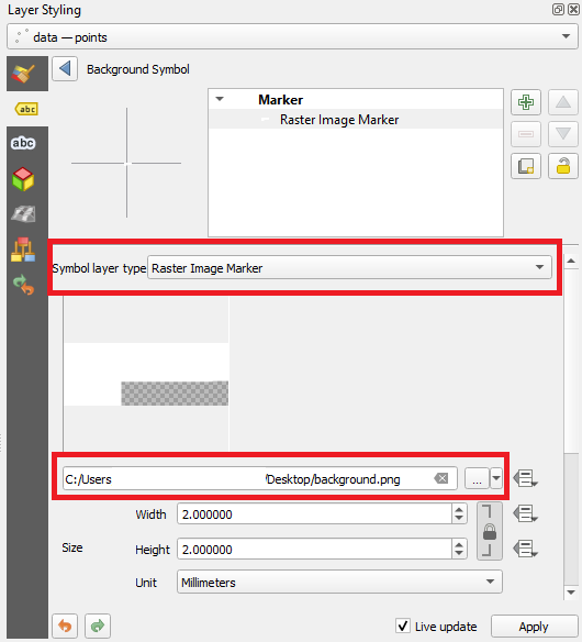
  1. Choose Raster Image Marker and browse to the file

enter image description here

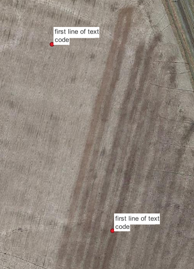
Result

enter image description here

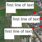
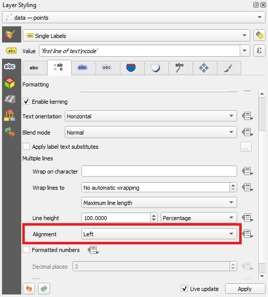
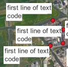
Note, if you have more clustered points, you may need to force the text alignment to the left, otherwise you may get a result like this:

enter image description here

enter image description here

enter image description here

Padding around the text within the image can be adjusted with the Buffer setting (2.0000 in the second screenshot).

You may have to experiment a little with the image file to get it right. Once you save it after editing, QGIS will use the updated version, no need to re-load the image file as the raster source.

1
  • Great idea! Might be the best course of action if no other option is available. But no, not all my text will be the same length. I might have to create a few options and save them as styles.
    – Kat
    Commented Apr 1, 2023 at 19:56
0

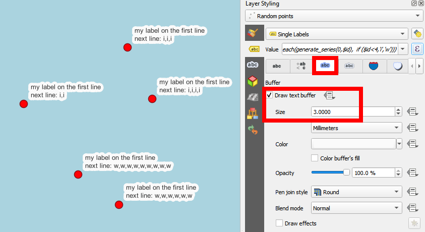
Coming close to what you want: draw large enough text buffers:

enter image description here

2
  • Setting the pen join style to square will get a result closer to the expected look
    – J.R
    Commented Apr 2, 2023 at 9:12
  • @J.R In my experience, join style Miter or Bevel (there's no square style) does not improve the result, to the contrary - it adds sharp peaks for letters like M.
    – Babel
    Commented Apr 2, 2023 at 11:44

Your Answer

By clicking “Post Your Answer”, you agree to our terms of service and acknowledge you have read our privacy policy.

Not the answer you're looking for? Browse other questions tagged or ask your own question.