31

I would like to plot the following per zone (30 zones total) data on a printable/non interactive map:

  • Average age
  • Average household income
  • Number of households
  • Population density
  • Number of people
  • Number of workers

How would you display the above 6 layers effectively on one map?

5
  • 1
    How large are the zones relative to the page size? Can you fit a small plot in each zone? (e.g. a radar chart)
    – djq
    Commented Dec 20, 2010 at 14:36
  • @celenius -It's a typical census survey type, where the downtown zones are a lot smaller than the residential zones which are significantly smaller than the suburban/rural zones
    – dassouki
    Commented Dec 20, 2010 at 14:40
  • 1
    These 6 layers on a static map is a tough design job. What is the issue preventing use of an interactive map?
    – Trevesy
    Commented Dec 20, 2010 at 22:48
  • @Trevesy - for the most part, the requirement is to design a printable map that highlights the 6 variables to promote visual analysis
    – dassouki
    Commented Dec 21, 2010 at 16:12
  • 1
    I've taken the liberty to add the visualization tag, feel free to remove it if you think it is inappropriate.
    – Andy W
    Commented Mar 20, 2011 at 16:06

9 Answers 9

20

I would say you can't include all that data on one map and have it make any sense. I'd recommend you think along the lines of Tufte's principle of small multiples, having multiple smaller maps of the same area, each using a different variable. Example: http://www.juiceanalytics.com/writing/better-know-visualization-small-multiples/

Even then, you have the problem that you're using a bunch of different units, so you need a bunch of keys. Another way to view the data (but not in a map) would be to use a table with all the values, colored (ie - different colors for below average, average, above average)

Would also recommend you look at the census atlas for more map ideas: http://www.census.gov/population/www/cen2000/censusatlas/

Might help to reflect more on what message you're trying to communicate, exactly (not just what data you have).

1
  • 5
    +1 This is far better than making a mess by attempting to symbolize six variables at once. In addition, why not print a table of the data? Six columns + id, 30 rows: it's sufficiently small and gives all the detail anyone would need.
    – whuber
    Commented Dec 20, 2010 at 15:54
14

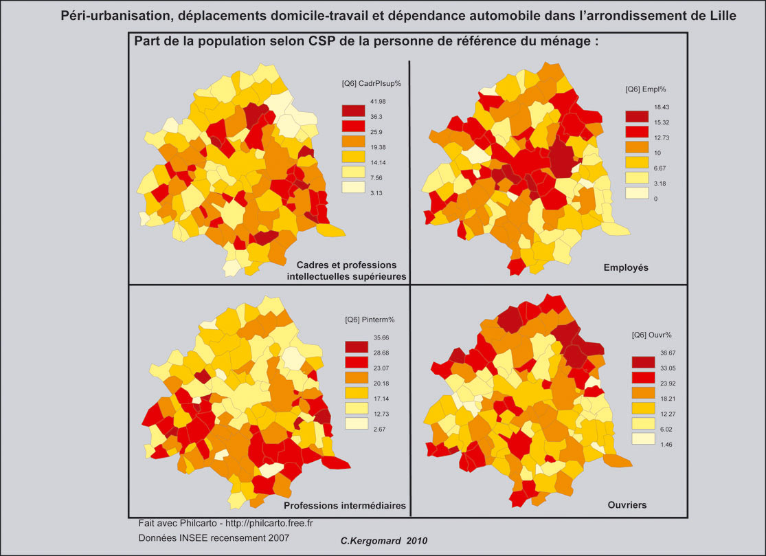
It is not possible to show efficiently so much data on a single map. Two possibilities:

  • Produce 6 maps,

  • Analyse your data to classify your regions, and display the result of the classification. A principal component analysis can help to determine the most important correlations within your variable. This method has been used to produce this synthetic map:

alt text

from these ones:

alt text alt text

5
  • The problem with having 6 maps is that it's hard to visually determine any trends. Sometimes, it is nice to look at a map with multiple variables and see how things line up
    – dassouki
    Commented Dec 20, 2010 at 19:16
  • 2
    @dassouki, to see how things line up you don't necessarily need to map them. Bivariate scatterplots would meet that criteria, and would be much easier to interpret.
    – Andy W
    Commented Dec 20, 2010 at 19:25
  • 3
    The advantage of having 6 maps is that it's easy to visually identify trends! When you try to crowd six (or more) variables into a single map it can become difficult to find patterns. (If this map involved thousands of features I would change this remark, though: certain kinds of mapping, such as glyph visualization, can be remarkably effective for finding patterns in richly multivariate datasets: lmi.bwh.harvard.edu/papers/papers/KindlmannTVCG2006.html )
    – whuber
    Commented Dec 21, 2010 at 18:39
  • @julien, Cool stuff, you may be interested in this article I just came across, e-publications.org/ims/submission/index.php/AOAS/user/… , it has maps with associated PCA analysis of similar multi-variate data as well as R code to make the plots.
    – Andy W
    Commented Dec 22, 2010 at 14:46
  • Really interesting, I'll have to read up about this.
    – neuhausr
    Commented Dec 22, 2010 at 15:34
9

I agree that small multiples are probably a good way to approach this problem. To supplement the map I would also suggest a scatterplot matrix of your variables, which would identify bivariate correlations. While you lose the geographic aspect of your data, it is much simpler to visualize the relationships between variables in a scatterplot than it is to compare two maps (even side by side).

If you still want some sort of spatial trends captured, you could include spatial statistics (such as local Moran's I) between the distributions and/or the original variables.

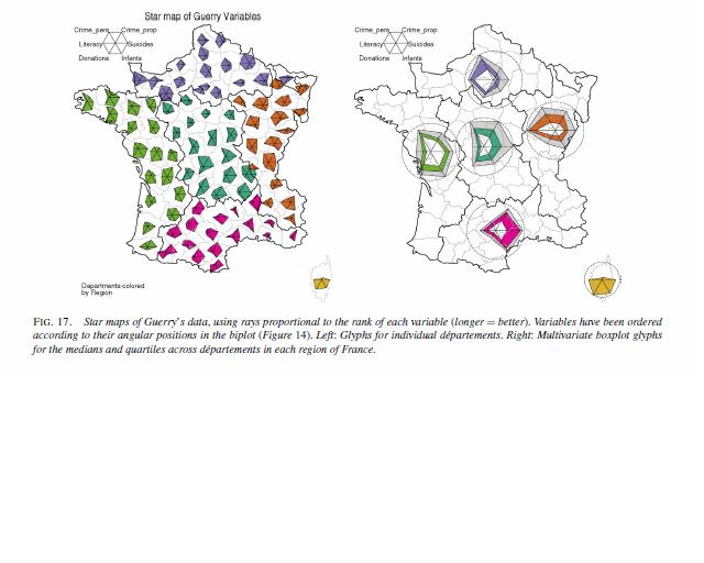
Edit: I've come across recently some work revisiting the Moral statistics published by Andre-Michel Guerry (originally in 1883) that has the goal of visualizing multi-variate relationships in space. The implementations of those authors are very similar to what has been suggested in this thread, small multiples, principal components analysis, scatter plot matrices, and within polygon diagrams. Attached are some pictures from A.-M. Guerry’s Moral Statistics of France : Challenges for Multivariable Spatial Analysis by: Michael Friendly Statistical Science, Vol. 22, No. 3. (August 2007), pp. 368-399 (The PDF is free). Also another article (Dray and Jombart, 2010) analyzes the same data and has some source code in R to make said plots.

One picture is a scatterplot matrix, the other is what is called a star diagram (which is just a different way to represent bar charts like Pablo suggested). alt text alt text

0
8

Here is a wonderful example of small multiples posted on Andrew Gelman's (and company blog) Statistical Modeling, Causal Inference, and Social Science. The map is of voter support for school vouchers by state, conditional on income and various race and religion categories. White non-evangelicals really don't like school vouchers! (If you go to the actual blog though it appears in the 2004 survey data their is more support for school vouchers among that group). enter image description here

5
  • The graph is cool, but the colour scale is horrible. Why is 50% so prioritised, by making it grey? Surely it should just use heatmap colours, or something? Also, why are only whit people split into religion? surely it would make more sense to split by race and then by religion?
    – naught101
    Commented Oct 31, 2012 at 20:54
  • @naught101, I'm a bit confused by your negativity. Surely grey is deemphasized compared to the brighter or darker colors on either end of the spectrum. While I'm abivalent about the arbitrarily diverging at 45%, IMO when making small multiple maps like these it is benificial to have highly contrasting values. The comment about the religion/race splits doesn't make much sense either IMO. These are categories that are obviously highly related to whether an indvidiual supports vouchers, and it seems some of the subsets you suggest don't exist. cont...
    – Andy W
    Commented Nov 5, 2012 at 20:41
  • I.E. I highly doubt there exists enough "Black Catholics" in the survey to say anything substantive about such a group (nor "Hispanic Non-Evang Protestants). I would suggest you read the post by Gelman and hopefully that will clear up the motivation for the sub-groups.
    – Andy W
    Commented Nov 5, 2012 at 20:42
  • maybe it's just that particular grey sticks out on my screen. I think it'd be better with white, and maybe a grey background to distinguish it. Also worth noting that the two images on Gelman's blog have different scales... I was under the impression that the black population was much higher, but I just looked at the census data, and stand corrected. One odd thing though, is that the census defines hispanic origin as orthogonal to race (it's a separate question). I guess Gelman's distinctions are defined differently..
    – naught101
    Commented Nov 5, 2012 at 21:46
  • @naught101 this isn't info from the census, it is from some other survey (census does not have anything public opinion on it)
    – Andy W
    Commented Nov 5, 2012 at 22:21
5

To choose between solutions presented here, you could provide two key informations :

  • what's the purpose of the map ? (Discover, Expose ?)
  • what's the intended public of the map ? (You, fellow analysts, city planner, public ?)

Solutions cited here may have different efficiency according to purpose and public.

I'd like to generalize the answer of Julien (one synthetic map by way of a PCA) by citing the technique of the matrix diagonalization, described by J. Bertin. Its usefull when one seek after a synthese of all the information, rather than a complete data presentation.

In brief, it consists in representing each variable with an histogram, sort an stack the histograms in such a way that the values (the map zones) are aligned in a diagonal fashion, to obtain a typology :

alt text

(Source : http://books.google.com/books?id=2tlQAAAAMAAJ&dq=bertin%20graphique%20information&hl=fr&source=gbs_similarbooks)

0
4

That's a lot of information and it's a fact that a single map combining all of them in a thematic way would result in a useless presentation because of visual pollution. In other hand there are 30 zones, so, many maps for each zone would result in pollution too.

My solution: Choose which one is the most important information, let's say 'household income', then zone the map in some categories of income. And finally for each income spot, plot a bar chat with the other 5 attribute.

With that map can make some comparisons like, for example: "High income areas always shows large number of workers and an average age of more than 21 years".

Look at the example...

alt text

4

Perhaps some of these ideas could help?

Assuming you have six dimensions:

1: Choropleth: Household income example 0

2, 3, and 4: Symbols: Representing number of people as dots, which can allow you to see the background: example 1, example 2 using grayscale for workers/non-workers and a different color scheme to show age

5: 3D: Using population density as terrain example 3

6: (I can't think of a 6th way!)

Is it redundant to show 'Number of households', 'Population density' and 'Number of people'?

I would be skeptical if a map with this complexity would be clear to anyone aside from you. If I was presenting it I would show each element separately first, and then add it on so the audience can understand the steps.


One alternative way (if you don't have room for a radar graph for each zone, could be to create a 'glyph' representing this information example 4, fig 10.28. I think these are usually hard to understand, and not easy to design clearly, but the linked example could be used in this case.


Another thought I had, would be to extrude the polygons to the same height for each polygon, and then use a section of the height to represent these parameters. Similar to making a bar chart for each area, but where each section is layered on top at similar intervals. This would need to be viewed from 3D which would mean some of it would be obscured.

10
  • I love, and I mean all your suggestions. I plan on implementing 1->4. However, for the 3d stuff: I find that when you do 3d maps, downtown areas, usually centrally located get most of the elevation, blocking lots of zones behind them
    – dassouki
    Commented Dec 20, 2010 at 14:59
  • @dassouki - I agree that is usually the case. Perhaps you could use a variable that does not have a huge range for this (average age?), or if it does, you could logarithmically transform it.
    – djq
    Commented Dec 20, 2010 at 15:05
  • 3
    @celenius Interesting question about possible redundancy: population density is number of people relative to area; number of people is an absolute count; and number of households gives information about how people live together. Although clearly these three variables are related (and can create near-collinearity problems in regressions) they really are three different pieces of information. BTW, it's "choropleth". (Fortunately Google recognizes this typo and does the intended search anyway.)
    – whuber
    Commented Dec 20, 2010 at 18:58
  • 1
    @whuber - I think it's probably done using flash (sadly!).
    – djq
    Commented Dec 20, 2010 at 19:35
  • 2
    I'm very suspicious about the suggestion of 3D. AFAIK no one has shown 3D is very usable. The link to San Fran crime works but only because its very simple - a more complex pattern would be difficult to decipher. I don't think 3D is the way to go at all in this case.
    – Trevesy
    Commented Dec 20, 2010 at 22:45
2

It is a challenging task. My answer is to go with a multivariate map. Check this map out. The map will look busy if you show all the variables on a one map. Make sure you select appropriate color scheme if you choose to go with a multivariate map.

10
  • Google Docs is blocked where I work :(
    – dassouki
    Commented Dec 20, 2010 at 14:55
  • didn't work either and i can't scrape it if it doesn't have a file extension at the end of it
    – dassouki
    Commented Dec 20, 2010 at 15:03
  • Still no go ....
    – dassouki
    Commented Dec 20, 2010 at 15:09
  • tht is block from my side. :( I do not mind sending you the map via email.
    – Raj
    Commented Dec 20, 2010 at 15:10
0

One degree of simplification would be to express one item, such as population density, through a cartogram, i.e. distort the area of each unit so that it is in proportion to population:

2008 U.S. Presidential Election
(source: amherst.edu)

The main drawback is that the viewer must be able to recognize the distortion of the zones from their "usual" shapes.

More info here: http://gis.amherstma.gov/data/SpringNearc2009/Session4Cartograms.pdf

2
  • 1
    I think this has potential, but it is unclear how well cartograms can be applied to this particular situation (simultaneously viewing multiple attributes over the same space). You could theoretically make many small multiple cartograms, but it may be difficult to interpret (you lose the consistency between maps, which is kind of essential for small multiples). Perhaps the cartogram can be combined with color in more interesting ways to show multiple attributes.
    – Andy W
    Commented Sep 22, 2011 at 22:25
  • 1
    An example of small multiple cartograms, gisandscience.com/2011/12/07/…
    – Andy W
    Commented Dec 7, 2011 at 16:44

Your Answer

By clicking “Post Your Answer”, you agree to our terms of service and acknowledge you have read our privacy policy.

Not the answer you're looking for? Browse other questions tagged or ask your own question.