I have contour lines with height values from 0 to 1030 (sorted by height 110, 115, 120, 125). Values with in-between number (like 5, 15, 115, 135...) should be grouped and colored with same color, and other values should be grouped this way 10, 60, 110, 160, 210, 260... (yellow), 20, 70, 120, 170, 220... (red), 30, 80, 130, 180, 230... (cyan) etc. I hope you get it despite my bad English :) So, I don't know how to change symbology in ArcMap to color them that way. Can somebody help me?
4 Answers

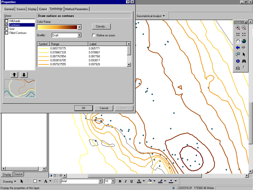
In the Symbology tab you can classify your own values and apply to the contours
http://webhelp.esri.com/arcgisdesktop/9.3/index.cfm?tocVisable=0&ID=-1&TopicName=contours&pid=1
Multiple layers and loads of symbol editing work, but the ideas can be combined into a simple efficient solution: use the Field Calculator to compute the contour levels modulo 50 (or whatever), effectively creating a new field to be used for the classification. Symbolize based on that new field.
Advantages and strengths
This method (a) maintains a single layer (which is useful for future spatial analysis, creating a persistent object, etc.) and (b) requires only one symbol to be selected and edited for each different type of contour. Its principal disadvantages are that you (c) need the attribute table to be editable and (d) will not frequently be updating that table. In situations where the table might be frequently updated or where you cannot or do not wish to modify it, consider creating a lookup table that effectively reclassifies all contour levels when joined to the attribute table. The join is dynamic and therefore will automatically reflect updates. The same lookup table can be used for other datasets having the same range of values.
Weaknesses
A disadvantage compared to the multiple-layer solution is that making subsets of the contours invisible is easy with multiple layers: just turn them on or off. Thus, which solution you choose will depend on how you anticipate interacting with the contours in the future.
One solution is to create separate layers for each group and then apply a definition query that uses a modulo operation to filter records, then symbolize each layer appropriately. For example, the query for your first group would be:
MOD("HEIGHT" + 5, 10) = 0
For the second (yellow) group:
MOD("HEIGHT" + 40, 50) = 0
et cetera. I believe the above syntax will work if the data is stored in an ArcGIS datastore (SHP, GDB, etc). If it is in SDE, you will need to change it appropriately to match the RDBMS syntax (e.g., ("HEIGHT" + 5) % 10 = 0 for Oracle)
Assuming that you contour lines are in a separat Layer and not part of a TIN, you can do the following:
- You have to access the Layer Properties for your contour lines (double click the layer in the Table of Contents on the left side of ArcMap).
- Choose the Symbology Tab.
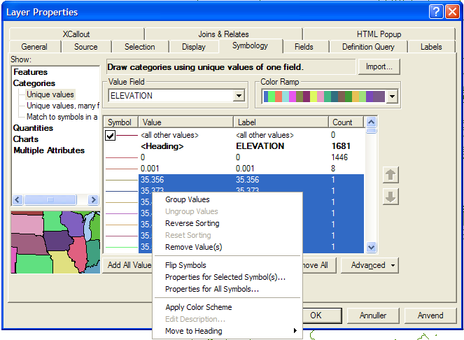
- On the left side choose "Categories" -> "Unique Value"
- Now you choose your Value Field containing the hights - Elevation as shown in the picture.
- Press the "Add All Values" at the buttom of the dialog.
- Now you simply select the values you want to group by clicking them one by one while pressing ctrl on your keyboard.
- When you are done selecting values you make a right click and choose "Group Values" as shown in the picture.
- Now you can choose a symbol for the new group by double clicking the symbol.

I hope this helps you and I realize, that if you have a lot of unique values this might be a long proces.
Regards from Steen
-
Yeah, I knew for this, but it is too long process. Thank you anyway. Commented Mar 24, 2011 at 14:33
-
2you can do this once and save it as a style (or .lyr) then can be applied to many contour datasets– Mapperz ♦Commented Mar 24, 2011 at 15:14
