I am trying to plot sales data on a map using QGIS. I will add the disclaimer that I am a rookie at using the program. I added the different sales types by adding delimited text layers (utf16). The data included Longitude, Latitude, and Amount. I want to make the dots on the map scale with the value of the sale. Ive had no luck with trying to use Simple Marker->Data defined properties-> size and writing case functions. Some data points show up at different sizes while others show up at all data points. Here are my functions under different simple markers:
CASE WHEN Amount <= 10000 THEN '.2' END
CASE WHEN 10000 < Amount < 75000 THEN '.4' END
CASE WHEN 75000 < Amount <= 250000 THEN '.6' END
CASE WHEN Amount >= 250000 THEN '1' END
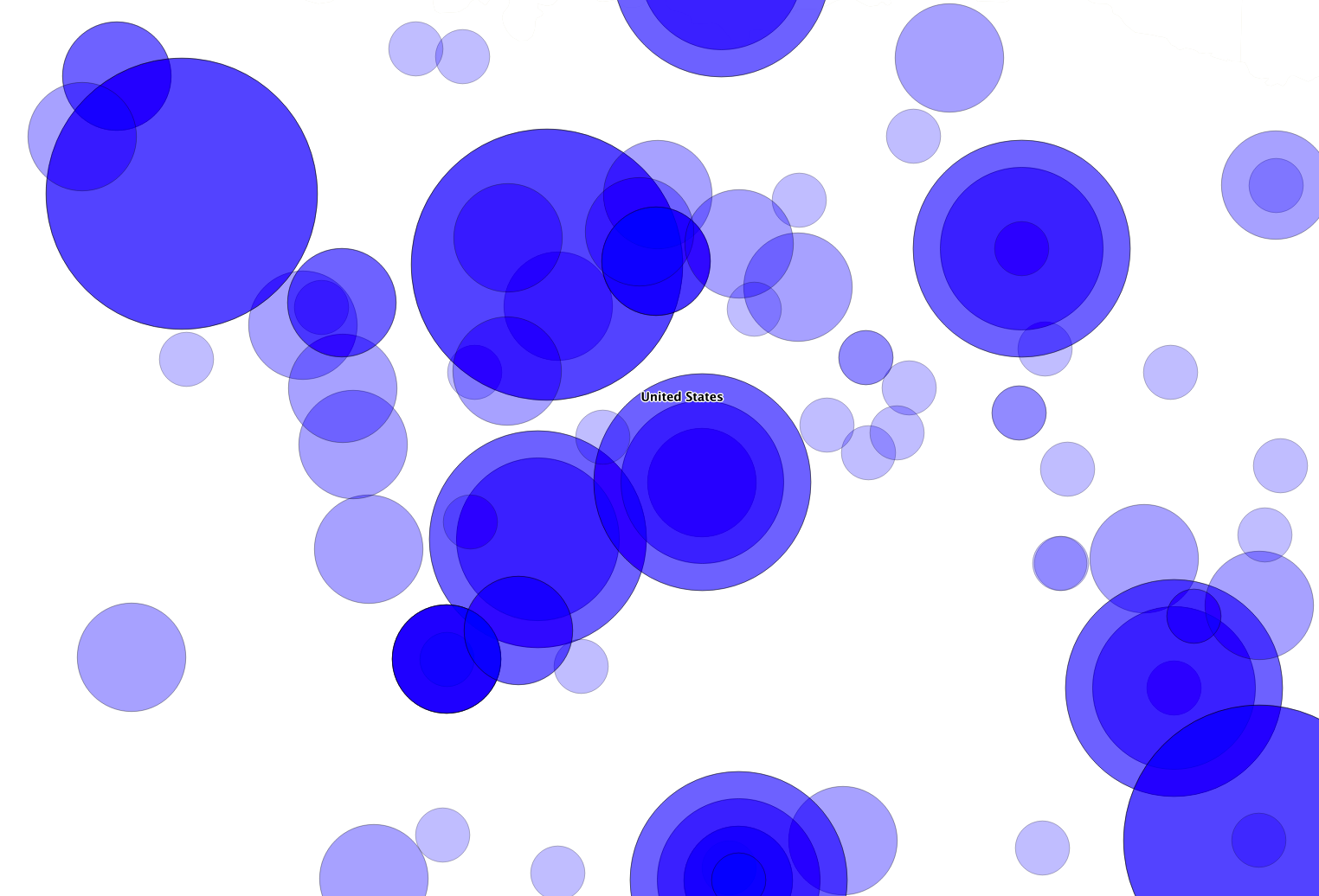
The majority of my data set falls into the 10-75k range. However the .4 and .6 size circles show up at every data point on the map, while the .2 and 1 sizes only show up where the data specifies (along with the .4 and .6 sizes). At this point I am trying to figure out what is wrong with the equations, however I am stuck.
Is there a better way to go about this or am I just simply messing up the equations?
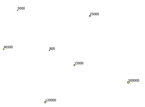
I wish I could share my whole map with you but it is looking great. I went with U/Joseph 's solution and here is an excerpt of the results for those interested.


