7

I am using QGIS for visualizing the health conditions of elderly living in an old age home, some of the elderly have multiple medical device with them and I want to show them on the map.

Suppose I have one bed for each elderly, I have created a centroid for each bed using ftool, then I join this label with my csv table, and then use Style tab in the layer properties.

In the csv table, I have 4 columns named A, B, C, D and each represent the presence/absence of a medical device. Currently I am using rule-based in the Style tab and use Offset X,Y to fine tune the position of the dots so that they don't overlap with each other completely.

I don't like the Offset X,Y method, because if I need to change the position of those symbols, I need to do it manually one by one, and I have 30 elderly homes that I need to work on. Is there a better way?

2
  • So you want to put up to four symbols on one centroid?
    – underdark
    Commented Oct 25, 2011 at 7:27
  • maybe more than 4, as I have 6 columns about medical device information now
    – lokheart
    Commented Oct 25, 2011 at 8:19

3 Answers 3

4

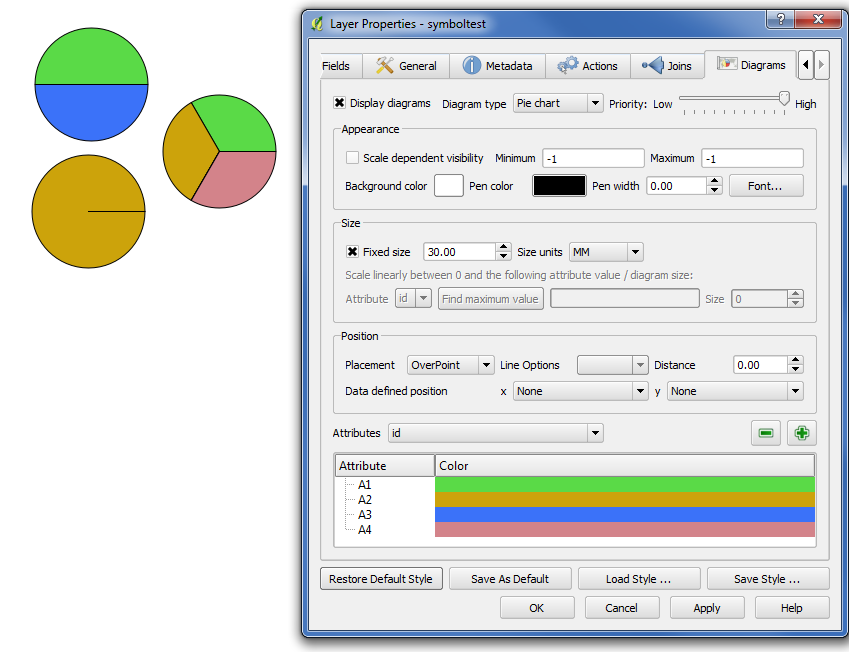
You could try the "Diagrams" labeling option in the layer properties. It's not exactly what it's designed for, but it might work for you. For example, I added four columns to an example dataset (A1, A2, A3, A4,) and set them equal to either '1' or '0' - in your case '1' being 'present' and '0' being absent. Then, in the layer properties, go to "Diagrams" and add the four (or six, whatever) columns at the bottom. The circle symbols will then show the colour if a feature is present, and not show it if it is absent. Unforuntately, the 'size' of each colour will change, but...

Test Case using made-up data

3
  • 1
    Great suggestion. This way you don't have to create customized symbols and can truly create data driven symbols. Commented Oct 25, 2011 at 16:43
  • thanks for the suggestion, I tried, but another problem pops out: I have some beds which the elderly there has no device at all, so all the 6 columns are "0" in my csv, but the presentation is as if the last column of the csv is "1". What happen? Anyway, thanks again!
    – lokheart
    Commented Oct 26, 2011 at 4:48
  • Can you link a small sample of your data to allow do some test locally?
    – gioman
    Commented Oct 26, 2011 at 11:07
3

The easiest way I see would be to create your own SVG symbols (one for each case/permutation of your parameters/columns) and then add them to QGIS.

1

To add onto @Giovanni's suggestion, you could take a similar approach as:

and use a base symbol (for example a diamond or rectangle) that is divided into 4 (or 6) segments, and each segemnt could be color coded or have symbol modifiers that represent the presence or absence of a particular device for that patient.

You would still have to build the various symbols, but this would make it so you no longer had to deal with offsetting various symbols.

Your Answer

By clicking “Post Your Answer”, you agree to our terms of service and acknowledge you have read our privacy policy.

Not the answer you're looking for? Browse other questions tagged or ask your own question.