34

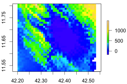
I have an elevation model plotted in R

r <- raster("example.dem")
plot(r, col = topo.colors(20))

Elevation plot

Some of the values are below sea level (0), and I'd like to have those display in red. How can I assign specific ranges to specific colours in the plot()?

1 Answer 1

37

Here is a really simple example

library(raster)
data(volcano)
volcanoR <- raster(volcano)

#making colors below 100 red and above 180 blue in this example

breakpoints <- c(94,100,120,140,160,180,195)
colors <- c("red","white","white","white","white","blue")
plot(volcanoR,breaks=breakpoints,col=colors)
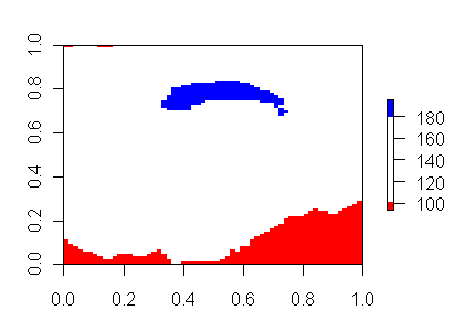
enter image description here

You just need to pass the plot a vector of break points and a vector of colors to match the breakpoints. Check out the RColorbrewer package for some very nice built in color ramps. Also check out the classInt package for making the breakpoints.
6
  • Excellent- embarrassing how long I fiddled with this. Is there a straightforward way to import colour ramps from colour brewer? EDIT: sorry, I now see you're referring to a package, not the site!
    – Simbamangu
    Commented Nov 29, 2011 at 13:25
  • 3
    @Simbamangu, We have all been there. I actually find many of the examples of doing this obfuscate what is actually being passed as breakpoints and colors by using objects created from other packages (like the ones I suggest). I think it is simplest to see it like this, and then go on to use the other packages to create appropriate breakpoints and color ramps without doing so much work.
    – Andy W
    Commented Nov 29, 2011 at 13:28
  • 4
    I completely agree with that - the examples in many of the R packages are really tough to figure out, with too much carried through from other objects!
    – Simbamangu
    Commented Nov 30, 2011 at 6:39
  • What if you want to specify the colors of certain values, instead of intervals?
    – Rodrigo
    Commented Apr 26, 2021 at 23:08
  • If you want the legend to look the same @Rodrigo, you can just make the interval very small and cover the value of interest. If you want to plot categories instead of continuous, see stackoverflow.com/a/19139384/604456 for an example. (Or you could use other plotting libraries, like ggplot.)
    – Andy W
    Commented Apr 27, 2021 at 12:20

Your Answer

By clicking “Post Your Answer”, you agree to our terms of service and acknowledge you have read our privacy policy.

Not the answer you're looking for? Browse other questions tagged or ask your own question.