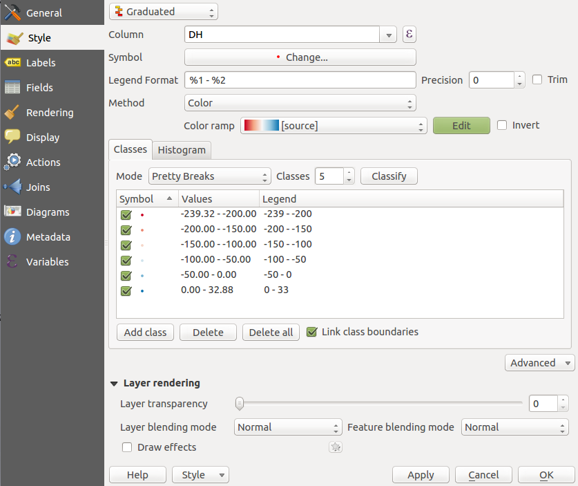
I'm working with QGIS 2.12.1-Lyon in Ubuntu 14.04 LTS. I really like the features of this nice program but I'm badly missing one thing. Quite regular I'm working with differences. For displaying I use a graduated polar style with white for zero and red/blue for the ranges in +/- direction. This works pretty well with raster data, where I can manually set the min/max values. Unfortunately as you can see on the screenshot, setting this range is not possible for vector data (or did I just not find it?). This has the consequence that if data is not equally distributed around 0, the colours can't be interpreted that easily. Is there another way to manually set the colour range for vector layers? (I don't want to manually edit each single class as I'm loading such data quite often and this could get very annoying).
-
1You can set your classes manually - just 'delete all' then 'add class' to the breaks that you're after - is that what you're trying to do?– Inactivated AccountCommented Jan 5, 2016 at 19:54
-
1This is exactly what I ment with the last sentence in brackets. I know, this is a possible way to do it, but to get a reasonably good resolution (in terms of classes) this means a lot of hand work and has to be completely repeated when you want to change the range. This is why I'm searching for a more automated way, like specifying min/max/nr_of_classes and let QGIS do the rest.– LudwigCommented Jan 6, 2016 at 11:24
-
You could probably do this in an expression - next to the Column drop down there is that E - i'll bet you could write how you wanted to break down the columns and even put some math in there to create your breaks... that might do the trick...– Inactivated AccountCommented Jan 6, 2016 at 16:35
5 Answers
Finally I found a solution. As it is not possible to adjust the limits of color range manually, it is at least possible to set the ranges of every class manually. Instead of doing this again and again for every profile, it is then possible to save it and just load the style in other projects. Within the same project it is even possible to copy and paste the styles from other profiles.
Seems to be impossible to do automatically in Graduated style, but here is a workaround by setting the color with an expression:
Select a Single symbol style. Go to Simple fill under Fill, and open the expression editor of Fill color. Enter this:
ramp_color('RdBu',
  scale_linear(DH, <lowerbound>, <upperbound>, 0, 1)
)
'RdBu' is the gradient's name (red to blue in this case), <lowerbound> and <upperbound> are the limits.
If you want to have zero to be at the the middle of the gradient, just set the upper and lower bounds to be the same (-x...+x). To do it automatically:
ramp_color('RdBu',
  scale_linear(DH,
    min(minimum(DH),-maximum(DH)),
    max(maximum(DH),-minimum(DH)), 0, 1
  )
)
(Putting an expression in Column of Graduated style is no good for centering zero: whatever comes out from that expression, the classifier doesn't know where zero is.)
-
2This is the best answer here at first sight... but the downside is that there's then no legend :-(– FlytoCommented Jul 3, 2019 at 17:34
I needed to apply the same style to data with different column names. What realy helped me is that it is possible to "copy style" and then paste it in notepad and copy-paste anything you like from one file to another.
Although not an amazing solution, I ended up creating a vector feature far off with max and min values I would like to use. When you classify Graduated, it seems to work fine. Equal Interval or Pretty Breaks works better than Natural Breaks as the distribution of data is not great.
Here is another workaround I just started using. Still quite some manual work, but I prefer this way.
I have a vector file of urban areas for a country with a fire risk index from 0 to 1, which I color with a graduated style, 10 classes. The automatic min/max range works well to visualize the data over the whole country, but I need to zoom in on individual regions and show the local variability in the index. But the variability is much less than at national scale, say [0.2-0.4], and there's no way I can constrain min/max style range, so I end up with my local data being all in 2-3 colors only.
So I could manually set every 10 class range, then save the style and reuse. But setting the 10 classes manually is the most annoying part I find, and some might have even more. The workaround (in my case, variable: "FireIndex", to change from [0-1] to [0.2-0.4]):
- Click on E next to the Column drop down menu
Change the variable to the desired min/max value:
CASE
WHEN "FireIndex"<0.2 THEN 0.2 WHEN "FireIndex">0.4 THEN 0.4
ELSE "FireIndex"
ENDClick ok
Do graduated style based on recomputed variable: chose colorbar, mode should probably be "equal intervals", number of classes, and click "Classify"
- Now we have the right 10 color ranges, from 0.2 to 0.4
- Go back to the Column drop down menu and chose your original variable again, "FireIndex"
- In case there are out of range values in the area being visualized they won't be visible, so spread the range of the upper and lower classes to the min/max of the original values.
- Save the style
- Click ok, do not click on "Classify" again, it would recompute color ranges from 0 to 1

