2

In the product description for a topographic map over Sweden there is a recommendation to use an abbribute field containing digits to quadrant placement of labels in a point shapefile containing all the text displayed on the map.

The shapefile contains a lot of categories so I use rule-based labeling to format each category, so that information can be more easily distinguished.

My problem is not using the quadrant placement digits I get from the attribute field. The problem is that the government agency that created the map defines that text displayed above the point is placed with the point on the baseline of the typeface, but QGIS places the text with the point at the bottom of the descent. At the opposite, the agency defines that text displayed below the point is placed with the point at the top of the ascent, but in QGIS text displayed below the point has a space between the point and the text. My guess is that the agency uses Arcgis as they provide .lyr files. Perhaps Arcgis defines quadrant placement in this way? Personally I think it makes a lot more sense, especially with text below the point.

I use QGIS 2.14.2, Linux Mint 17.3 Cinnamon. I have tried Noto Sans, Liberation Sans, Nimbus Sans L, Arial, Verdana and Fira Sans. The problem exists using both points and map units.

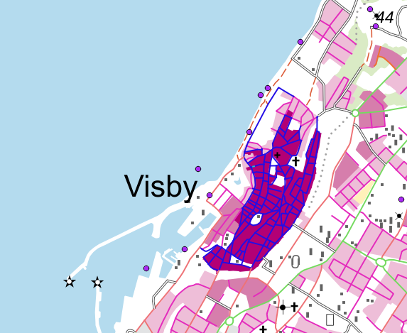
Here I use Arial 32pt for text "Visby". As you can see, the point is at the bottom right of the ascent, and not at the baseline.

Here I use Arial 32pt for text "Visby". As you can see, the point is at the bottom right of the ascent, and not at the baseline.

Again, Arial 32pt. The point is at the top right of text "Visby", and QGIS has added some space between the typeface and the point.

Again, Arial 32pt. The point is at the top right of text "Visby", and QGIS has added some space between the typeface and the point.

My question is then, how do I make QGIS define text placement above point as the baseline of the typeface, and how do I set text below point as the the top of the ascent?

2
  • Can you add some pictures of the issue, because I just did a little test and it looks to me like QGIS places the text so that it is inline with the baseline (when above the point - which sounds like what you want) and not the bottom of the descent as you describe. Likewise, I see the converse as being correct (text below the point). Perhaps it's an issue with the choice of font - but anyway, some annotated pictures would be helpful, plus a statement of which font you are using (I tried the default MS Shell Dlg2 and Arial in my mini test). Commented May 24, 2016 at 7:19
  • Added some pictures. Yes, you you have understood my question correctly. Text placed above point should be placed so the point is at the baseline. Text placed below point should be placed so the point is at the top of the ascent.
    – Tidspilen
    Commented May 24, 2016 at 12:22

2 Answers 2

2

I "attacked" this problem in a more practical way.

Using the attributes and working with the QGIS way of doing things, I managed to replicate the map styling: enter image description here

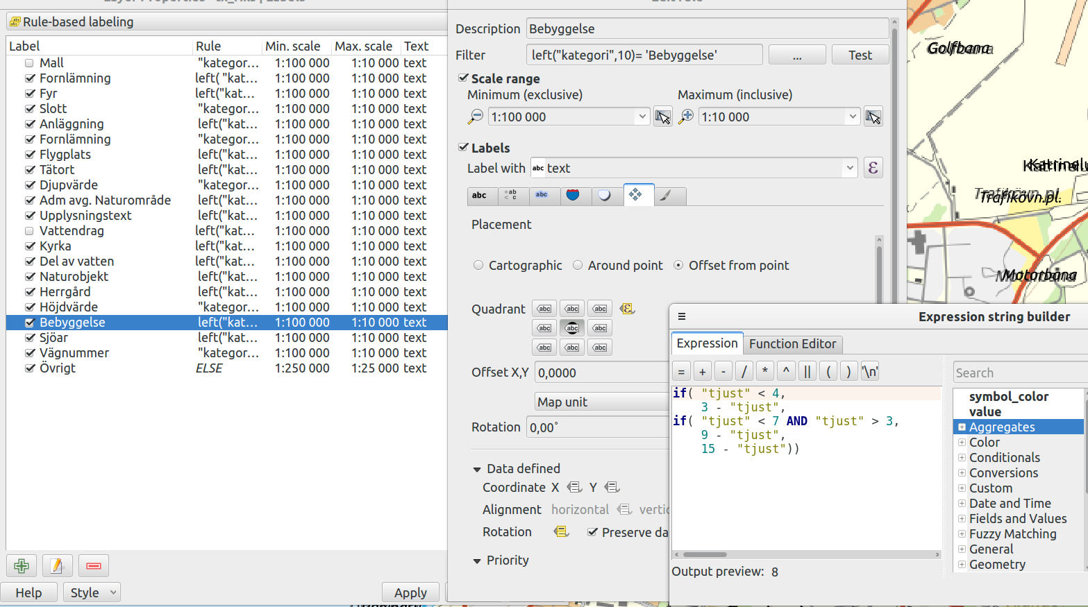
I needed to be a bit creative with the placement, since the quadrant placement of the labels differs between ArcGIS and QGIS. Se picture below for my solution: enter image description here

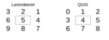
The attribute "tjust" contanis information on the placement and in order to "convert" this ArcGIS way i used an expression like above.

If you are curious about the difference i include the picture below: enter image description here

I don't know if this answers your question, but it solved my problem with the label placement at least.

1
  • I'm with you on what you've written. Perhaps I'm picky, but if you make a visible point you can see that there is a difference between what is specified and what Qgis does. In Qgis text above point is placed on the bottom of the ascent, while the specification places the point so the text is on the baseline. In Qgis text below point is placed with a gap between text and point, while the specification declares that the point should be on the top of the ascent. Is it a motivated design to place text like this in Qgis, as I see no reason why text placement isn't 100% compatible between software.
    – Tidspilen
    Commented Oct 10, 2016 at 18:04
0

Try setting the label placement to the "Cartographic" option (available in QGIS >= 2.14). That mode uses the font baseline/ascent for placement.

1
  • Good answer, but the "ideal" placements when using the "Cartographic" option seems not ideal. The attribute field that comes along with the shapefile sets to me an ideal placement for labels using quadrant placement. This is apparent when multiline text is presented using two separate points, one point with text for each line. Also a lot of text is sometimes really close to each other, and the attribute field has optimized this. As I've stated the shapefile contains a lot of points with text. Manually optimizing this would be tedious, and useless as these shapefiles are updated regularly.
    – Tidspilen
    Commented May 24, 2016 at 16:40

Your Answer

By clicking “Post Your Answer”, you agree to our terms of service and acknowledge you have read our privacy policy.

Not the answer you're looking for? Browse other questions tagged or ask your own question.