7

I have a dataset that contains many points (representing specimens) with GPS locations taken at the same point. When I map these points as a vector layer, only the uppermost point shows - so, at one given location, for example, there could be 50 data points yet it looks exactly the same as a location that may have just 1 data point.

I am wondering if there is a way to increase the marker size relatively to show this abundance of points at the same location using QGIS? I have tried to use the point displacement tool but I am not looking for the result that this gives with a centroid and a ring of points surrounding. I basically want to create a buffer that has a size in accordance with the number of points at that same lat long to show the relative abundance of specimens at that point.

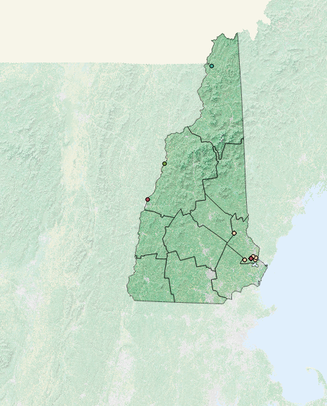
here is a screen shot, the different colors are classified based on time, the points in the southern/coastal area of NH have A LOT of points whereas the northern area has fewer points

1
  • I tried to solve the issue using a geometry generator, please see my answer and let me know if it works (the solution is explained in detail and it is really easy to apply).
    – mgri
    Commented Apr 30, 2017 at 16:16

3 Answers 3

4

Have you thought of styling the data as a heatmap. This way areas of concentration will show up as more intense colors. I am not sure what program you are using but this can be done quite simply using QGIS. A good tutorial explaining the process can be found at http://www.qgistutorials.com/en/docs/creating_heatmaps.html.

2

I propose an approach which only recurs to a geometry generator and a custom function.


Firstly, go to Layer Properties | Style and then choose the Single symbol renderer.

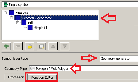
From the Symbol selector dialog, choose a Geometry generator as symbol layer type and Polygon / MultiPolygon as geometry type. Then, click on the Function Editor tab:
enter image description here

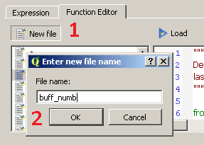
Then, click on New file and type buff_numb as the name of the new function:
enter image description here

You will see that a new function has been created and it is listed on the left side of the dialog. Now, click on the name of the function and replace the default @qgsfunction with the following code (don't delete the libraries imported by default):

@qgsfunction(args='auto', group='Custom')
def buff_numb(layer_name, curr_feat, feature, parent):
    layer = QgsMapLayerRegistry.instance().mapLayersByName(layer_name)[0]

    index = QgsSpatialIndex()
    for ft in layer.getFeatures():
        index.insertFeature(ft)

    tmp_geom = curr_feat.geometry()
    idsList = index.intersects(tmp_geom.boundingBox())
    return len(idsList)

Once you have done this, click on the Load button and you will be able to see the function from the Custom Menu of the Expression dialog.

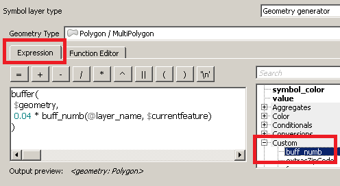
Now, type this expression (see the image below as a reference):

buffer(
 $geometry,
 0.04 * buff_numb(@layer_name, $currentfeature)
)
enter image description here

You have just run a function which is saying, in an imaginary way:

"For the current layer (@layer_name) and the current feature ($currentfeature), display its geometry using a buffer having a radius of 0.04 decimal degrees times the number of occurrences."

The only thing you need to change is the value of the radius: I expressed it in decimal degrees since you wrote about lat/lon, so I assumed you were using a Geographic Reference System (if not, this is not a problem and you can set any value you want). Therefore, leave the other function parameters as provided.

Finally, click on the Apply button for applying the changes.

You will see something like this:
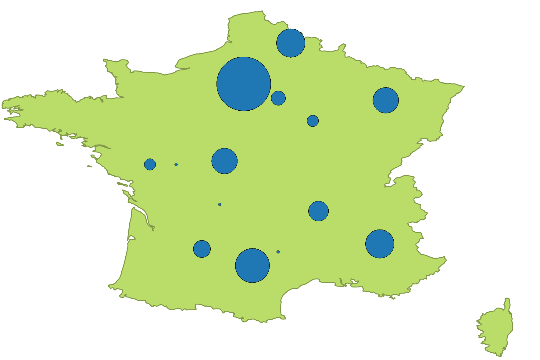
enter image description here

0

The answer provided here by mgri (which I think would work great in QGIS 2) unfortunately won't work in QGIS 3 as the QgsMapLayerRegistry is no longer recognized (please see Is QgsMapLayerRegistry removed in QGIS3?).

QGIS 3 now includes a point cluster renderer that will accomplish this same result out-of-the-box, without additional coding: https://north-road.com/2016/09/06/point-cluster-renderer-crowdfunding-successful/

Video explaining how to setup and configure is here: https://www.youtube.com/watch?v=gNL-ZSlc4KM

Also please see here: https://anitagraser.com/2017/06/13/even-more-aggregations-qgis-point-cluster-renderer/

1
  • Can you include a summary from the links?
    – MrXsquared
    Commented Sep 13, 2020 at 17:25

Your Answer

By clicking “Post Your Answer”, you agree to our terms of service and acknowledge you have read our privacy policy.

Not the answer you're looking for? Browse other questions tagged or ask your own question.