10

I am using the levelplot function of the awesome rasterVis package to create a map whose values diverge around zero. I am plotting a raster file using a red to blue palette, but I am trying to assign grey to zero values in the map.

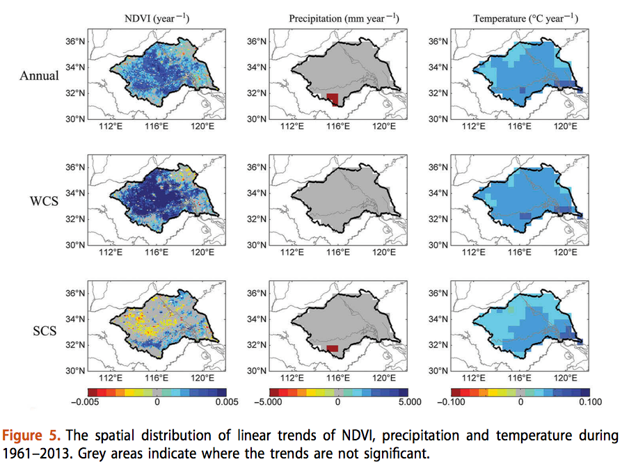
Specifically, I want to reproduce the colors of this figure:

enter image description here

Notice that where a red to blue scale is used, but zero values have been colored with grey.

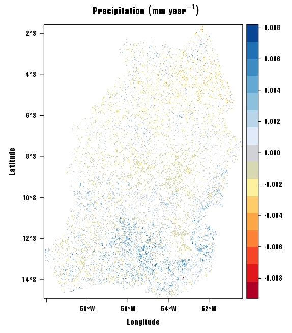
Currently, my maps looks like this:enter image description here
And this is the code to reproduce it (file available at https://www.dropbox.com/s/cypfdu1eaz2fuok/r.annual.tif?dl=0):

# Load required packages
library(rasterVis)

# open file
r.annual <- raster("Downloads/r.annual.tif")

# Set color palette
myTheme=rasterTheme(region=brewer.pal('RdBu', n=11))

# Plot
levelplot(annual.mask, par.settings=myTheme, margin=F)

How can I assign grey to all zero values in my map above?

1 Answer 1

8

You can define your own color palette by concatenating two predefined color palettes and your desired gray color as: [red orange yellow palette] + [zero gray color] + [blues palette]. To get zero value aligned with the gray color you have to use the same number of colors (n) for the predefined color palettes.

Try the commented code below:

# Load libraries
library('rasterVis')

# open raster file
r.annual <- raster("r.annual.tif")

# Set color palette
zeroCol <-"#B3B3B3" # (gray color, same as your figure example)
reds <- rev(brewer.pal('YlOrRd', n = 7))
blues <- brewer.pal('Blues', n = 7)

myTheme <- rasterTheme(region = c(reds, zeroCol, blues))

# Plot
levelplot(r.annual, par.settings = myTheme, margin = FALSE, main = expression("Precipitation" ~ (mm ~ year^{-1})))

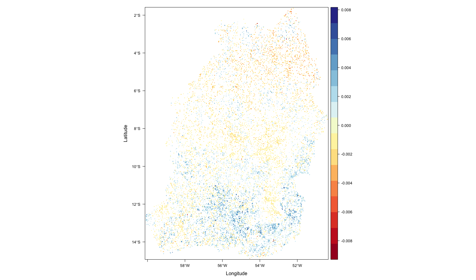
plot

Notice that your plot won't look like the figure example you posted because your raster have more sparse data with many Nas

2
  • Thanks for the reply. I realized that my problem is probably too many NA's in the map. Try adding myTheme$panel.background$col = 'grey70' after your myTheme line and plot it to see the result. Apparently now I need to get rid of the excessive NA areas around the image. Commented May 19, 2017 at 15:15
  • 3
    You are welcome! Note that 0 value is different from NA value. Also they have different meanings. You can assign the same color to both, but I think It's not appropriate. If you want to have a precipitation raster that look like the figure you posted (more data), one suggestion maybe trying to interpolate your data following an appropriate prediction model.
    – Guz
    Commented May 19, 2017 at 16:10

Your Answer

By clicking “Post Your Answer”, you agree to our terms of service and acknowledge you have read our privacy policy.

Not the answer you're looking for? Browse other questions tagged or ask your own question.