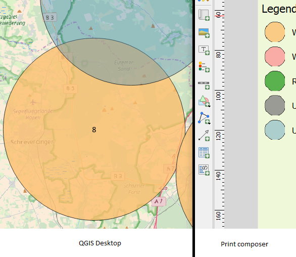
My problem: I have a point layer with a symbol size of 15958 meters. On the map they are all correctly displayed. When designing the map in the print composer and adding a legend, the symbols in the legend of this layer are not anymore displayed correctly. The outline seems to be cut on the right and the bottom side (see graph). The problem still exists when removing the outline. Unfortunately I wasn't able to find any solution on this issue.
-
For a quick fix, you could take a screenshot of the layers panel and add it to the print composer as an image.– cskCommented Sep 27, 2017 at 16:37
-
I am having the same issue right now woth both qgis 2.18 and 3.4. nothing i tried seems to work and the weirdest thing is that it affects only some layers although they use exact identical styles. Any news or workaround?– mar_coponeCommented May 12, 2019 at 6:40
-
Unfortunately not...– Raoul RedingCommented Sep 1, 2019 at 17:11
Add a comment
|
1 Answer
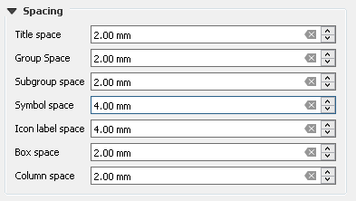
Have you tried increasing the Symbol space and the Icon Label space in the Spacing menu of the legend? Those control the gaps between rows and between the icon and the label.
Alternatively, you can duplicate the layer, style it with normal sized round icon with the equivalent colors, hide it from the map, but show it in the legend instead of the current one.
-
Thanks for your reply! But unfortunately, both suggestions had no effect... Commented Sep 27, 2017 at 6:58


