0

I have very limited knowledge of ArcMap.

I am trying to use a density heat map to portray the number of incidents in an area. I have used the Kernel Density tool in ArcMap 10.1. However, instead of the standard output in the legends, I am wondering if there is a way I can set the parameters to show something like:

Color 1= 1-99 Incidents, Color 2= 100-199 Incidents, Color 3= 200-299 Incidents, ...

I believe that the normal output is the number of occurrences over the given search area. This gives a good visual output as to where the greatest number of incidents are.

When trying to provide a quantity for a field unit how do I accurately change the information?

2
  • 1
    You are incorrect in your assumptions, please read up on KDE, there is considerable information on-line. Here is a starting point, from ESRI help: pro.arcgis.com/en/pro-app/tool-reference/spatial-analyst/… Commented Feb 2, 2018 at 18:23
  • I have read quite a few of those, so I guess I misworded my understanding. However, I didn't see on any of those manuals anything about the question I proposed.
    – CHogge
    Commented Feb 2, 2018 at 18:56

1 Answer 1

1

About your visualization question:

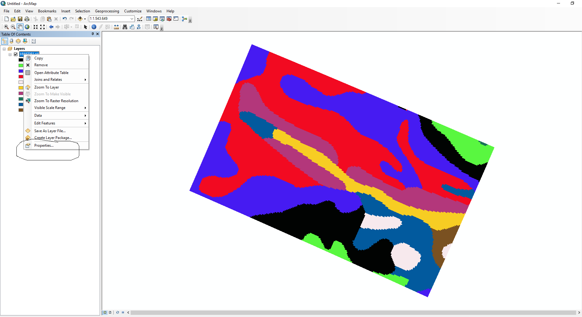
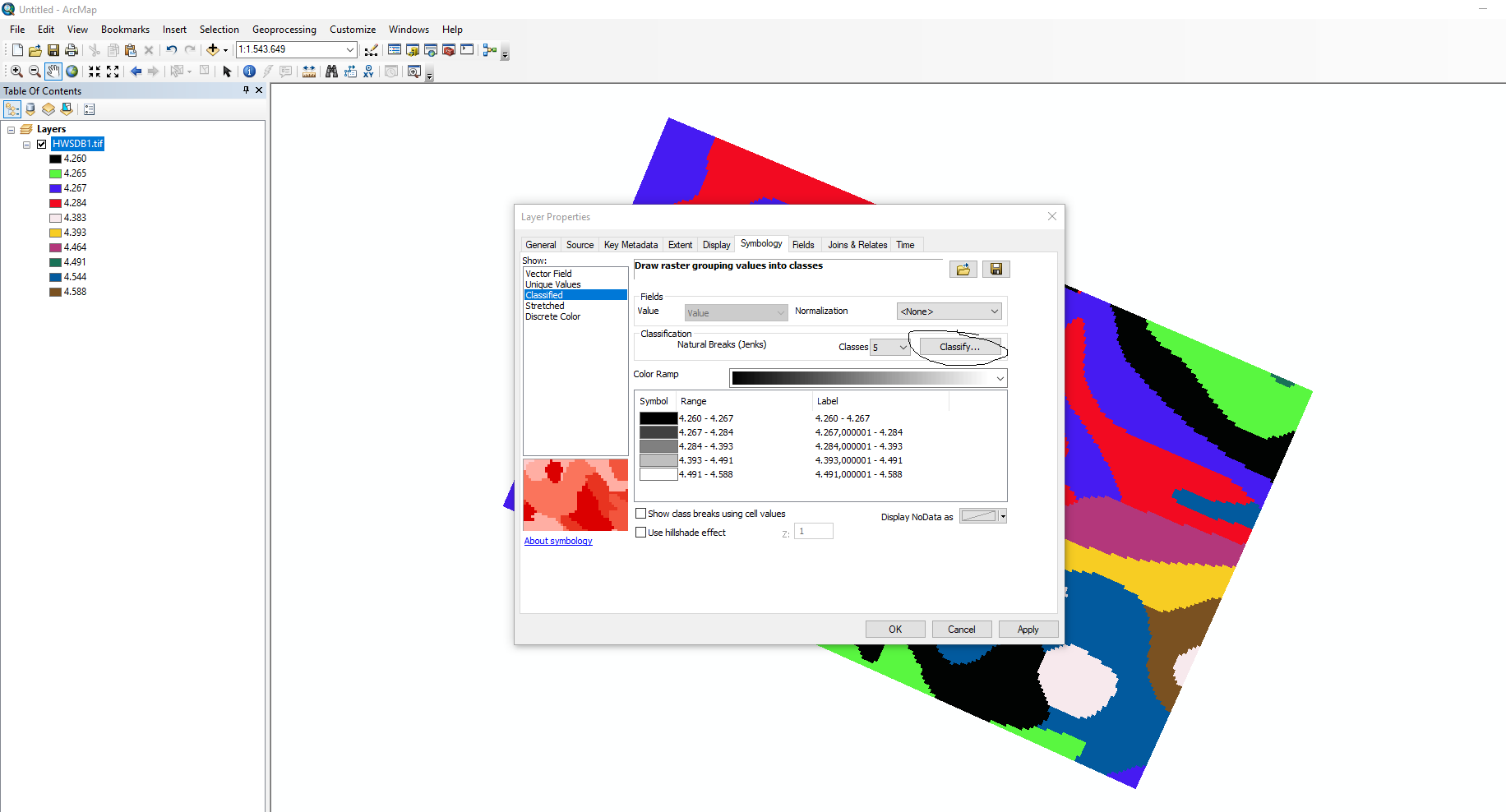
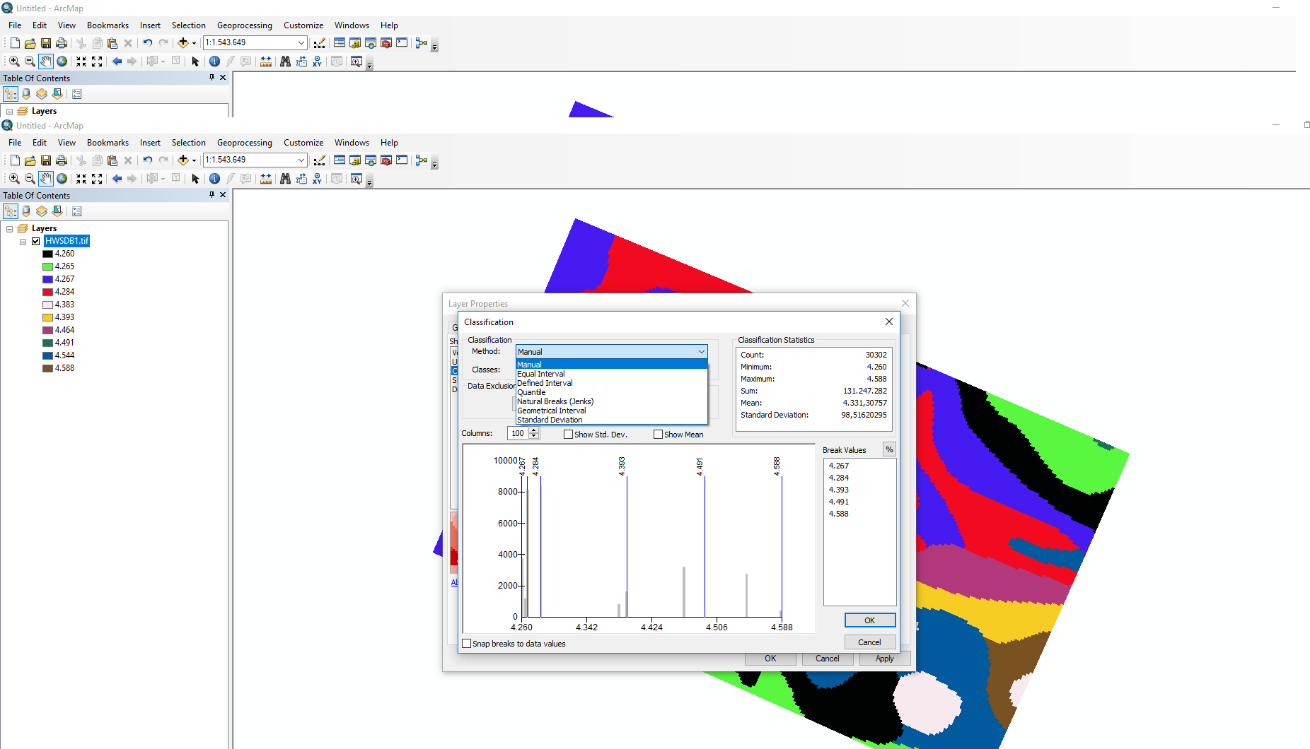
To manually set the colors and their corresponding values you right click the layer in the table of contents. Go to properties. enter image description here Go to the symbology tab and select classified. Click the 'classify' button. enter image description here Select 'manual' from the classification method dropdown menu. enter image description here

Also ensure that you indeed understand Jeffrey Evans comments.

4
  • Thank you for your response. Are the numbers you used the number of occurrences in your data? Because when I run mine, the highest number that I get on the table of contents far exceeds my actual data. We have roughly 4,000 incidents and the high number returned is about 11,000. I have had only 3 days of very basic training on ArcGIS software so I could be running the command wrong.
    – CHogge
    Commented Feb 6, 2018 at 17:36
  • My data are for illustration, they do not represent occurrences. You can mannually adjust the 'break values' to the right of the histogram in the right picture. You are getting a value of 11,000 because it is the density of occurrences at that location (per unit area you set for area_unit_scale_factor when running the tool), it does not mean that there are 11,000 occurrences. E.g. 2 occurrences within one square meter equal 2 * 1000 * 1000 = 2.000.000 occurrences / square kilometer. It does not mean that there are 2mln occurrences.
    – LMB
    Commented Feb 6, 2018 at 19:41
  • Ok that makes a lot more sense as to reading what I am getting back, thank you. When I change the break values it doesn't change my map the correct way it seems. It looks like when I set those numbers it still looks for density of occurrences at that location, and not just bands of numbers. Maybe the kernel density isn't the right tool for what I'm trying to do? But that is the only tool I know of that displays a heat map.
    – CHogge
    Commented Feb 12, 2018 at 17:30
  • If you simply wish to visualize a density you might use --- pro.arcgis.com/en/pro-app/tool-reference/spatial-analyst/… --- Otherwise you need to think of what exactly your goal is and choose a method based on your goal. What exactly is your goal?
    – LMB
    Commented Feb 13, 2018 at 10:09

Your Answer

By clicking “Post Your Answer”, you agree to our terms of service and acknowledge you have read our privacy policy.

Not the answer you're looking for? Browse other questions tagged or ask your own question.