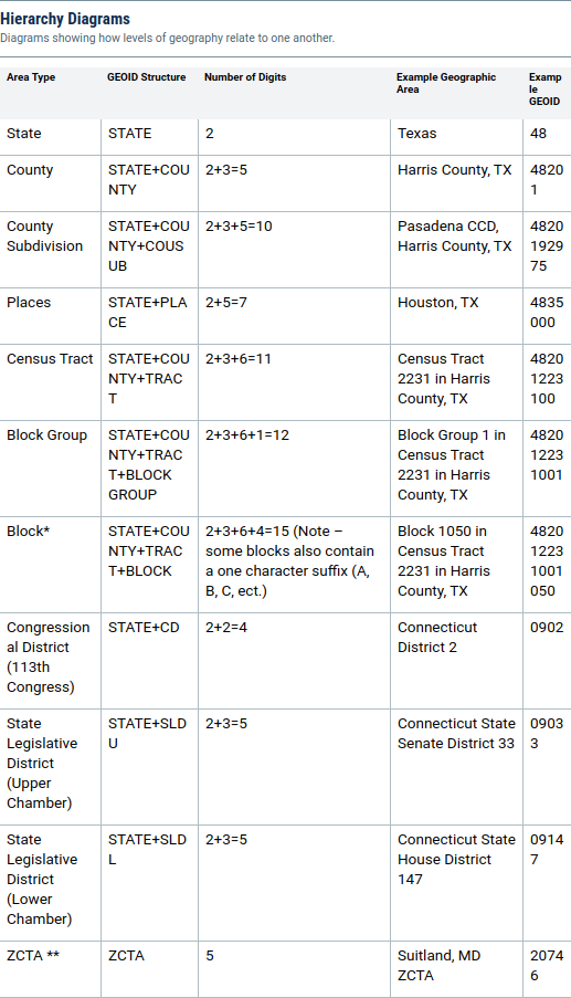
I'd like to make a plot of the US, with each county colored according to a scalar value (the average summer temperature).
I'm using R.
I have a shapefile with all the counties:
> shape = st_read(paste0(my_dir, "cb_2018_us_county_5m/cb_2018_us_county_5m.shp")
> head(shape)
Simple feature collection with 6 features and 9 fields
geometry type: MULTIPOLYGON
dimension: XY
bbox:      xmin: -120.0726 ymin: 30.28043 xmax: -83.34348 ymax: 39.37874
geographic CRS: NAD83
  STATEFP COUNTYFP COUNTYNS     NAME                       geometry
       39      071 01074048 Highland MULTIPOLYGON (((-83.86976 3...
       06      003 01675840   Alpine MULTIPOLYGON (((-120.0725 3...
       12      033 00295737 Escambia MULTIPOLYGON (((-87.62999 3...
And a csv file with temperature data:
> temp_data = read_csv(paste0(this_dir, "temperature_data.csv"))
> head(temp_data)
  GEOID    State  County Temperature
1001     ALABAMA AUTAUGA          25
1003     ALABAMA BALDWIN          31
1005     ALABAMA BARBOUR          15
I feel like I should be able to match these up - but I don't see any identifying column that matches across both files. (The county names get close, but the US has a lot of Jefferson and Madison counties)
How can I merge the temperature data into the shapefile for plotting?

