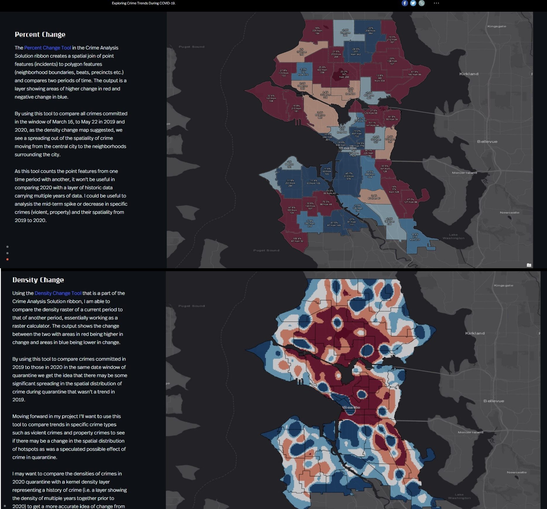
I want to create similar maps like shown at the bottom but I am "limited" to QGIS only right now. My goal is to compare crimes committed in 2019 to those in 2020 in the same date window of quarantine. ArcGIS Pro has solution for making the analysis of crime data easier called the Crime Analysis Solution. How can i achieve similar results (maps) using QGIS?
"Using the Density Change Tool that is a part of the Crime Analysis Solution ribbon, I am able to compare the density raster of a current period to that of another period, essentially working as a raster calculator. The output shows the change between the two with areas in red being higher in change and areas in blue being lower in change"
"The Percent Change Tool in the Crime Analysis Solution ribbon creates a spatial join of point features (incidents) to polygon features (neighborhood boundaries, beats, precincts etc.) and compares two periods of time. The output is a layer showing areas of higher change in red and negative change in blue."

