5

I've got a raster layer in QGIS 3.10. It's statistics are the following (hopefully understandable although in Spanish):

Valor mínimo: -0.36928805708885193
Valor máximo: 0.6040433645248413
Intervalo: 0.9733314216136932
Suma: 14433.653211801786
Valor medio: 0.12369652924773997
Desviación estándar: 0.09271679256133081
Suma de cuadrados: 1003.0713567335182

I would like to represent it with a Red-to-Black colour ramp, but centered to zero, so values < 0 appear in the red palette and those > 0 in the grey one. Logically, my attempts with an automatic classification always set the central white color into the positive values. Is it possible to do what I want and how?

1
  • I suggest you fiddle around with the colours in your ramp and with the values. You can manually adapt them.
    – Erik
    Commented Feb 11, 2021 at 15:09

1 Answer 1

8

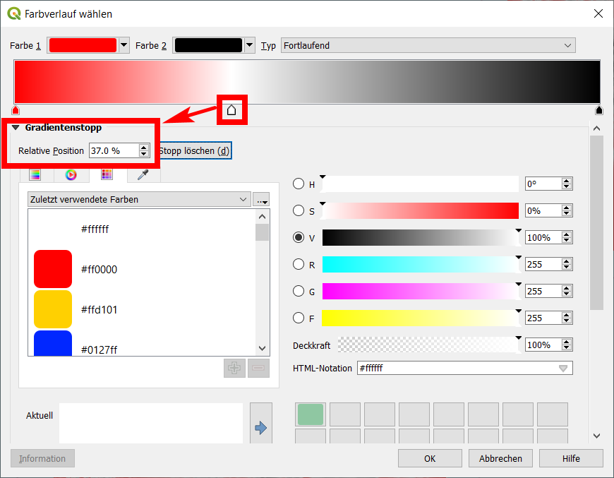
You have a range of values from -0.369288057 to 0.604043365, thus a difference of 0.973331422. You have a color ramp red-white-black and the "middle" value (white) is set to the middle of these values, thus at 0.117377654 - but you want it at 0. So your white value must be shifted to the left. To get the exact position, calculate the percentage of the value 0 in the range of your min/max values: (0-min) / (max-min) * 100 = 37.94%. Thus set the marker for the withe color to this value.

enter image description here

Apart from this, see also this solution: https://gis.stackexchange.com/a/385536/88814

Your Answer

By clicking “Post Your Answer”, you agree to our terms of service and acknowledge you have read our privacy policy.

Not the answer you're looking for? Browse other questions tagged or ask your own question.