7

In the recent QGIS version, layer tree symbols for pseudocolor continuous raster palette have changed, so that it shows as bar with continuous color range with only minimum and maximum value of the raster for the defined color range displayed.

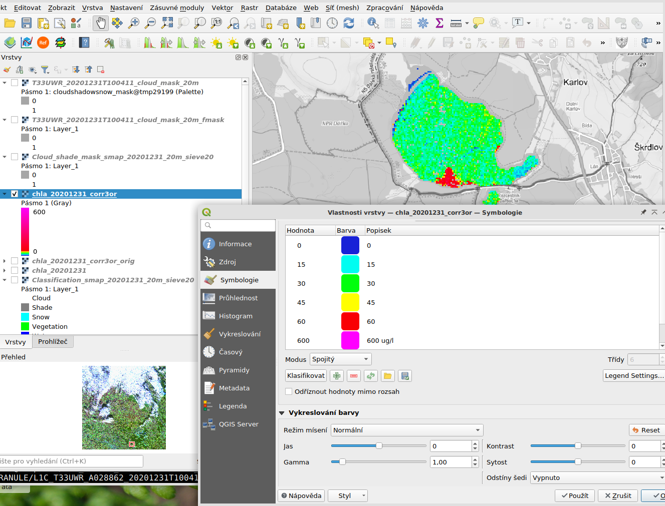
But for raster showing for example concentrations of chlorophyll-a in inland water as in image below, it is important to be able to distinguish if the concentration value is 0 or 15 or 30 or 60 mg/m3 or much higher. Therefore, I created a color legend with continuous color change in the map, which shows well how the concentrations change, but showing the discrete values of 0, 15, 30, 60, and 600 in the legend, each with different distinct color and linear transition between them.

Is there a way to switch the layer tree style back to the old rendering (i.e. similar to what is visible in the Layer properties/Style dialog)? Or at least show more distinct values on the scale in the bar than just minimum and maximum.

I see many users wanted the change the way it is now, since I am basically wanting the opposite of what was requested for older versions for example here.

enter image description here

Edit: What I was asking for was solved in QGIS versions 3.18.1 and up, so for me this question is now obsolete.

7
  • Are you asking about the legend item or about the layer tree?
    – Erik
    Commented Feb 23, 2021 at 14:42
  • I mean the symbols shown in the layer tree (in the sample image the color bar symbol shown under the layer chla_20201231_corr3or name), as well as symbols in legend item of print layout. These look basically the same and now (in QGIS 3.16) do not use the labels defined in Symbology tab of Layer properties.
    – Tomas_IV
    Commented Feb 24, 2021 at 8:50
  • Oh, and I have QGIS 3.18, did not realize it updated...
    – Tomas_IV
    Commented Feb 24, 2021 at 9:29
  • 2
    Looks like this functionality should be back in QGIS 3.18.1 next week. github.com/qgis/QGIS/pull/42193
    – Baswein
    Commented Mar 13, 2021 at 19:07
  • This looks really promising, thanks for the notice @Baswein. Have to test it ASAP.
    – Tomas_IV
    Commented Mar 22, 2021 at 15:18

2 Answers 2

3

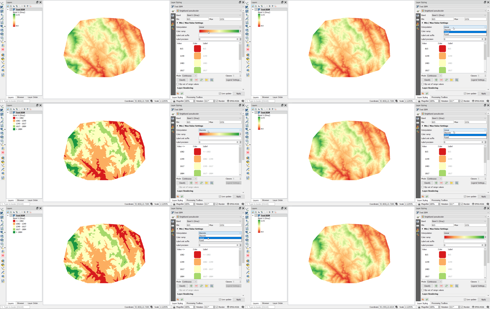
You need to change the Interpolation method from Linear to Discrete, and you will be able to get a separate class for each range of values similar to the old behavior. Actually, the Distrete interpolation was always there in the previous versions of QGIS, but Linear interpolation was the default rendering behavior of raster.

enter image description here

You can see from the image above that the legend in the layer tree (Table of contents) was changed from continous color range to discrete color range. I think using the Discrete interpolation to show a specific range of pixel values for a raster image makes more sense.

I used QGIS 3.18 for your reference.

0

Thank you ahmadhanb. This is an option and makes sense when you want only stress the categories into which the values modeled by the map fall. But as you can see even on the excellent image you posted, by using discrete color range, you lose precision of your idea, how the value depicted on the map behaves in space, if you are looking on the map. I mean, you do not know for example, where exactly runs bottom of a ridge, which would become a place of a stream running down a slope, provided that what is depicted on your example is terrain model.

With the old rendering with continuous color palette (linear rendering) but distinct values showed in list of layers symbols or legend in a print composition you could se it in the map all. Where the limit is reached, where the value in the water body is minimal, where it is maximal, where it almost reaches the limit, where it exceeds it by a lot. It was just perfect for me. I take it in the new style of the rendering you cannot get both continuous color rendering of a value changing in space and distinct, in the list of layers easily identified colors at defined values. A pity I would say, but this is not a place to complain... I am aware similar effect can still be achieved for example by combination of linear rendering and overlayed vector isolines, or by static image legend added to the print output of the map, it would be just a little more complicated.

1
  • 2
    This should be an edit to your question as it didn't answer your question. but to partially solve your problem you could duplicate your layer, one set like you did the other set as suggested by ahmadhanb and then by displaying only one and using the other only for legend
    – J.R
    Commented Mar 4, 2021 at 17:09

Not the answer you're looking for? Browse other questions tagged or ask your own question.