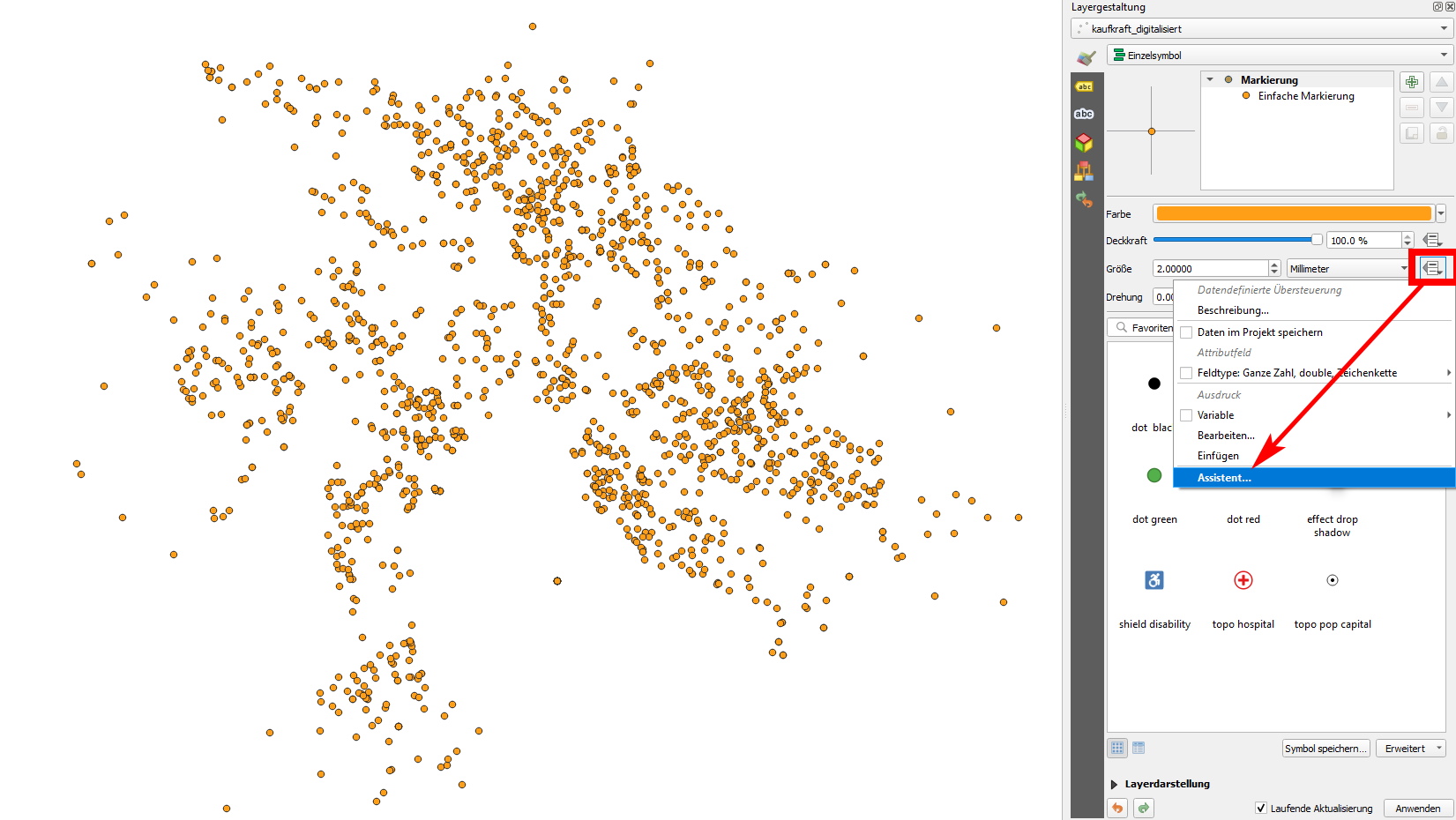
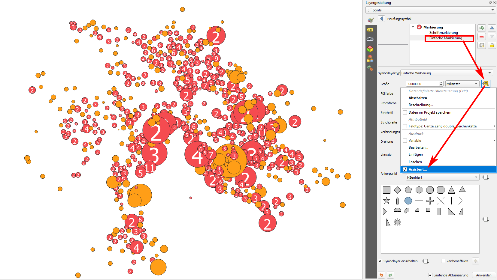
If you want to change the size of a point symbol according to an attribute value, click the data driven override icon next to the size setting of the layer's Layer Styling panel and select assistant:

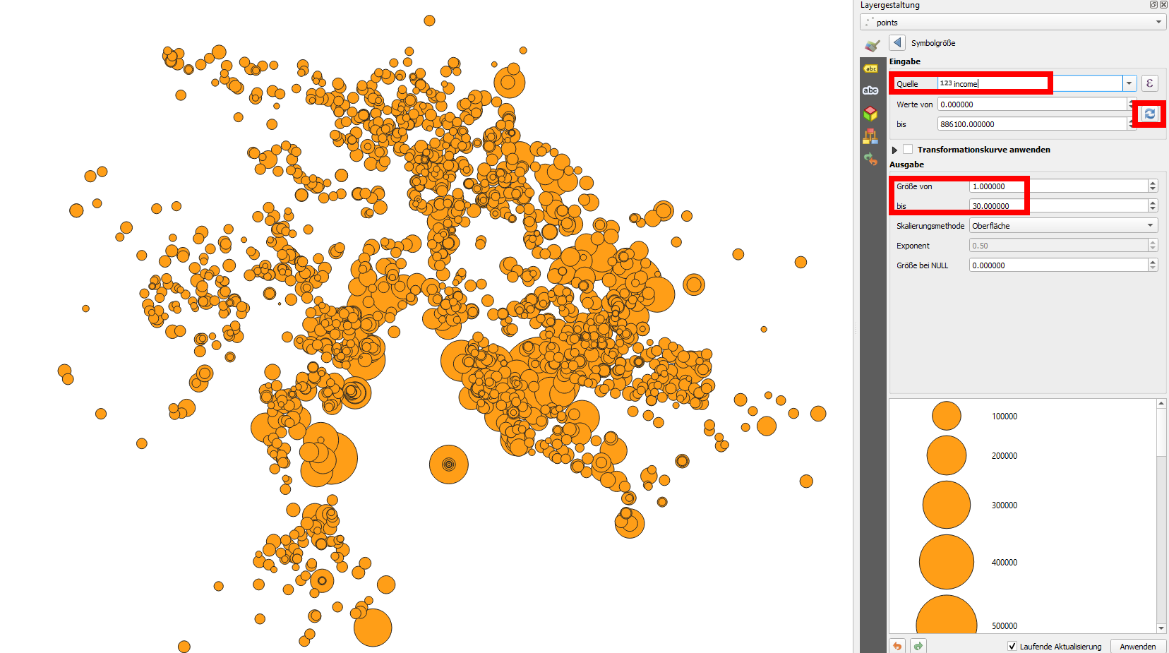
Choose the source (the attribute) you want to use, load the min/max values with the double arrows and set the size of the smallest and biggest symbol (and change scale method, if you want):

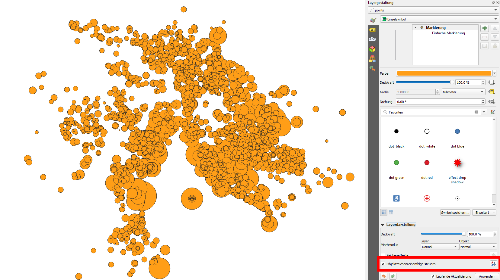
In this case, the result is quite messy. You could apply transparency and/or layer or feature blending modes to see the points better. Also be sure to order the symbols in a way the the smallest ones are on top, the bigger ones in the background: For this, at the very bottom expand Layer Rendering and check the box next to Control feature rendering order, than click the a[arrow]Z symbol on the right. In the dialog that opens select the same attribute as expression and select descending.

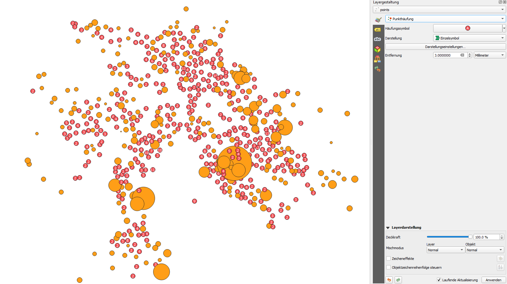
However, it still looks messy. You could now cluster together points that are too close to each other to be distinguished as individual points. For this, set the symbol rendering mode to Point cluster. See how the map changes:

To change the size of the red (clustered) symbols, in the screenshot above click
the entry Cluster Symbol (red circle with A) to open the styling dialog of the cluster symbol. There again use the same method as above (assistant) for a data driven override of the cluster symbol: you can do this only for the simple marker symbol layer (see screenshot) and/or also for the Font marker. See the result:

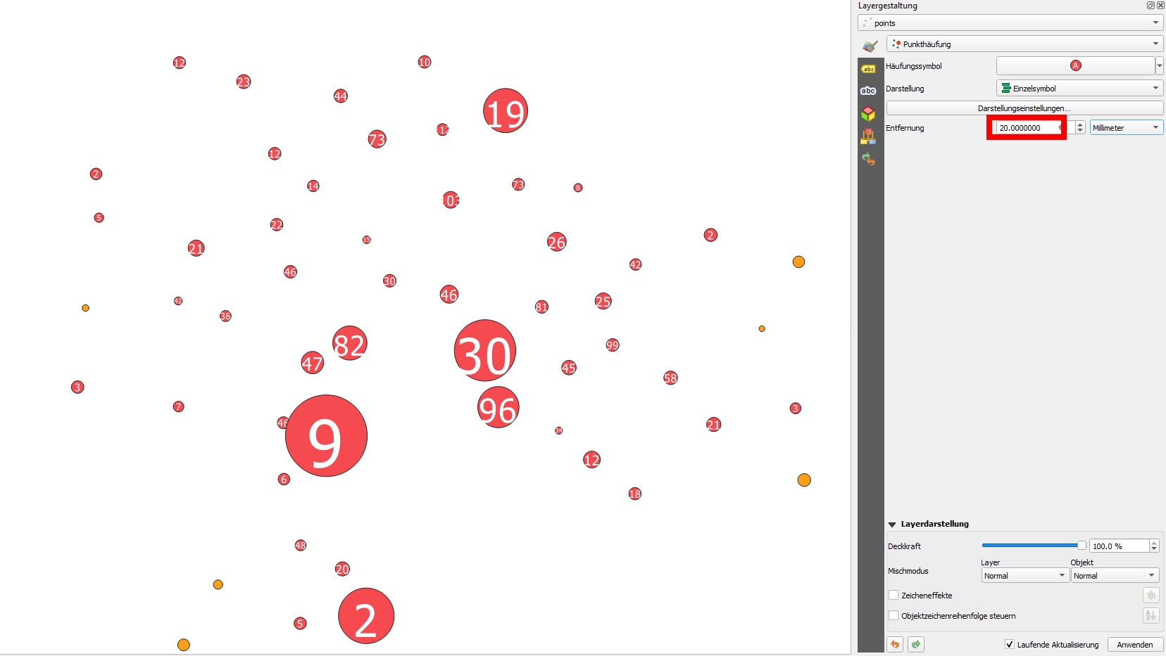
Back in the main Layer Styling panel, you could increase the distance: thus more points will be "collected" together to a cluster symbol (all points in the defined distance):

As you can see above, the size of the circles does not correspond to the numbers contained. This is because the size depends on a value in the attribute tabel, whereas the number represent the amount of points clustered. If you want both to correspond, change either the size or the font marker.
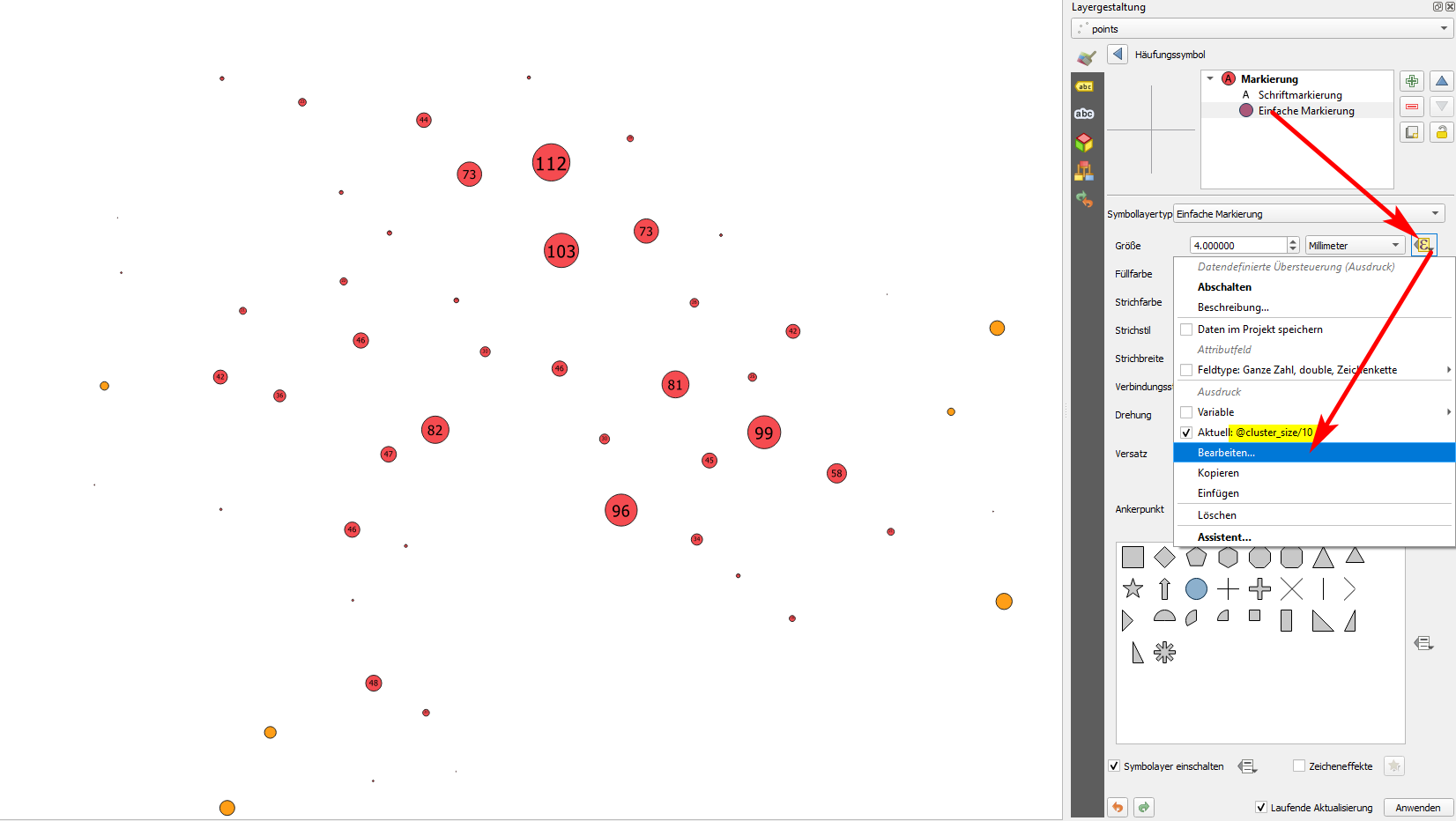
To change the cluster size: in data driven override, don't select assistant, but edit.... Introduce @cluster_size. I set it to @cluster_size/10, dividing it by 10, otherwise it would have been too big - see yellow highlighte part on the screenshot:

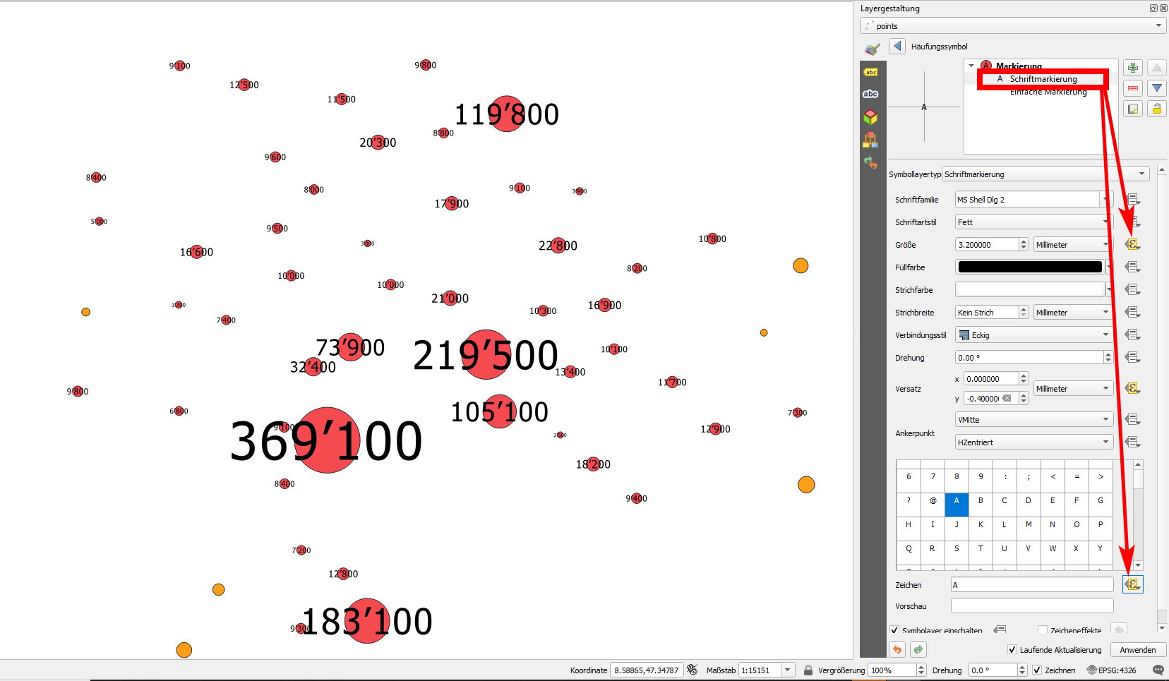
To change the Font Marker, select it and apply the same settings as above - but be sure this time to change the size as well as the font:

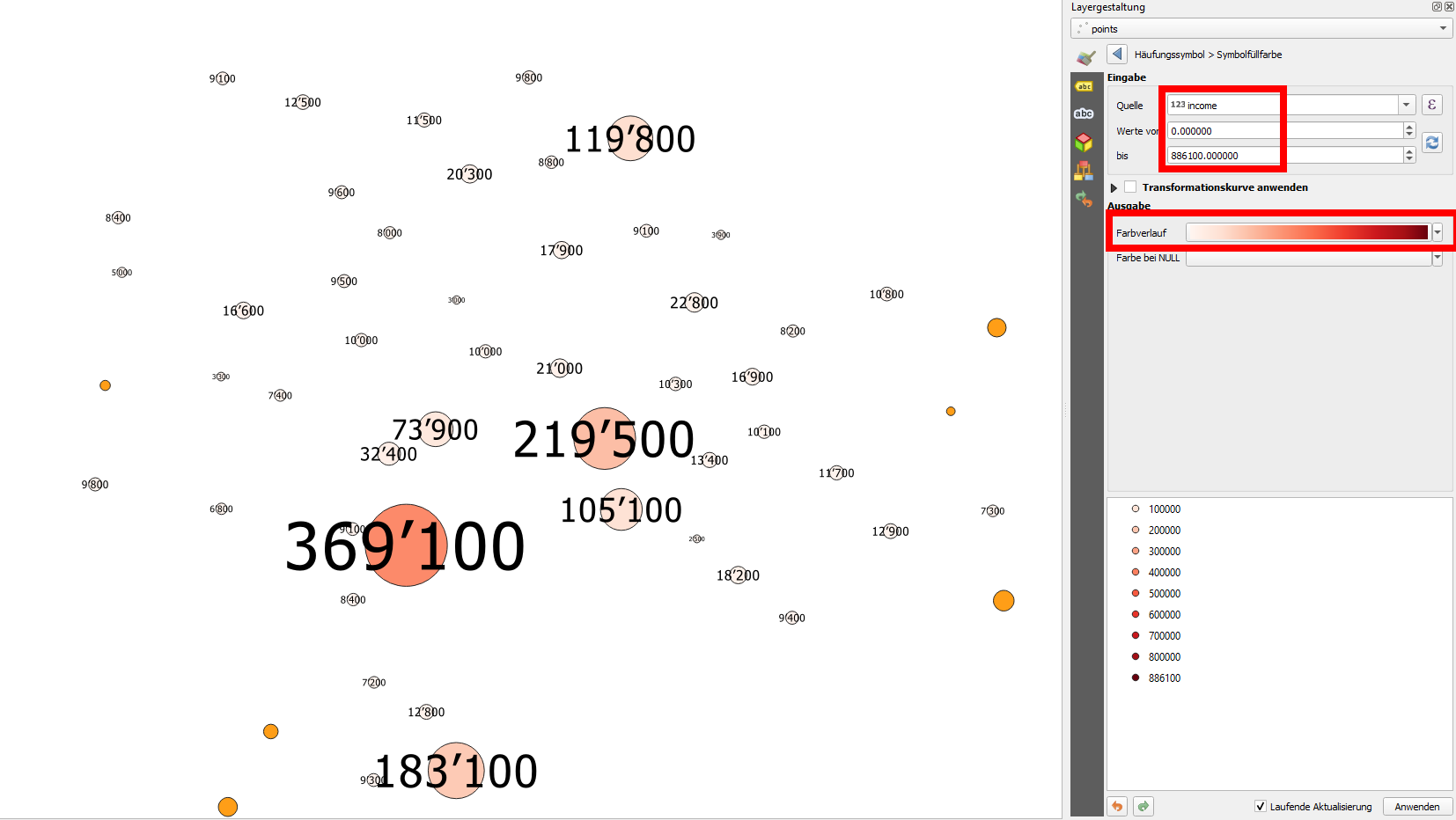
In a similar way, you can define more data driven overrides, e.g. the color of the symbol: select the data driven override icon next to the color and proceed as before, but this time select a color ramp:

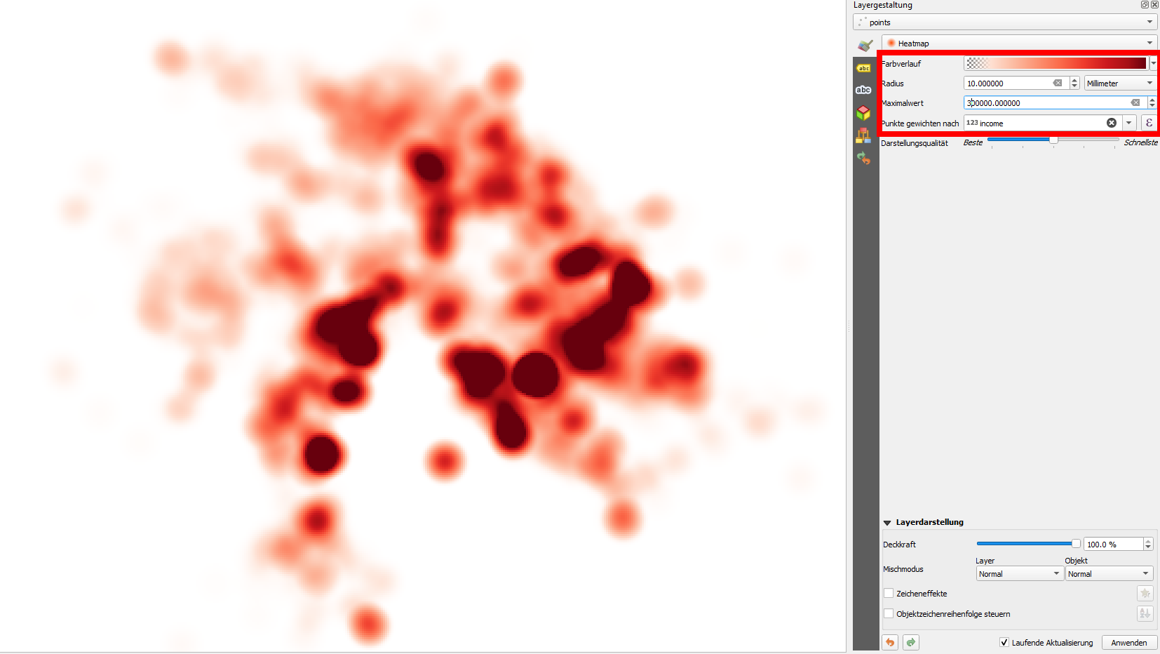
And than, there's also the Heatmap rendering mode: set a color ramp, a radius, a max. value and use Weight points by an attribute (if it is the case) - otherwise, it will only show the density of the points:
