I downloaded the CLC 2018 raster data to test how the Proximity Tool works with this data.
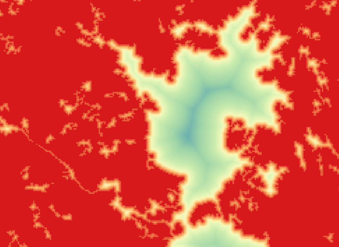
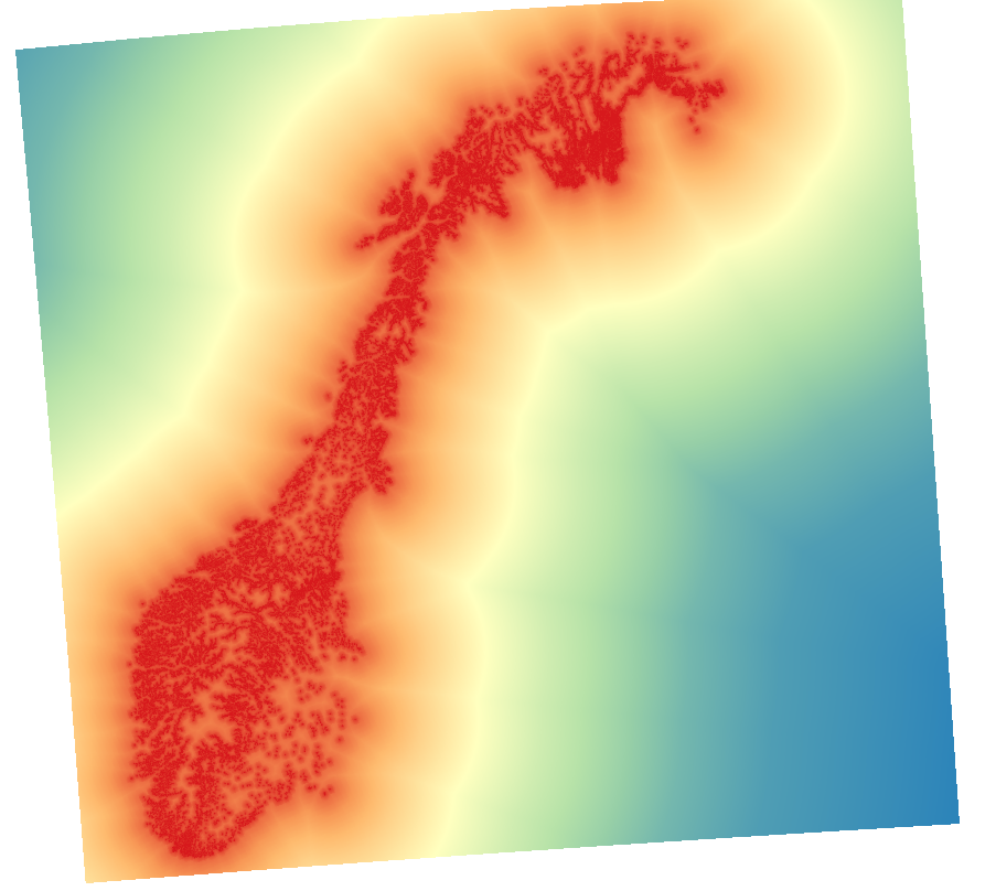
I was able to produce the following output:
To do this I:
- Kept the CLC data in its own projection
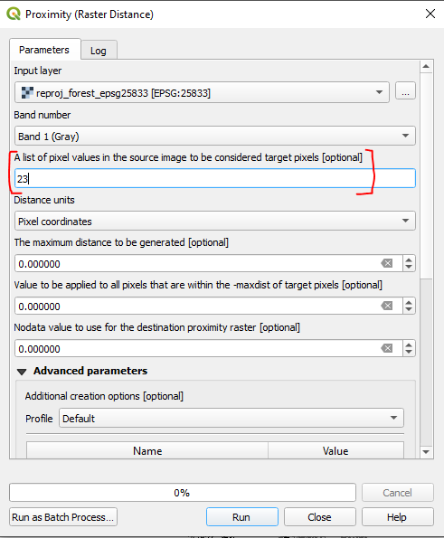
- Using the Proximity Tool, I set the "List of Pixel Values" to 24 (which from what I could tell is a forest class)
- Ran the Tool
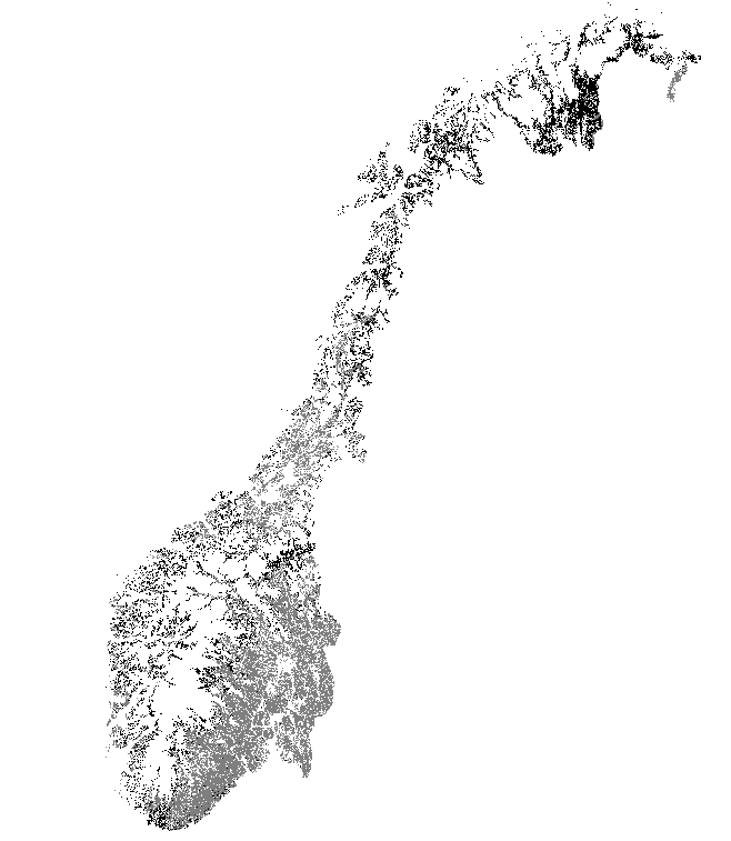
The result did come up as appearing to be all black (as you experienced) but this seemes to be how the raster is presented, with no streching of the pixel values. QGIS is trying to draw the full range of pixel values (0 to 21900 in my case), so everything appears to be black.
This can be fixed one of two ways:
- Right-click the result and select "Stretch using current extent", this should normalise the view and you should see pixels representing distance; or
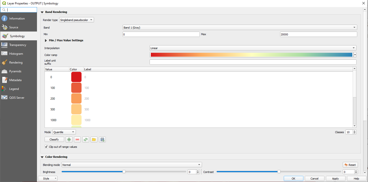
- Open the results properties, and open the "Symbology" menu. Choose the render type as Singleband Pseudocolor and play around with the settings. Here is mine:

Hit apply and it should present as you wanted it.
Just remember the resolution of the image is 100m, so try stick to those intervals.
If you want to include more of the classes you can either add them in the Promiximity tool's options or you can Reclass the image identifying those pixel values representing Forest.
UPDATE WITH SOURCE DATA
Here is the data as provided through the WeTransfer link:

The legend shows the forest having a pixel value of 23.
Running the proximity tool I set the "List of pixel values" to 23.

The OUTPUT:

I opened the Layer Properties, and the Symbology Tab.
Changed the Render Type to "Singleband pseudocolor"
Changed the Mode to "Quantile"
Changed the "Classes" to 15
Hit the "Classify" button and then
Apply
Here is the result:

I think you may be there with your method, just a little refinement in the presentation.

