I have an exported collection of iNaturalist observations which have latitude and longitude values, but also report the GPS accuracy in meters. This data is in the form of a csv file.
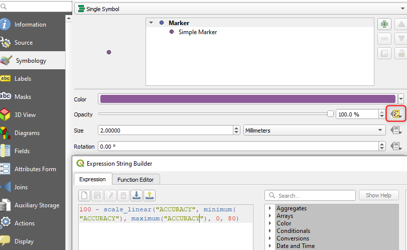
The accuracy varies from observation-to-observation, which I would like visualized by the marker size. Because there are some areas where the markers have poor accuracy, I don't want those points to mask the other nearby observations that may be more precise. To tackle this I would like to set opacity of each point to be a decreasing function of the accuracy. One approach might be to take 1 - S(d) where S(d) is a s-shaped curve over the accuracy score d.
How can I plot the position of observations (lat/long) such that the marker size is equal to the accuracy, and have the opacity decay with the (in)accuracy?
- I am new to QGIS, so many of the available objects are unknown to me. But I am experienced with Python, so a scripting solution is fine.

