1

I have created a confusion matrix plot in R however I would like to get the legend that shows the values for the colours. How would I do this? So far I have the following:

z = c(135,9,0,7,0,0,55,3,
      3,260,0,1,0,0,104,2,
      0,0,0,21,0,0,56,16,
      1,1,0,155,0,0,66,45,
      0,0,0,134,0,0,28,11,
      0,0,0,10,0,0,4,24,
      7,7,0,31,0,0,454,6,
      0,0,0,73,0,0,21,181)

z = matrix(z, ncol=8)
colnames(z) = c("Water","Shrubs","Commercial Agriculture","Residential Areas","Subsistence Farming","Roads","Grassland","Degraded Areas")

rownames(z) = c("Water","Shrubs","Commercial Agriculture","Residential Areas","Subsistence Farming","Roads","Grassland","Degraded Areas")

image(z[,ncol(z):1], axes=FALSE)

axis(2, at = seq(0, 1, length=length(colnames(z))), labels=colnames(z))

heatmap(t(z)[ncol(z):1,], Rowv=NA,
         Colv=NA, col = heat.colors(256))
4
  • Would you like to show the column names, or continuous numerical? In the later case, adding something after the heatmap works: legend(x="right", legend=c("min", "med", "max"),fill=heat.colors(3))
    – PGerrits
    Commented Sep 24, 2022 at 12:18
  • Thank you, have tried adding after the code above and nothing seems to come up
    – Rozy
    Commented Sep 26, 2022 at 13:13
  • Your code worked fine for me. Have you pasted the script I mentioned after the heatmap? If I run your code all at once it does not work, but line-by-line it does.
    – PGerrits
    Commented Sep 26, 2022 at 16:37
  • Thank you so much, line by line works fine now
    – Rozy
    Commented Sep 27, 2022 at 12:16

1 Answer 1

1

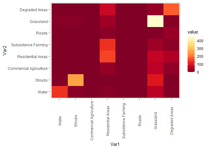
I suggest using tidyverse and ggplot. Sample code below. With the values parameter in scale_fill_gradientn you can set the values for the individual colors. For other options, I recommend ?scale_fill_gradientn - there are a lot of them.

library(tidyverse)
library(RColorBrewer) # only for color set

z = c(135,9,0,7,0,0,55,3,
      3,260,0,1,0,0,104,2,
      0,0,0,21,0,0,56,16,
      1,1,0,155,0,0,66,45,
      0,0,0,134,0,0,28,11,
      0,0,0,10,0,0,4,24,
      7,7,0,31,0,0,454,6,
      0,0,0,73,0,0,21,181)

z = matrix(z, ncol=8)
colnames(z) = c("Water","Shrubs","Commercial Agriculture","Residential Areas","Subsistence Farming","Roads","Grassland","Degraded Areas")

rownames(z) = c("Water","Shrubs","Commercial Agriculture","Residential Areas","Subsistence Farming","Roads","Grassland","Degraded Areas")

z2 <- reshape2::melt(z) %>% # converting data to tibble
  as_tibble()

ggplot(z2, aes(x = Var1, y = Var2, fill = value))+
  geom_raster()+
  scale_fill_gradientn(colours = rev(brewer.pal(9, "YlOrRd")))+ # you can use a different palette, I use RColorBrewer, but it can be e.g. scale_fill_continous
  theme(axis.text.x = element_text(angle = 90, vjust = 0.5, hjust = 0.5))

Created on 2022-09-30 with reprex v2.0.2

1
  • Thank you so much, this is exactly what I was looking for.
    – Rozy
    Commented Oct 3, 2022 at 10:50

Your Answer

By clicking “Post Your Answer”, you agree to our terms of service and acknowledge you have read our privacy policy.

Not the answer you're looking for? Browse other questions tagged or ask your own question.