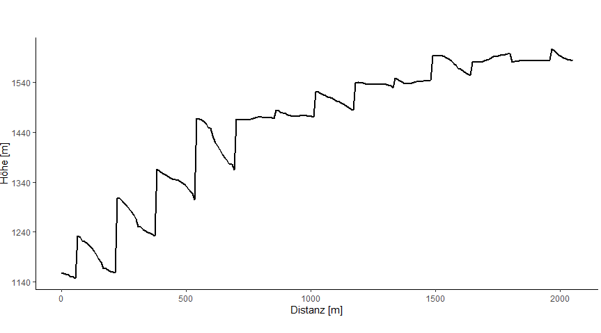
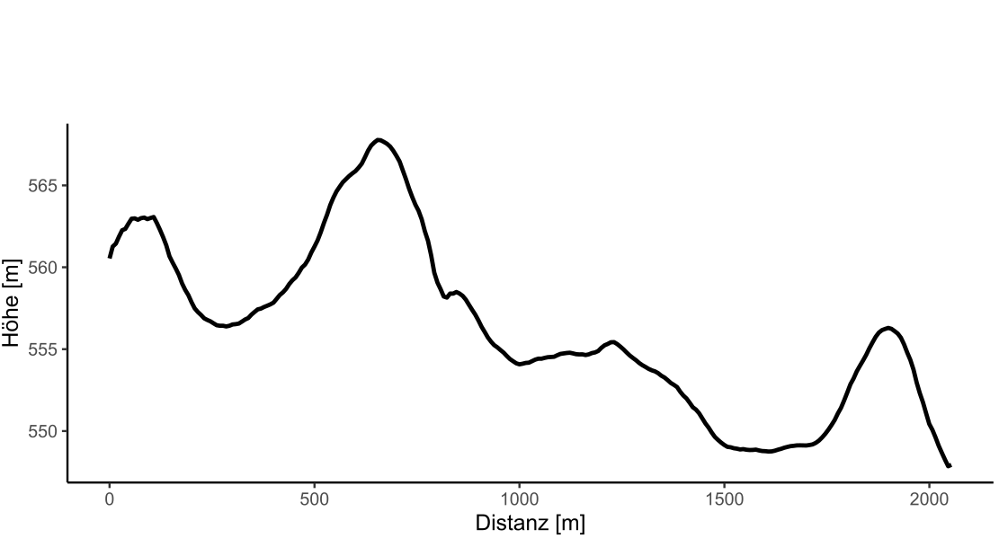
I created several random profiles and cannot reproduce any type of "error" or erroneous results so, lets try to put your results into context. At a large distance, I would imagine that a cross-slope profile would exhibit these "spikes" since the elevations decreases and increases with the slope(s). I illustrate this effect in my example.
First, we add required libraries (note; spatialEco is only for the DEM), create 2 sf LINESTRING features representing down and cross slope profiles and, extract the elevation profiles which are then turned into a list object for plotting. We plot the profile lines on a shaded relief to better visualize the terrain.
library(spatialEco)
library(terra)
library(sf)
library(dplyr)

elev <- rast(system.file("extdata/elev.tif", package="spatialEco"))

cross <- data.frame(id=1, cbind(c(613160.2, 645160.2),c(4918281, 4930281)),
                    sequence=c(1,2))
  names(cross)[2:3] <- c("x","y")
down <- data.frame(id=2, cbind(c(658160.2, 671160.2),c(4986281, 4959281)),
                 sequence=c(1,2))
  names(down)[2:3] <- c("x","y")

xy <- rbind(cross, down)
  xy <- xy %>%
    st_as_sf(coords = c("x", "y"), crs = st_crs(elev)) %>%
      group_by(id) %>%
        summarize() %>%
          filter(st_geometry_type(.) == "MULTIPOINT") %>%
            st_cast("LINESTRING")

z <- extract(elev, vect(xy))
  z <- lapply(unique(z$ID), \(i) as.numeric(z[z$ID == i,][,2]))
    names(z) <- c("cross-slope", "down-slope")

slope <- terrain(elev, "slope", unit="radians")
aspect <- terrain(elev, "aspect", unit="radians")
hill <- shade(slope, aspect, 40, 270)
  plot(hill, col=grey(0:100/100), legend=FALSE, mar=c(2,2,1,4))
    plot(elev, col=rainbow(25, alpha=0.35), add=TRUE)
      plot(st_geometry(xy), lwd=2, add=TRUE)
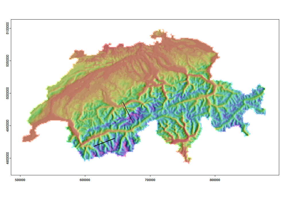
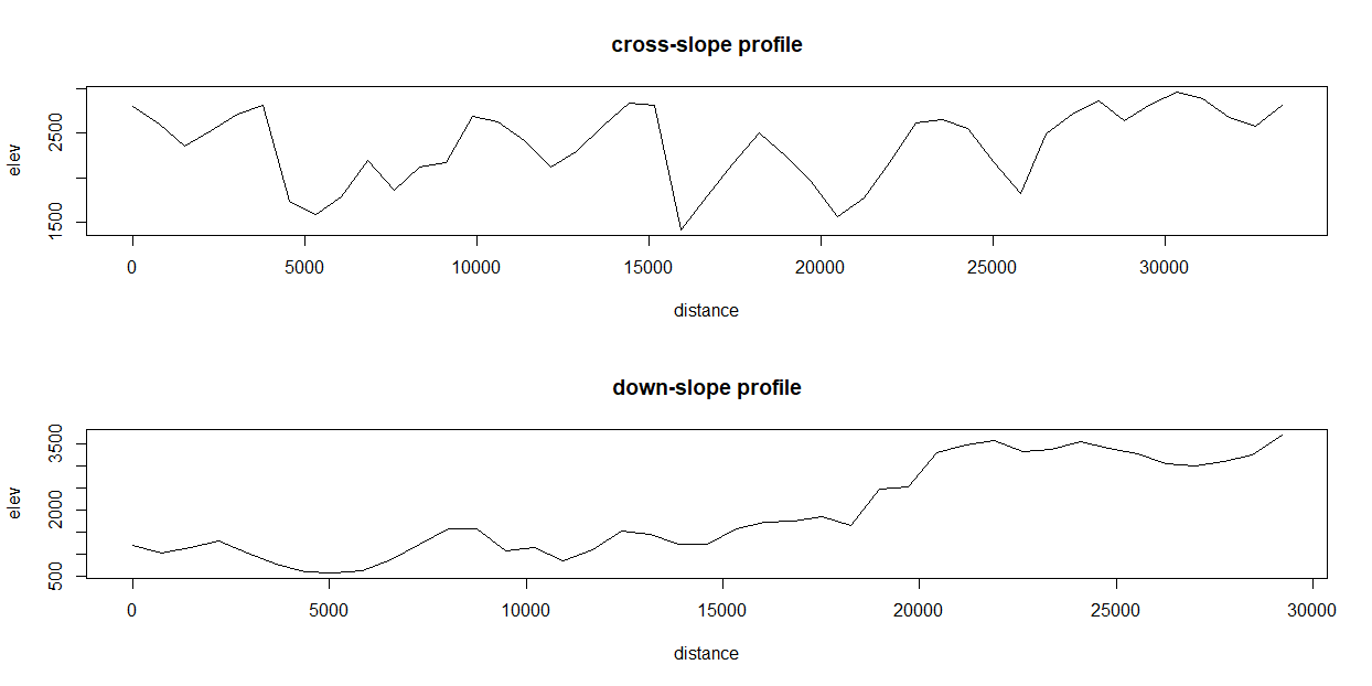
Hare are comparisons of cross and down slope profiles. As you can see, the cross slope profile exhibits similar "spikes" as your result. This is due to the profile intersecting decreasing/increasing slopes.
dev.new(height=8, width=16)
  par(mfrow=c(2,1))
lapply(1:length(z), \(i) {
  l = as.integer(st_length(xy[i,]))
  x <- seq(from=0, to=l, by=as.integer(l/length(z[[i]])))[1:length(z[[i]])]
    plot(x, z[[i]], type="l", xlab="distance",
         lwd=1.5, ylab="elev", main=paste0(names(z)[[i]], " profile"))
 })
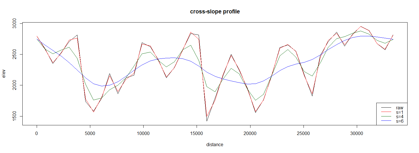
Now, as to the influence of smoothing. I have a feeling that the profile plot that you are getting from QGIS is being smoothed in someway (Python function is calling QwtPlotCurve). Often software will do things in the background that the user is unaware of, making it difficult to compare results from different software. Here is a plot that contains the original profile and the result of 3 different spline smoothing parameters. You can really see how the plot starts looking like the one produced by QGIS.
dev.new(height=8, width=16)
l = as.integer(st_length(xy[2,]))
x <- seq(from=0, to=l, by=as.integer(l/length(z[[2]])))[1:length(z[[2]])]
  plot(x, z[[2]], type="l", xlab="distance",
       lwd=1.5, ylab="elev", main=paste0(names(z)[[2]], " profile"))
    lines(smooth.spline(x, z[[2]], spar = 0.25), lty=2, col="red")
      lines(smooth.spline(x, z[[2]], spar = 0.4), col="darkgreen")
        lines(smooth.spline(x, z[[2]], spar = 0.6), col="blue")
    legend("bottomright", legend=c("raw", "s=2", "s=4", "s=6"),
           lty=c(1,2,1,1), col=c("black", "red", "darkgreen", "blue"))

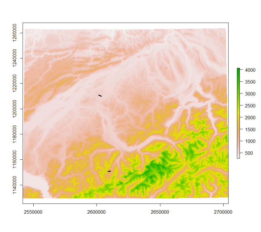



terra::rast. There is a vector class in the package so to extract you would useextract(r.dem, vect(trans))The result is a data.frame object, not a list so, you have to aggregate by ID using something liketapply.