42

For a project I'm working on, I need to represent network flows over 1,000 zones with directionality.

  • Any suggestions on displaying the information in a nice and non overwhelming way?
  • Any examples on displaying network flows in heavy urban areas?
  • Color suggestions and thickness schemes?
  • any "not to dos" when representing network flows?
0

12 Answers 12

16

A recent article in the open journal PLoS, Redrawing the Map of Great Britain from a Network of Human Interactions by: Carlo Ratti, Stanislav Sobolevsky, Francesco Calabrese, Clio Andris, Jonathan Reades, Mauro Martino, Rob Claxton, Steven H. Strogatz PLoS ONE, Vol. 5, No. 12. (8 December 2010)

alt text

Another one I came across this morning,

Facebook worldwide friendships Mapped (via the Flowing Data blog) alt text

0
11

Similar to the graph suggestions by @Adam Matan there is a tool called Flow Map Layout that will create a tree like visual of data. Perhaps you can use something like that.

http://graphics.stanford.edu/papers/flow_map_layout/

10

My basic intuition would be displaying the data as a graph, not as a map. Think of it as a subway line map: It does not display the lines on a geographic map, but as abstract lines which intersect on junctions. That way you can focus on the important part (i.e, the next station; how to move from one line to another) instead of being distracted the actual fractured geometry of the line.

Graphviz is definitely the best choice when it comes to graphs. You can control nearly any aspect of your graph - Colors, shapes, line types, order, size and many more. Graphviz processes intuitive text files which contain nodes and edges.

I had great experience with a recent project I've worked on few months ago, and I highly recommend it ever since.

Some examples from the Graphviz gallery that might suit your need:

Radial layout:

You can put the major cities at the inner circle, and shape the lines according to the density of the traffic. It's probably the best way to show all the cities.

alt text
(source: graphviz.org) , link

Tree-like structure:

That's a good choice if you want to represent the connection of the suburbs to main cities. alt textlink

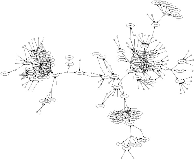
Ordinary graph:

This is a nice choice if you decide to omit smaller cities and focus on the major MTAs. Of course, you can control the colors and make the graph more vivid. alt text
(source: graphviz.org)

link

2
  • The second image from the graphviz site has a large amount of transparent space around it, could you find an alternate image or throw up a clipped version hosted elsewhere?
    – scw
    Commented Aug 5, 2010 at 18:54
  • 2
    +1, a graph approach is definitely worth considering. If you're using ArcGIS, perhaps also consider getting an eval for ArcSchematics. esri.com/software/arcgis/extensions/schematics/index.html Commented Aug 10, 2010 at 3:18
10

For more theoretical starter, you might be interested in browsing some of the papers about movement geovisualization from Natalia & Gennady Andrienko.


Update 1: GraphRECAP and FlowMap might also be of some help.


Update 2: There is a very useful article on the topic:

Jenny, B., Stephen, D. M., Muehlenhaus, I., Marston, B. E., Sharma, R., Zhang, E., & Jenny, H. (2016). Design principles for origin-destination flow maps. Cartography and Geographic Information Science, 1-15. (pdf)

@underdarkGIS built upon this and implemented first ideas in QGIS:

enter image description here


Update 3: Old project from JFlowMap was turned into new tool - Flowmap.blue (github). It promises publishing interactive flow maps representing data uploaded to Google Sheets:

flowmap.blue

flowmap.gl seems to be related(?) project.

--

7

In December 2012, Esri has published a tool for generating flow maps. It is written in Python and available for ArcGIS Desktop users. And there is a ArcGIS Blogs post on generating flow maps with the links to the tool, some more information, and test data for the tool. I believe this is the kind of tool you would use to generate trade flows, too.

2
  • +1 Thanks for this link. I've been looking for this for a while now.
    – Aaron
    Commented Apr 12, 2013 at 19:03
  • 2
    No problem. I believe this type of tools released by Esri should be somehow pooled to one place where it would be easy to browse them and search for. I miss ArcScripts :) Commented Apr 12, 2013 at 19:05
5

This is a hard problem that as far as I know is not solved. A look at the current literature (http://scholar.google.com/scholar?hl=en&q=spatial+interaction+data+visualization) seems to support this view. Alisdar Rae has some interesting maps in http://mediamapping.wikischolars.columbia.edu/file/view/Rae+-+2009+-+From+spatial+interaction+data+to+spatial+interacti.pdf that might help you but I'm not really sure that you get much information from them.

Oliver Duke-Williams did some nice visualizations of 10K+ ward to ward migrations from the 1991 GB Census that were a rectangular grid coloured by flow size but you loose the directionality again.

1
  • This paper (Wood et al., 2010) perhaps uses a similar concept in visualizing flows by using heat maps and small multiples. Do you have a particular example of the work by Duke-Williams you are referencing?
    – Andy W
    Commented Sep 13, 2011 at 17:05
5

Firstly, am I correct that the image shows a polygon to point relationship? If so you want to make sure that the polygons stand out more and should visually match the links. I would suggest choosing a group color (say blue), use light blue polygon fill, a dark blue border (helps the eye resolve the edge of the polygon) and medium blue for the link (associates the link with the polygon).

I would not use color to express the flow volumes in the links as you have done above, it will probably be too busy with lots of links, width and transparency are the variables to play with.

Secondly, the essence of the problem is volume of data, it isn't possible to produce a simple graph of the suggested 1000+ network as the visualization would be very cluttered. The two main suggestions so far seem to be to collate edges together (tree visualization) or to produce a graph where disconnecting the locations from real space in effect creates more space to visualize the connections (in the same way by losing true locations the famous tube map of London creates more 'space' in the centre of London to help visualize the connections between tube stations that are very close together). Both these have value but the graph has the obvious disadvantage that you whilst you've visualized the network, you have lost the real spatial positions.

An alternative is to cope with the data overload by splitting the data into groups. If there are no logical groups then directional segments (N, NE, E etc) is a possible way to do it. I would build a visualisation where all the relationships are grayed out, on mouse rollover the relevant polygons and links appear in bold color. A sub option would be to work the mouseover via toggle clicking or radio layer buttons where multiple sections could be chosen at once.

You could also produce an animation where the links are shown as 3D loops and the segments are ungrayed one by one with the camera viewpoint changing to make maximum use of the 3D (see http://senseable.mit.edu/obama/the_world.html which shows what I mean by loops and camera view changes). After the animation is shown, users could be allowed to explore the map freely with radio buttons controlling the segments or groups of data.

This is not that complex to achieve using Google Earth client or API and kml, I've blogged about producing loops here http://googleearthdesign.blogspot.com/2009/09/loop-links-in-google-earth.html and tours here http://googleearthdesign.blogspot.com/2009/08/creating-tours-howto-2-turning-elements.html. kml is pretty easy to work out http://code.google.com/apis/kml/documentation/.

Whilst I'm always one to worry that 'flashy' visualisations are clever but ineffective, I suspect this one will work be effective and the bonus is that the 3D animation will impress most clients.

4

you can try the method that i used in ArcGIS: Create a line layer from a point layer and csv data file.

one question regarding the lines: you are representing the world and all the lines converge or diverge from a given country, right? brasil, as in your case, has trading relations with a bunch of countries and it will be difficult to distinguish all the arrows.

1
  • I am trying to solve such trouble by having arrows of differing sizes representing different quantities. As the map will only focus on single product, I am sure it won't become too convoluted.
    – relima
    Commented Jan 9, 2011 at 21:19
3

Clearly a bit delayed, but this question: How to make radial flow map showing curved lines over short distances links to a great article by Esri called Creating radial flow maps with ArcGIS that will help answer your question.

Using the techniques described in the article, you can use the XY to Line tool in order to create your curved map. I put together a very custom ModelBuilder tool (custom to my needs) that would create the O-D table, populate the XY values of the source points, and then use the XY to Line tool to generate the Arcs. It involved a lot of "Add Field", "Add Join", "Point Distance", and "Calculate Field" functions, but it turned out very well, aside from arcs crossing the 180 degree line. Next step would be to try to force the arcs to stay "in frame" only (for example, from North America to Asia, crossing over the Atlantic instead of the shorter distance over the Pacific).

Flow map from ArcGIS

3

There seems to be multiple ways of looking at this. Either the lines are simple representations of numbers based on the records in points as graphics which would be good for one off maps, alternatively they are representations of value based on an attribute Value of a line. I would suggest creating a line Feature Class from all locations to all other locations, and then assign a separate unique ID for each line. Then you can create a join between your trade attribute Data and your linear feature data. The last stage is then to symbolise the lines based on the Quantities in your joined table. Then you can assign arrow size, directions and line information to each of the lines and customise.

1

enter image description here

You might get some ideas from those posts:

http://paulbutler.org/archives/visualizing-facebook-friends/

http://lin-ear-th-inking.blogspot.com/2010/12/visualizing-geodetic-information-with.html

0

I realize this post is old but I'm sure many others have the same question, most likely in creating a simple flow map for a school project or paper. If you are looking for a simple trade flow map you might be surprised by the ease and effectiveness of using powerpoint. It's much easier to create really nice arched arrows in powerpoint than it is in Illustrator and certainly easier than in ArcMap. Obviously if you are looking for something more in depth and the actual widths of the arrows needs to accurately represent your export numbers than this would not be your best option.

Not the answer you're looking for? Browse other questions tagged or ask your own question.