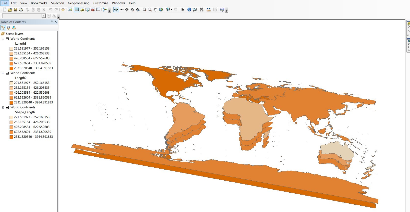
I have a base map made up of three hundred polygons,
Each polygon has lots of attribute values(For example, each week/month get a value). But I only want to draw one picture(due to page limitation) to represent the variation info.
I have tested two methods, one is layers, one is "subplot"(MATLAB).
1.Every monthly attribute can be drawn as a layer, so the picture contains 12 layers. But the result is not clear for some areas, some polygons are covered by others.
2.Draw subplot, a page can contain 12 subplot images, but 52 (week number of a year) is too much for one picture.
I could use both two method with my monthly value, but none for weekly value. So my question is: Is there any other method for visual representation.
I can't paste my own data due to secrecy agreement, but here is example in ArcScene using ArcGIS sample data.( Only three layers was used in sample case, but my own data has 12 or 52 layers. I want to show all the layers using less even only one picture.)
PS: I don't know if there is any better solution except above two method.
Need your help.
