1

I searched GIS.SE for "Desktop vs. Mobile" and didn't get anything helpful, so I guess I'll be the one to ask.

Question: With respect to Internet mapping applications, is it better to have separate sites for desktop and mobile, or to pursue one highly adaptable site (Responsive Web Design) that attempts a best-fit across all devices?

Background: A quick review of this problem reveals this article (Nielsen, April 10 2012) where the author advocates separate sites for desktop and mobile, as well as this rather strong rebuttal (Lawson, April 19 2012) encouraging development of one well-planned site capable of serving a variety of devices. Other articles discuss various pros and cons, but ultimately remain neutral. [1] [2] [3]

My Own Experience: My first attempt at this was the one-site-fits-all approach, and while it renders properly on most mobile devices, I find it lacking with respect to the total experience. I want better use of screen area. I want bigger control surfaces to prevent "fat fingering" consequences. And frankly, unlike Lawson, I think our mobile users probably do have different goals than our desktop users. I doubt our mobile users care about our 2-foot elevation contours, but I bet they commonly want as much parcel data as they can get, preferably in a layout that's convenient on mobile.

At the same time, maintaining two separate web mapping clients seems like a bad idea. ..then again, maybe that's a false economy? Perhaps two simpler, more focused sites would be easier to maintain than one burgeoning, more complex site?

Denouement: The Lawson article suggests there will always be edge cases favoring multiple sites over responsive design, and I'm starting to believe Internet mapping is one of the edge cases. So I'm asking the community to provide insight. Which of these strategies do you prefer and why? I figure the better strategy should organically up-vote its way to the top, providing a kind of de facto authentication of the approach that's better suited for Internet mapping applications.

2
  • FWIW I don't see how to tag this as "Community Wiki", so I suppose that is the prerogative of the moderators?
    – elrobis
    Commented Mar 4, 2014 at 20:35
  • 2
    The trend I see is smaller, more focused web apps that do one thing well. Smaller codebases are easier to iterate upon than larger ones. If it's not too much work to support mobile and desktop in the same app, go for it, otherwise divide and conquer. I guess a lot depends on the app, requirements and frameworks involved.
    – blah238
    Commented Mar 4, 2014 at 21:04

1 Answer 1

1

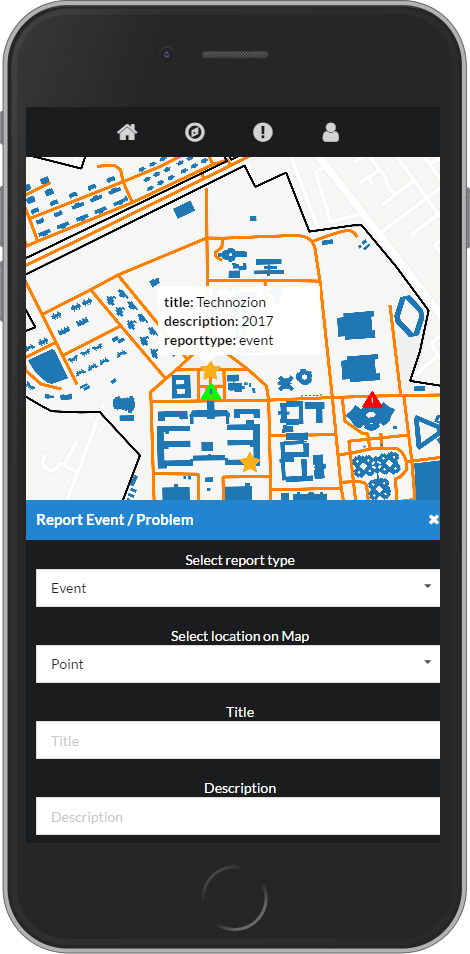
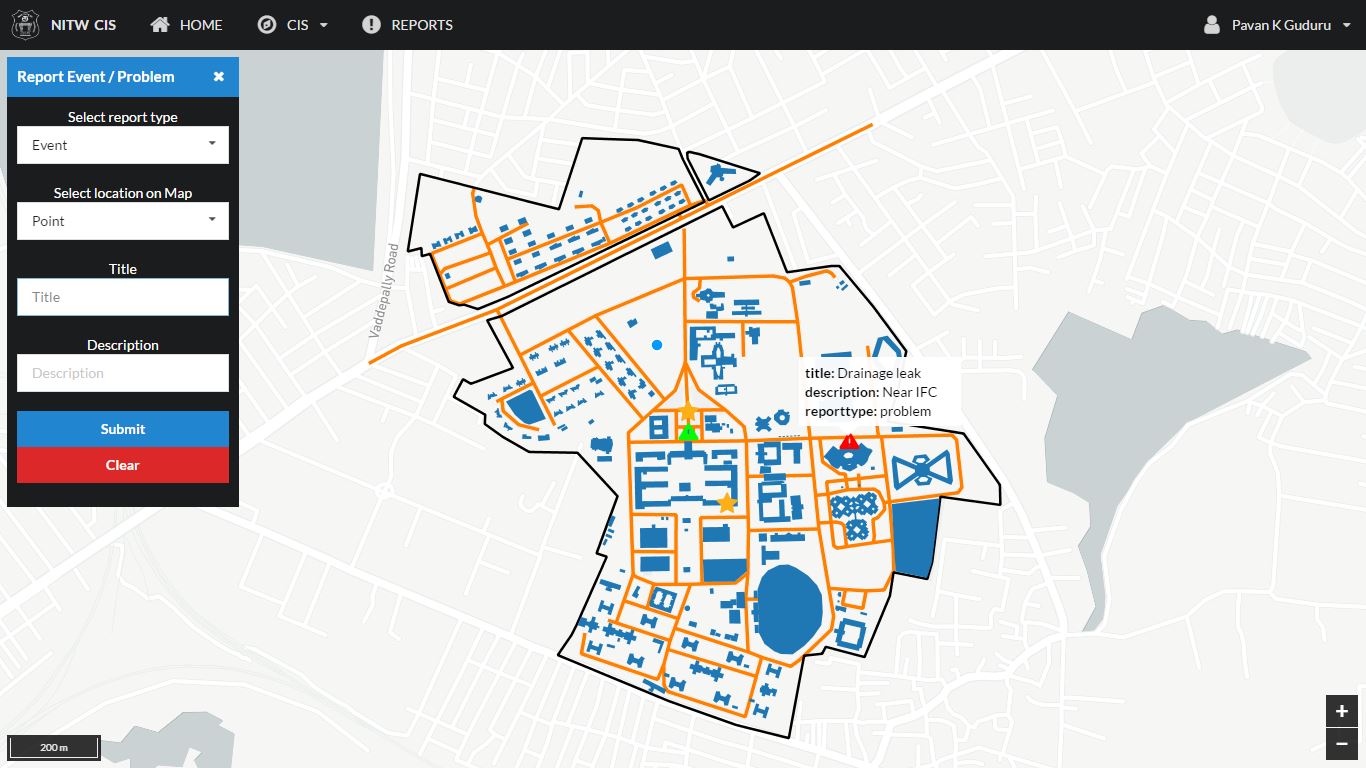
I developed a WebGIS application as a part of my thesis work. The idea was to display and interact with the data using the web view and collect field data using a mobile application. But I couldn't really finish the mobile application so I decided to make it responsive so that the web application can be accessed even on a mobile/tablet using a browser.

I used Semantic UI for this purpose (there was no specific reason for choosing this I just wanted to try it as I have used bootstrap before). It provided computer, tablet or mobile only classes to control what can or cannot be displayed on a particular device. I ended up writing the same code twice on a page with little changes required for mobile view (I'm sure this must be due to my inexperience with Semantic UI). Though this was a bit troublesome I did manage to optimize the interface for both desktop and mobile view. But this didn't affect the functionality of the application in any manner. It could be because of the simple nature of the application. Desktop View Mobile View

So I believe in the end it depends up on the purpose of the application, its complexity and usability. As having a separate site for smaller can help us in limiting the functionality of the site and making it more usable whereas a simple application without a lot of functions can be made usable just fine with a responsive design.

1
  • +1 and nice work on your application. Since asking this question, we ultimately created a single app driven by a JSON config file that accommodates both application- and layer-level plugins, and which was both desktop/mobile/touch friendly using dynamic UI detection. Since writing it, we have re-used it in-theme with @blah238's comment above, where we just reconfigure it and write a plugin or two to support the immediate needs of the application. In my opinion it's been a very effective solution, and it's allowed us to respond to new requests with fast turn around times.
    – elrobis
    Commented Aug 25, 2017 at 21:39

Your Answer

By clicking “Post Your Answer”, you agree to our terms of service and acknowledge you have read our privacy policy.

Not the answer you're looking for? Browse other questions tagged or ask your own question.