3

I have a SpatialLinesDataFrame dataset of rivers in R. The dataset consists of lines (river segments) with a "Turbidity" attribute. I want to create a map and legend, where:

  • Turbidity between 0 and 10 is yellow
  • Turbidity between 10 and 20 is orange
  • Turbidity between 20 and 30 is red

Here is my sample dataset:

library(sp)

#create the sample SpatialLines with 3 lines and 1 attribute
x1 <- c(15.10,15.20, 15.25)
y1 <- c(48.9, 49.1, 49.0)
Line1 <- Line(cbind(x1, y1))
LineString1 <- Lines(list(Line1), ID=1)

x2 <- c(15.25,15.21)
y2 <- c(49.0, 49.12)
Line2 <- Line(cbind(x2, y2))
LineString2 <- Lines(list(Line2), ID=2)

x3 <- c(15.21,15.12)
y3 <- c(49.12, 49.05)
Line3 <- Line(cbind(x3, y3))
LineString3 <- Lines(list(Line3), ID=3)

spLines <- SpatialLines(list(LineString1, LineString2, LineString3))
spLinesDF <- SpatialLinesDataFrame(spLines, data.frame(Turbidity=c(5, 24, 16), row.names=c(1, 2, 3)))

#this is the color breaks that I want to use in map and legend
breaks = c(0, 10, 20, 30)
colors = c("yellow", "orange", "red")

#this doesn't assign the correct colors to my line values
plot(spLinesDF, col=colors)

What commands do I use to match the color breaks (0, 10, 20, 30) with the colors(yellow, orange, red) and with the Turbidity attribute values in my map and in the legend?

I know that for raster I could use simple commands like:

brk <- c(0, 10, 20, 30)
col <- c('yellow', 'orange', 'red')
plot(raster, col=col, breaks=brk)

But for SpatialLines, the plot doesn't appear to support the color breaks parameter.

0

3 Answers 3

3

Here is one suggestion:

require(ggplot2) #function fortify, function ggplot
require(plyr) # function join

  spLinesDF@data$id = rownames(spLinesDF@data) #join id column to data slot on SpatialLinesDataFrame
  df = fortify(spLinesDF,region="id") #create data frame from SpatialLinesDataFrame
  df = join(df, spLinesDF@data, by="id") #add Turbity information to the data frame object

  df$Turbidity=cut(df$Turbidity,breaks=c(0,10,20,30)) #set breaks

  axis.size = 14 #set axis.size
  axis.label.size = 11 #set axis labels size
  legend.size = 13 #set legend size

#plot graph with R package ggplot
ggplot(data=df,aes(x=long,y=lat, colour=Turbidity)) +
      geom_path() +  
      scale_colour_manual(values = c("yellow","orange", "red")) +
      xlab("Longitude") + ylab("Latitude") +
      coord_equal() + 
      theme_bw() + 
      theme(panel.border=element_rect(color="black"),
            panel.grid.major=element_blank(),
            panel.grid.minor=element_blank(),
            axis.title.y=element_text(size = axis.size, vjust=+0.2),
            axis.title.x=element_text(size = axis.size, vjust=-0.2),
            axis.text.y=element_text(size = axis.label.size),
            axis.text.x=element_text(size = axis.label.size),
            legend.title=element_text(size = legend.size))

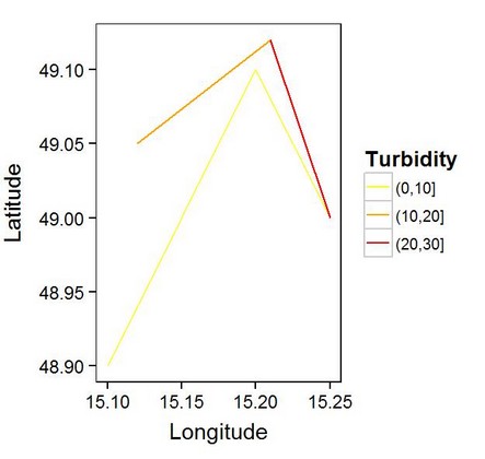
enter image description here

2

Use cut to build the breaks, and auto-coercion of the cut factor to integer:

plot(spLinesDF, col=colors[cut(spLinesDF$Turbidity, breaks)])
1
  • For adding the legend, the following commands worked: legend("topleft",legend=levels(cut(linPtsF$Turbidity, breaks)), lty=c(1,1,1), col=colors) Commented Apr 3, 2014 at 7:59
2

I always appreciate the application of "ggplot" but this can easily be done using the low level plotting functions available in R. I like @mdsumner's solution because it is so efficient. However, you do not have clear control of a specific color pallet.

A simple approach is to use "ifelse" to create a vector of equal length to your variable, containing the desired colors.

Here is an example.

require(sp)

#create the sample SpatialLines with 3 lines and 1 attribute
L1 <- Lines(list(Line(cbind(c(15.10,15.20,15.25),c(48.9,49.1,49.0)))), ID=1)
  L2 <- Lines(list(Line(cbind(c(15.25,15.21),c(49.0, 49.12)))), ID=2)
    L3 <- Lines(list(Line(cbind(c(15.21,15.12),c(49.12, 49.05)))), ID=3)
      L <- SpatialLinesDataFrame(SpatialLines(list(L1, L2, L3)),           
              data.frame(Turbidity=c(5, 24, 16),row.names=c(1, 2, 3)))

# Create a color vector that is the same length as y
( y.col = ifelse( L$Turbidity <= 10, "yellow",
            ifelse( L$Turbidity > 10 & L$Turbidity <= 20, "darkgoldenrod1",
              ifelse( L$Turbidity > 20, "red", NA) ) ) ) 

# Plot the sp object passing the color vector to the col argument
plot(L, col=y.col)
  box()
    legend("topleft",legend=c("low","med","high"),
           lty=c(1,1,1),col=y.col[c(1,3,2)]) 

Your Answer

By clicking “Post Your Answer”, you agree to our terms of service and acknowledge you have read our privacy policy.

Not the answer you're looking for? Browse other questions tagged or ask your own question.