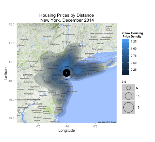
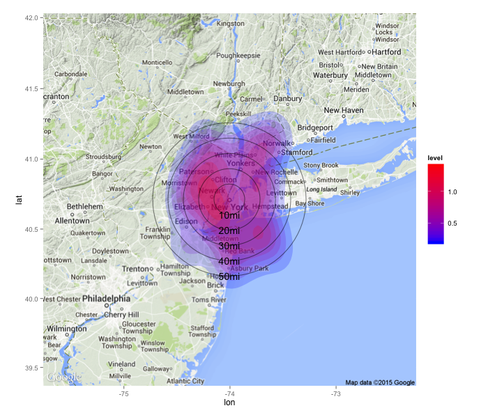
I'm looking to generate a geographic heatmap (using 'ggmap') that overlays some dimension (to start, housing prices) over the lat/lon near a city center. Then I want to create circles of equi-distant spacing (i.e. 10 miles per circle) to get an idea how far out. I would also like my heatmap to go from blue to red for low to high of the dimension. I've been struggling with this for a day and this is as far as I got:
require(ggmap)
require(ggplot2)

ggmap(NewYork)
  + stat_density2d(data=positions, mapping=aes(x=lon, y=lat, fill=..level..), geom="polygon", alpha=0.2)
  + geom_point(shape=1, aes(x = housing.data.NY$Longitude, y = housing.data.NY$Latitude, size=sqrt(distance)), data = positions, alpha = .9, color="black")
  + scale_size(range=c(3,20))
  + labs(x = "Longitude", y = "Latitude", fill = "Housing \n Price Density")
  + ggtitle("Housing Prices by Distance\n New York, December 2014")
The code does the following:
- Load the created GoogleMap file as a layer
- Create price heat maps
- Add concentric circles with radius ~ distance from city center (NEEDS WORK)
- Scale the circles (or atleast try to)
- Add labeling to make the plot more legible
- Add plot title
The code produces the following output:


