1

I'm interested in creating a graph showing the frequency of my data based on the categories of my Quantiles symbology. The Graphs Manager does not seem to allow me to do that, so I was wondering if there is another way to do so.

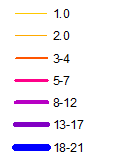
For example this is an image of the different classes I have using the Quantile symbology,

enter image description here

and I would like a histogram/vertical bar graph showing a count by class.

The current "Create Graph" wizard only allows me to create graphs based on my original dataset in the attribute table. My original attribute table does not show the breakdown by class.

Does anyone know a solution to this?

1
  • Did I understand you right that you want to count how many features have value of 1, how many features have value of 2, how many features have value of from 3 to 4.... up to how many features have value from 18 to 21? If so, you would need to do custom counting using arcpy (Python) and then build a plot either using a result count table or using matplotlib. You won't be able to use an out-of-the-box tool for this. Would you accept a Python script that would do this for you? Commented Feb 13, 2018 at 7:36

1 Answer 1

1

In this case, you can group your data first in a table using (summary statistics) for example (by range) and that would create a new table with your grouped values.

Then create a graph, and for the x field option choose (the new column that you created for the ranges).

The following link explains these processes well

Grouping Values

Your Answer

By clicking “Post Your Answer”, you agree to our terms of service and acknowledge you have read our privacy policy.

Not the answer you're looking for? Browse other questions tagged or ask your own question.