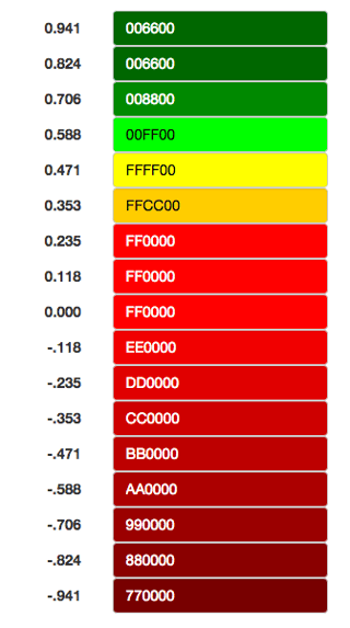
Currently, I have the NDVI values, and I transformed it from [-1, 1] to [0, 255]. Now my question is how do I visualize either of these value? My first thought is to make a color map similar to the image below. Are there any "official/mainstream" way besides assigning arbitrary colors to values?
1 Answer
I have been working with NDVIs for years and I haven´t heard of an official palette to visualize data. My suggestion is using a palette that highlights the type of data in which you are interested. For example, if you are interested in vegetation only, values below -0.2 (before conversion to 8 bit) are not significant, so you don´t need different colors beyond that threshold.

