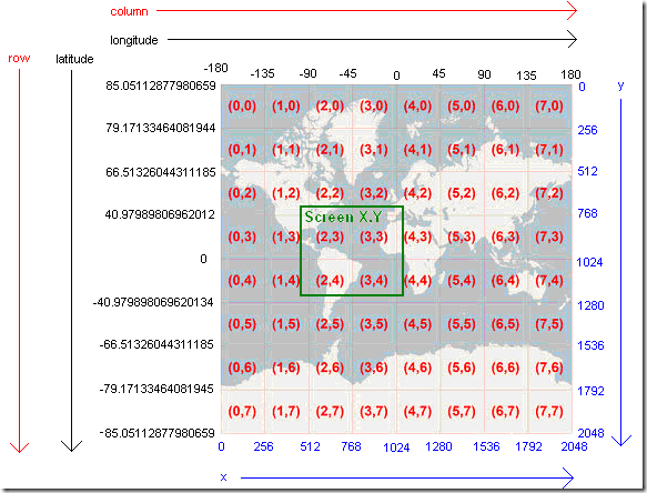
As underdark answered, it's related to how map projections are used to model the earth in two dimensions. In this particular case, the first image shows the world in a Mercator projection, with data above 85N and below 85S omitted. The map is labeled with latitude and longitude values, because those are more understood than the actual Mercator values in meters. The particular latitude value, 85.05112877980659, was chosen because it creates a square. Thus making it easy to divide up data into square tiles for storage and handling.
Mercator maintains the shape of features, but not the areas nor distances.
The 2nd picture shows the earth in what I call a pseudo-Plate Carree projection. Data in a geographic coordinate system (latitude-longitude) is simply displayed. The angular values are treated as if they're linear. It creates great distortion east-west as you move away from the equator.


