You are really just asking about an effective color scheme to distinguish between foreground and background in this particular setting. I've speculated that the dark backgrounds work similar to the high contrast screen options on the computer, but I am not familiar with any academic work examining this.
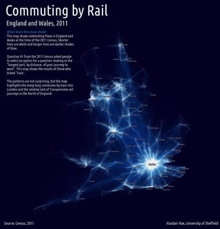
Alasdair's map (and the facebook friends map) are created by superimposing a series of highly transparent thin lines. The lines in those examples are weighted as well, and it appears the ramp goes from blue to white. Blue seems to work nicely on a black background map, but I suspect any fully saturated color-to-white will do, and when stacked in dense areas will come to the foreground.
Note if you had a white background map you would want the color ramp to go from lighter-to-darker, which ends up being more difficult to make it look nice in my experience. (They probably are just as effective data visualization though IMO.) It is a tradeoff with the dark backgrounds -- they are more difficult to show thematic information in the background, but that may be considered a good thing as it focuses the attention on the flows.
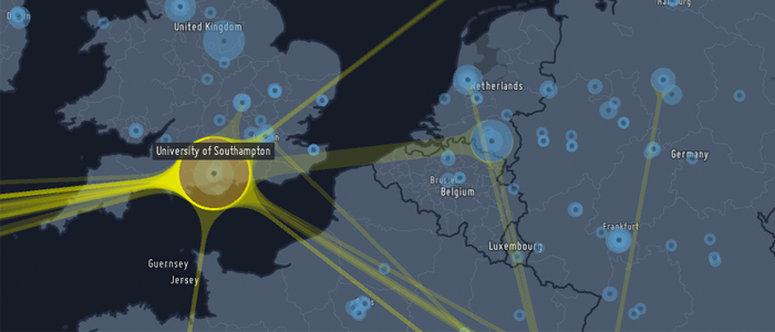
Pro-tip with flow maps like these, the long lines need to be drawn first, and then the smaller lines on top. Else the dense areas are somewhat muted because of the lines on top.


