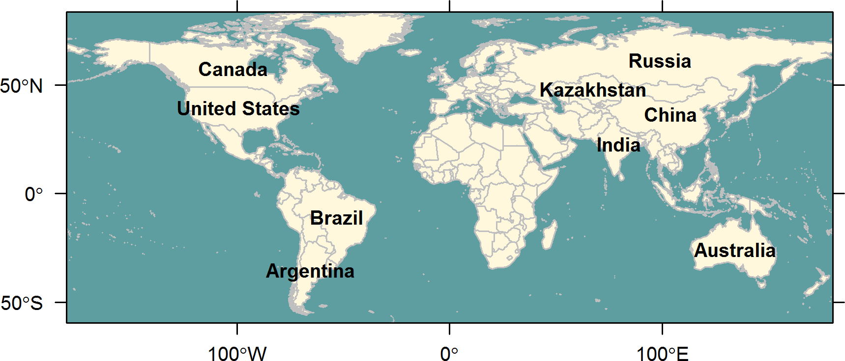
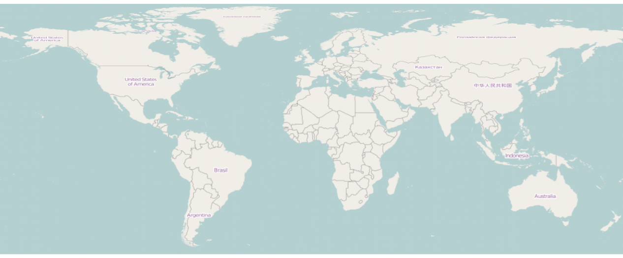
The following code might seem a little long-winded as it represents a manual approach rather than relying on OpenStreetMap, but maybe it's of any help to you anyway. I took the country boundaries and the referring country labels from the wrld_simpl dataset (class 'SpatialPolygonsDataFrame', projected in EPSG:4326) that comes with maptools. The shapefile data has been cropped by the extent you mentioned above.
## sample data
library(maptools)
data("wrld_simpl")

## remove antarctica
library(raster)
ext <- extent(c(-179.99999, 179.99999, # xmin, xmax
                -60, 85))              # ymin, ymax
spy_world <- crop(wrld_simpl, ext)
With regard to label placement, only countries with an area larger than 250,000 (* 1,000 hectares) are labeled at the moment, but you might wish to adjust this to your personal preferences.
## countries larger than 250,000 (* 1,000 ha)
int_id_large <- spy_world@data$AREA > 250000
spy_world@data$LABEL <- " "
spy_world@data$LABEL[int_id_large] <- as.character(spy_world@data$NAME[int_id_large])
I wrote a small code chunk that identified the largest sub-polygon per country and calculated the center coorinates of it based on rgeos::gCentroid. Otherwise, some labels would have been poorly positioned (e.g. US with Alaska, Hawaii, etc. that quite distorted the center coordinates as compared to the mainland area).
## centroid coordinates of largest polygon per country
library(rgeos)

ls_spt_cntr <- lapply(spy_world@polygons, function(i) {

  # areas of sub-polygons per country
  num_area <- sapply(i@Polygons, function(j) {
    attr(j, "area")
  })

  # polygons to spatial polygons
  py_largest <- i@Polygons[which.max(num_area)]
  py_largest <- Polygons(py_largest, ID = i@ID)

  spy_largest <- SpatialPolygons(list(py_largest),
                                 proj4string = CRS(proj4string(spy_world)))

  # center coordinates
  gCentroid(spy_largest)
})
spy_cntr <- do.call("rbind", ls_spt_cntr)
Finally, I visualized the polygons using spplot along with lattice-powered label placement via ltext.
## visualize
library(latticeExtra)

png("worldmap.png", width = 16, height = 12, units = "cm", res = 300)
p <- spplot(spy_world, "NAME", col.regions = "cornsilk", colorkey = FALSE,
            par.settings = list(panel.background = list(col = "cadetblue")),
            col = "grey75", scales = list(draw = TRUE))

p +
  layer(ltext(spy_cntr@coords, labels = spy_world@data$LABEL,
                font = "bold", cex = .8))
dev.off()


