0
Bornholm_data <- geo_RH %>% 
  filter(KOMNAVN=="Bornholm") 


tm_shape(geo_RH) +
  tm_fill(col="Befolkning") +
  tm_borders()  


mainland <-  tm_shape(mainland_data, projection = 0) + 
  tm_fill(col="AREAL") +
  tm_polygons() + 
  tm_layout(frame = FALSE)   


Bornholm_map   <-  tm_shape(Bornholm_data) + 
  tm_fill(col="AREAL") +
  tm_polygons() + 
  tm_layout(title = "Bornholm", frame = TRUE, bg.color = NA, 
            title.position = c("RIGHT", "TOP"))


mainland 
print(Bornholm_map, vp = viewport(x = 0.8, y = 0.5, width = 0.3, height = 0.2))

enter image description here

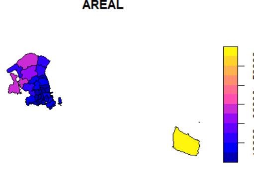
I know that the color on the map is not correct because a simple plot produces this which is the reality enter image description here
2
  • In short, the problem here is that the Bornholm map is an independent map of a single row of the data and so is using a scale of its own, and so its unrelated to the scale for the larger map.
    – Spacedman
    Commented Jan 31, 2019 at 12:15
  • @ Spacedman: Is it possible to fix it?
    – xhr489
    Commented Jan 31, 2019 at 12:18

1 Answer 1

1

Here's a way. Instead of taking one element out of the data and making a map with it, make two maps with all the data, but the inset map is cropped to the element you want to focus on. Here's an example using the data(World) dataset you get with tmap:

Make a world map using pop_est for the fill colour:

> world = tm_shape(World) + tm_fill("pop_est")

India is the 74th row:

> World$name[74]
[1] India
177 Levels: Afghanistan Albania Algeria Angola Antarctica Argentina ... Zimbabwe

Make an India map with no legend (so we don't get a tiny legend in our inset map). I use the bbox= argument to set the bounds to the box that contains India:

> india = tm_shape(World, bbox=st_bbox(World[74,])) + 
      tm_fill("pop_est", legend.show=FALSE)

Set a viewport and combine the world and india:

> vp = viewport(.3,.3,.2,.2)
> world
> print(india, vp=vp)

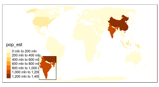
enter image description here

Worst cartography ever, but shows that India is coloured according to the main legend.

1
  • @ Spacedman: So the complete solution actually also needs to limit the x and y axis in the original "plot" as you explained here [link] (gis.stackexchange.com/questions/310485/…). Why is tmap better than ggplot? Will this issue be easier to solve with ggplot?
    – xhr489
    Commented Feb 1, 2019 at 9:06

Your Answer

By clicking “Post Your Answer”, you agree to our terms of service and acknowledge you have read our privacy policy.

Not the answer you're looking for? Browse other questions tagged or ask your own question.