This is related to a previous question How to determine projection parameters when customizing a projection I posted.
I am trying to quantitatively evaluate scale distortion associated with choosing different projection center, center azimuth, and scale factor values for a Hotine Oblique Mercator (HOM).
1) Is the following method a reasonable approach?
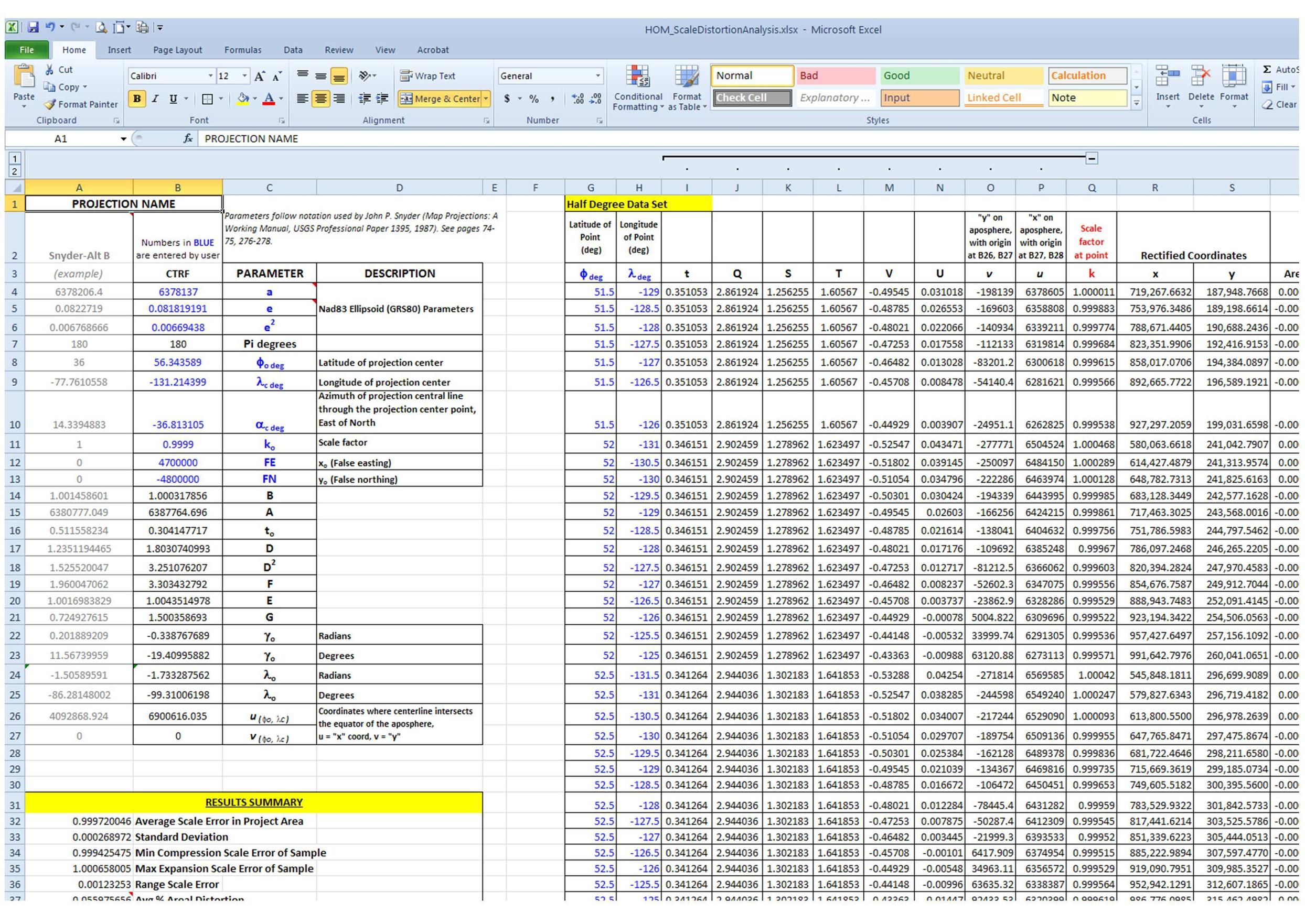
Using the same concept as the spreadsheet whuber created for evaluating Albers scale distortion, create a spreadsheet filled with Snyder’s equations for the HOM (ellipsoid formula, “alternative B”, page 74 in “Map Projections – A Working Manual”). The user inputs the chosen ellipsoid parameters (a and e), and values for the "customized" projection parameters (lat/long of projection center, centerline azimuth, scale factor, and false easting/northing). The rest of the projection constants are then automatically calculated. The spreadsheet also contains cells for each lat/long pair (in half-degree increments, or whatever increments are desired) across the projection area. The scale factor and rectified coordinates at each lat/long point are automatically calculated when changing any of the projection parameters. Now, the scale factor can be numerically evaluated 1) by computing an overall average and range of scale distortion across the projection region, and 2) the point coordinates and their associated scale factors can easily be imported into ArcMap to create a visual picture of how the scale distortion is distributed. Obviously the results are just a sample and will vary depending on how many lat/long locations are evaluated, but does this sound like a valid methodology? Spreadsheet looks like this:

2) I've also been using a distortion analysis tool created by Michael Braymen that calculates scale (and area and angular) distortion for any given projection using an "asterisk analysis" that approximates a Tissot's Indicatrix.
The tool's Python script can be viewed or there is a also Powerpoint available that describes the tool. I have modified the script to create 50 meter asterisk lines (i.e., a 50 meter ellipse "radius"), instead of the default 5000m.
When I compare the results from this tool against what is produced by the spreadsheet method in #1 above, the numbers do not agree very well. For example:
Sampling approximately the same number of locations (~400) across the same projection extents yields:
Avg Scale Error using method under #1 above = 0.9997200465 (0.027995%)
Max "compression" scale error, Method 1 = 0.9994254755 (0.057452%)
Max "expansion" scale error, Method 1 = 1.0006580056 (0.065801%)
Range scale error, Method 1 = 0.0012325301 (0.123253%)Avg Scale Error using method under #2 above = 1.0001550206 (0.015502%)
Max "compression" scale error, Method 2 = 0.9998956844 (0.010432%)
Max "expansion" scale error, Method 2 = 1.0010584928 (0.105849%)
Range scale error, Method 2 = 0.0011628084 (0.116281%)
Can anyone think of a reason the results would be so different? Can I interpret the scale factor at a point (method 1) as the scale distortion of an "infinitely small circle" at that point?
Also, I am aware of the many discussions on creating Tissot's Indicatrices, so I don't need to be pointed to those ... unless there is some vetted tool out there that accurately, quantitatively evaluates distortion for user-defined regional (i.e., not global) areas, accepts the HOM, is easily implemented, and is nearly free :)? Actually, assuming the tool used in Method 2 is accurate, it work's great for my purposes. The drawback is it takes about 9 hours to run on my PC for each evaluation.
