It would be helpful if you include a sample dataset with your question next time.
That said, I've acquired a river map from the World Resources Institute's Aqueduct Floods Hazard Maps; specifically, this one.
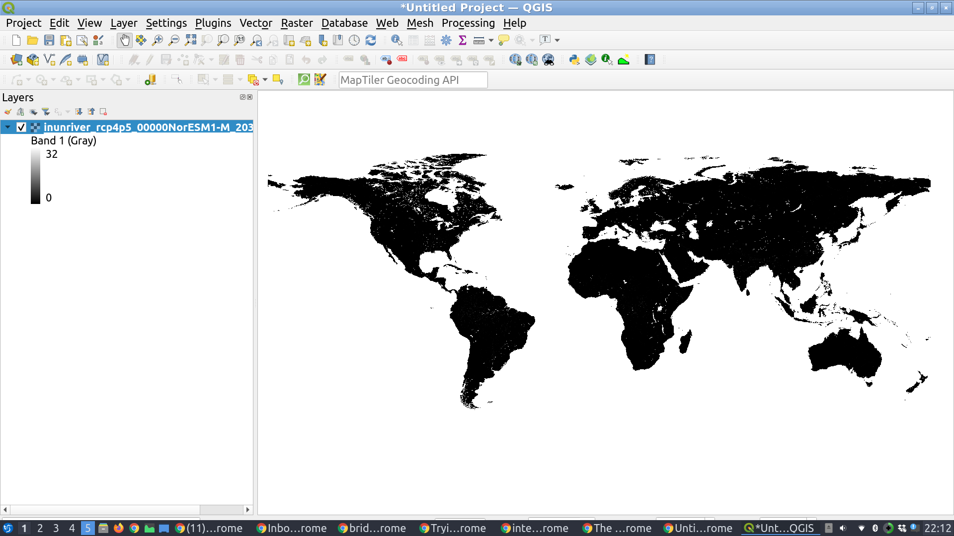
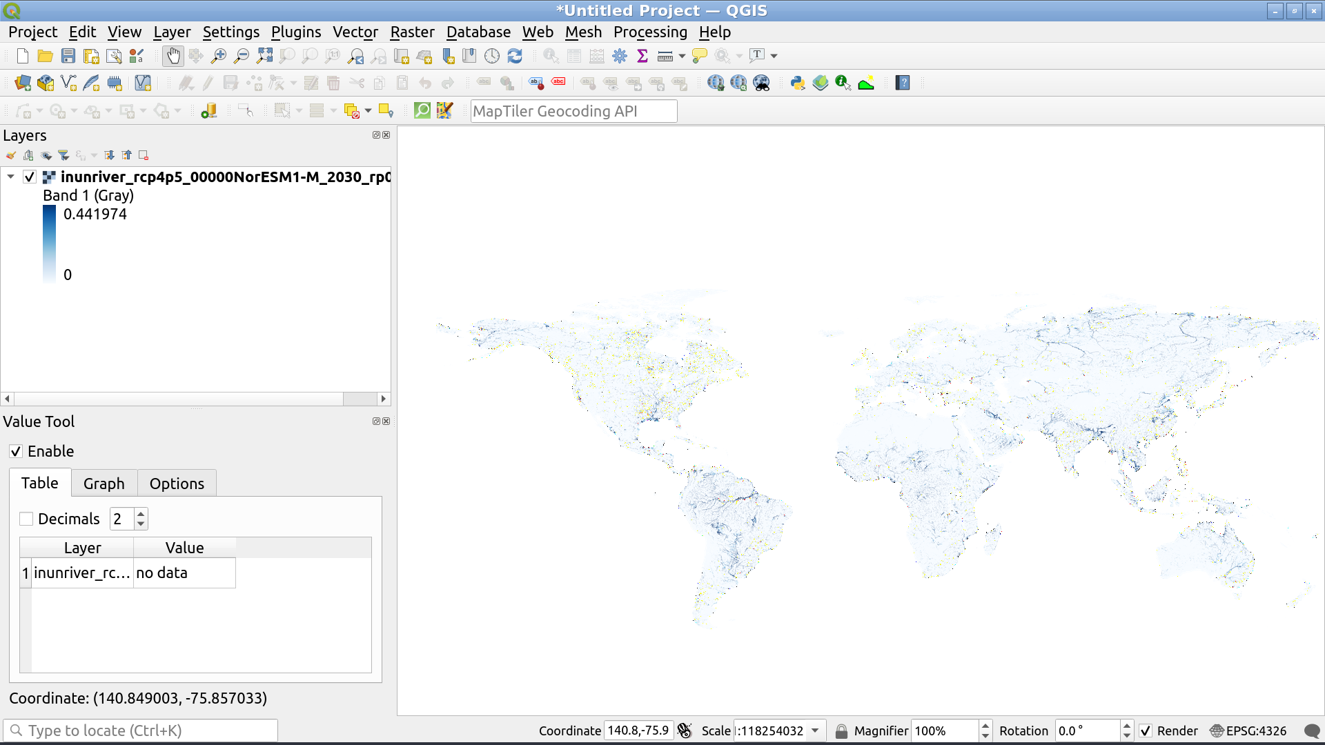
When we first load this data into QGIS we see pretty much nothing:

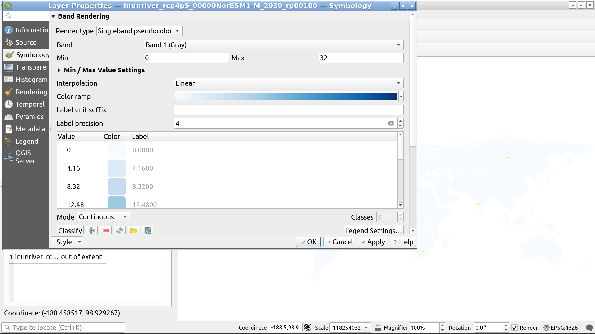
So our first step is to change the colour of water to blue. We do this by right-clicking on the layer in question and clicking Properties, or simply by double-clicking on the layer's colour scale. We then select the "Blues" colour ramp.

Next, note the range of the data: it's from 0 to 32. According to the documentation this represents "inundation depth in meters for coastal and riverine floods".
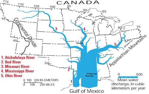
But, when it comes to rivers, our default assumption should always be that the datasets associated with them will have strong nonlinearities. To understand why consider that a river network is formed by, roughly speaking, by rivers of approximately equal size joining together to form a single river that's twice as large. If you repeat this process a few times you end up with an exponential size distribution. Strahler numbers quantify this. The result is something like this:

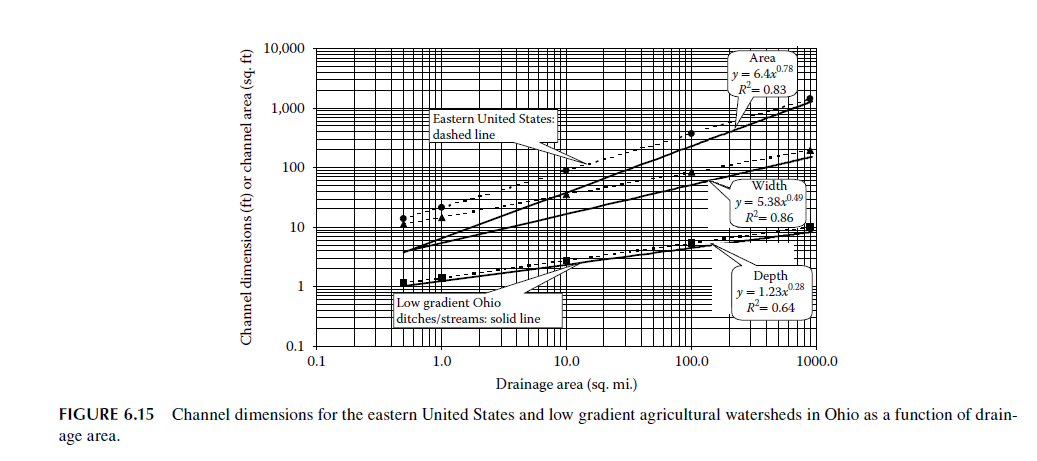
These exponentials don't just hold for volume: they also apply to other dimensions of rivers:

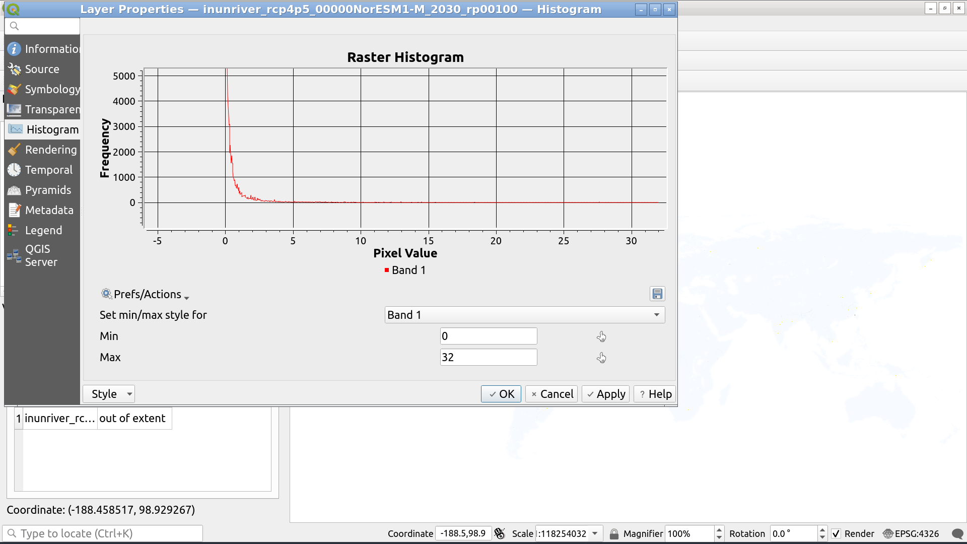
The implication is that using a linear color scheme with rivers will almost always be a bad choice. And so it is here. Looking at the histogram of your data shows a clear exponential curve:

The best way to deal with this would be to use a logarithmic transform on the data; however, QGIS does not currently offer this as an option for rasters and no one seems to have backed up the source code for the one plug-in that provided this option.
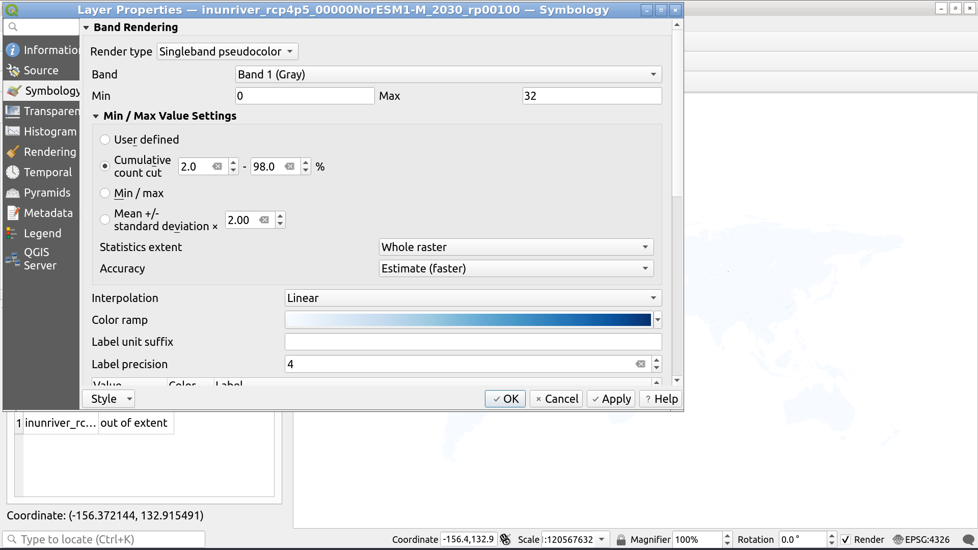
No matter, we can deal with it by asking QGIS to choose a more appropriate data range by throwing out outliers. To do so we:
- Select "Min/Max Value Settings" in the layer's Symbology menu.
- Select Cumulative count cut with 2% and 98% as the bounds (adjustable), choose the whole raster as the statistics extent, and use "Estimate" for accuracy (otherwise the operation will be very slow):

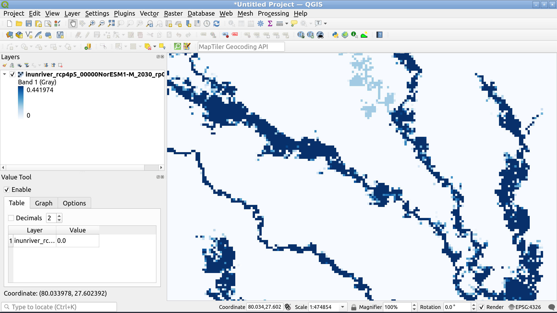
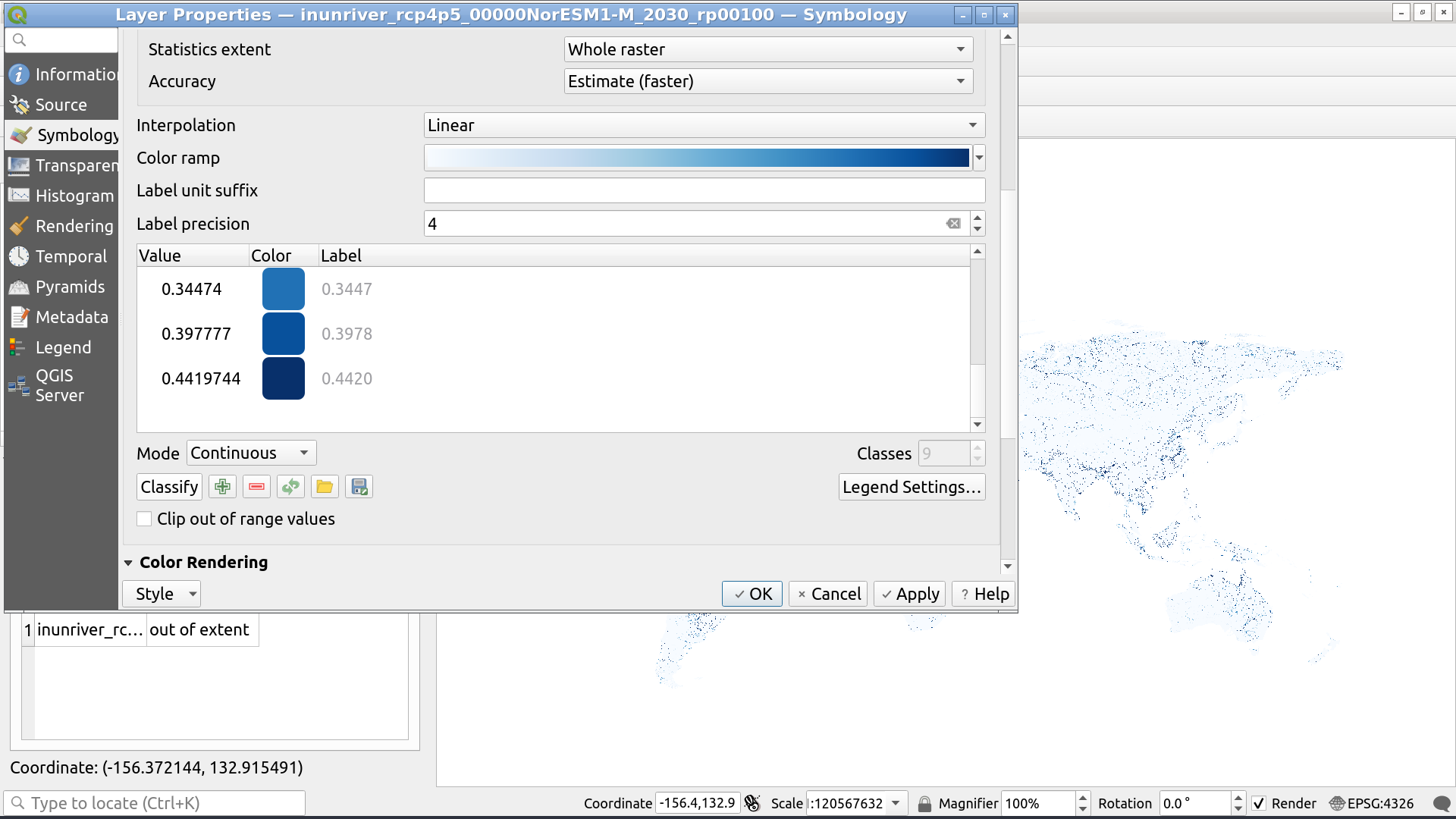
This shows us a range of 0 - 0.4419744.
Now, we reclassify our data by hitting the "Classify" button below the color-value menu:

Note that we do not select "Clip out of range values". This would make the big numbers all disappear. What we want, instead, is for them to saturate on our colour scale.
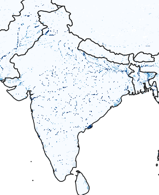
This leaves us with the a choppy, pixelated image not unlike the first image you show as being "beautiful plots showing connected flow paths". If you look at the smaller rivers on the left-hand side (closer to the United Provinces and moving towards the Punjab) there's actually significant disconnection.

The reason is that the smaller rivers are often only a single pixel wide and, by default, QGIS uses "Nearest Neighbour" resampling because it is fast. Nearest neighbour is going to (essentially) assign the value of the pixel in the zoomed out map based on a single pixel value from the zoomed in map and, odds are, it's going to miss the rivers we're interested in.
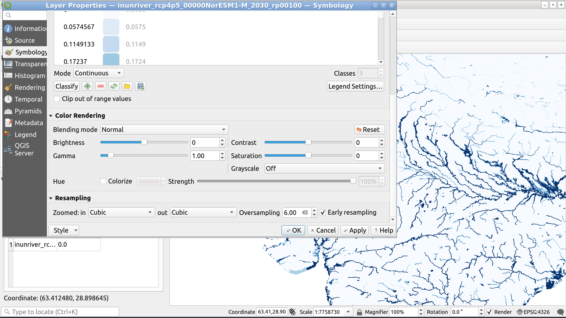
To fix this, we want to instead use something like "Bilinear" or "Cubic" resampling, like so:

I achieved my best-looking results by using Cubic resampling with 6.0 oversampling and no early resampling.
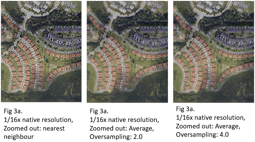
The effect of nearest neighbour, bilinear, and cubic sampling is better seen here:

And the effect of oversampling can be seen in the right two images here:

This answer goes into much more detail about these settings.
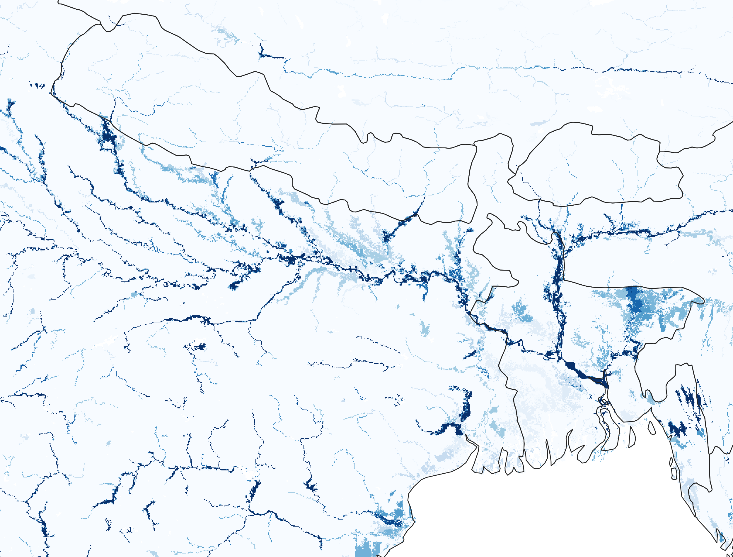
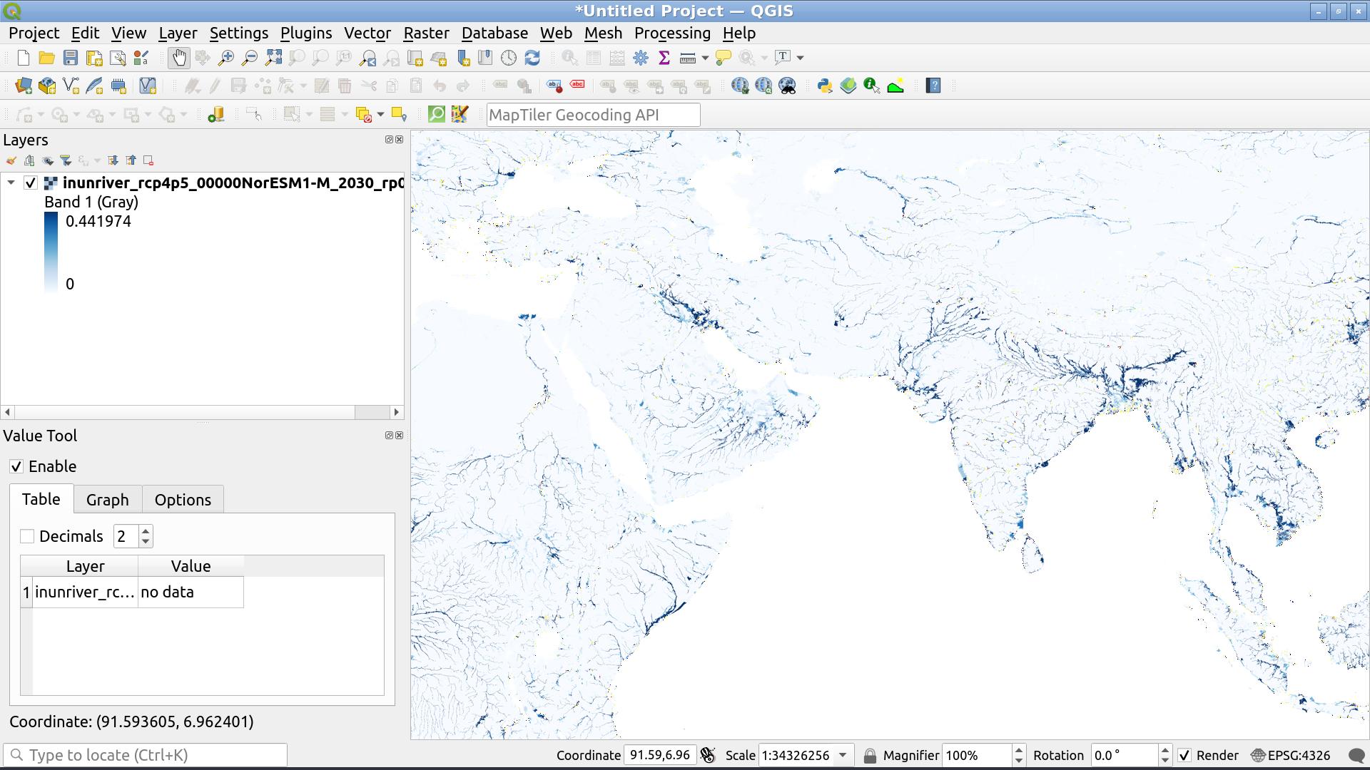
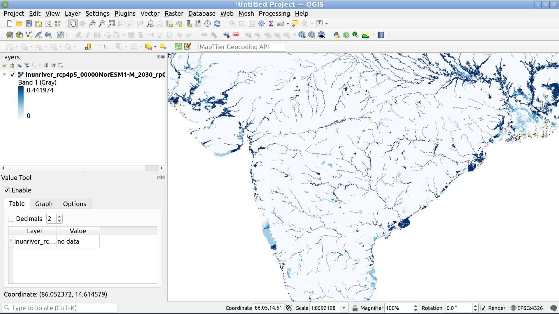
The final map is something that looks good at most resolutions:


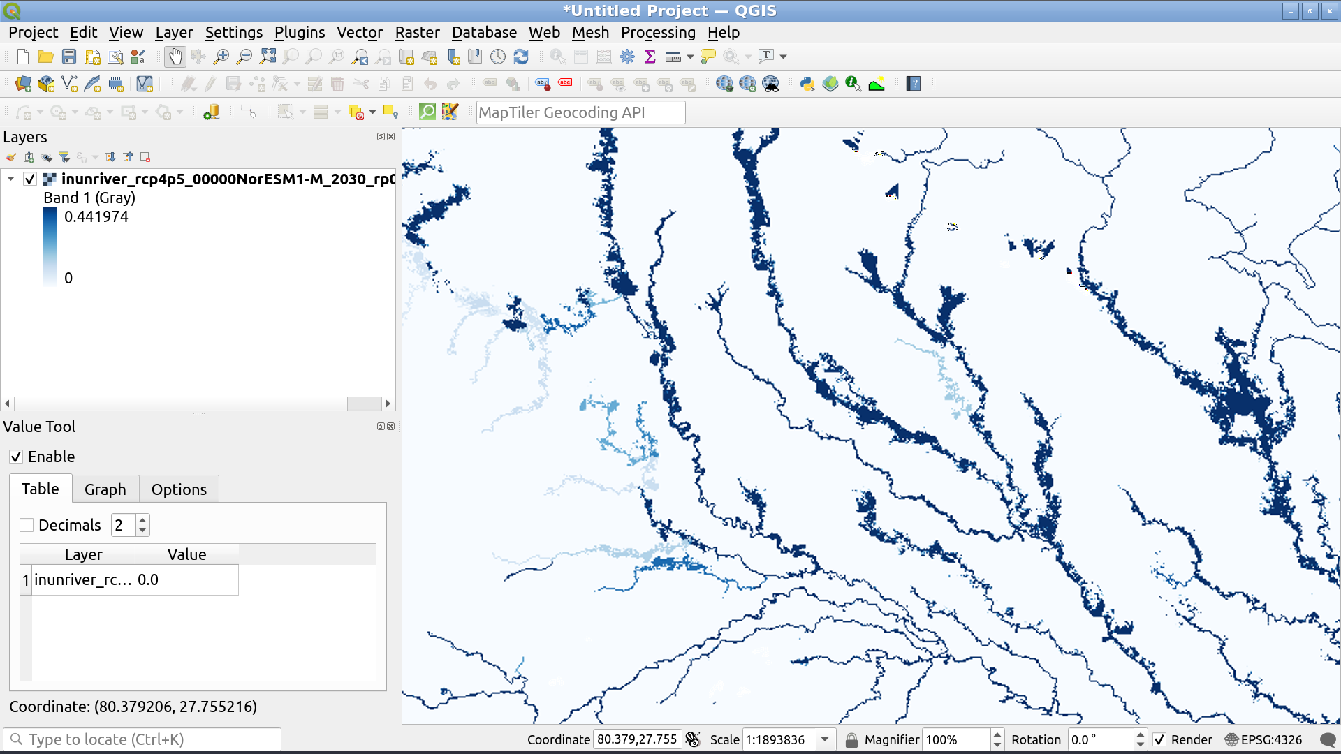
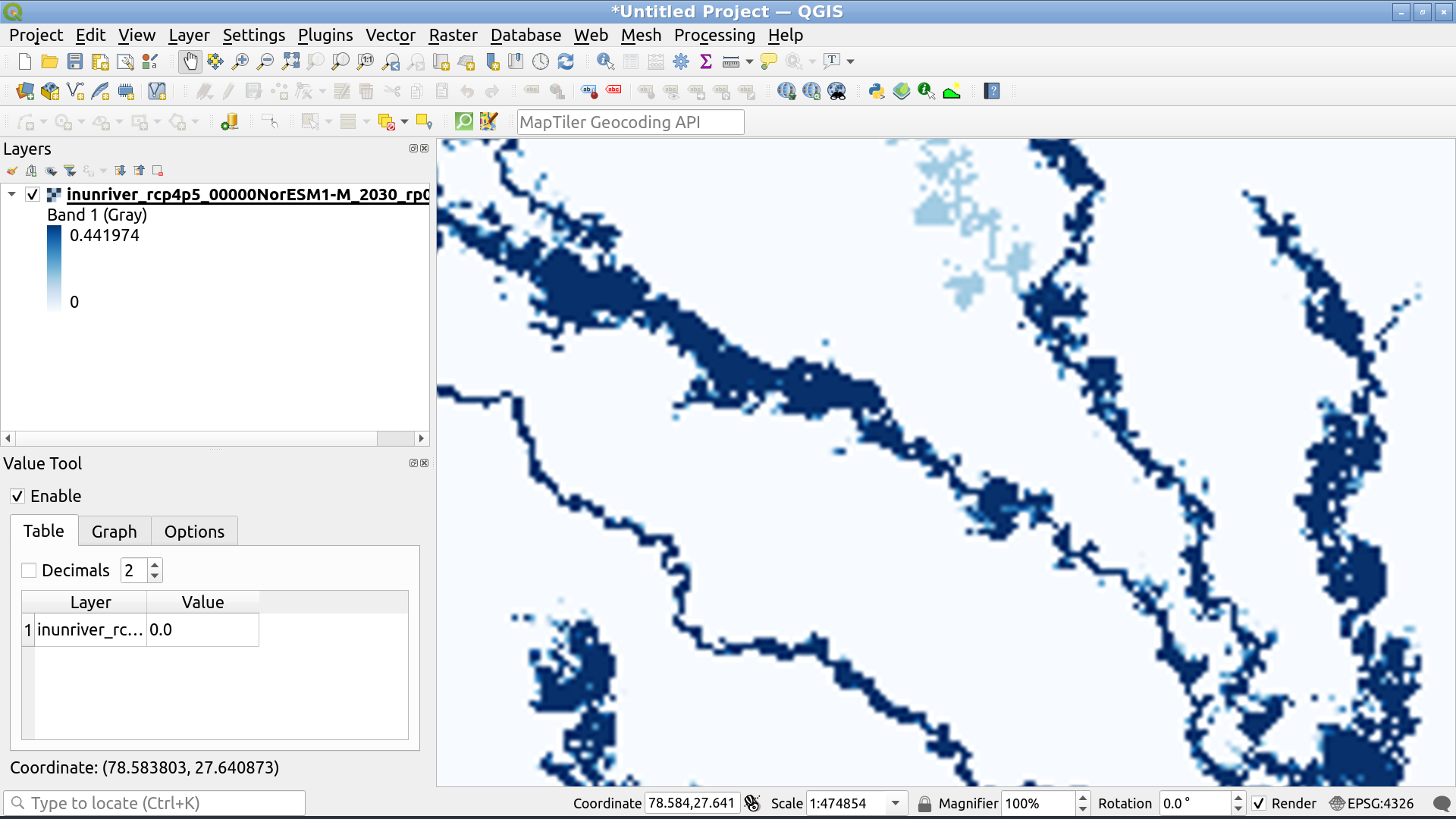
Except the inner most zooms. At this point cubic or bilinear interpolation is actually going to blur the image because we can visually resolve the individual pixels underlying the data at this point:

The solution is to switch back to nearest neighbour interpolation at this point:
