What, in fact, is a heatmap all about?
Using a tool like Heatmap without understanding how it works and what it means is dangerous as you visualize something without knowing what it means. Then better abstain from using Heatmaps at all or first try to get an understanding of the fundamental concepts of a heatmap. See the following explanations and the screenshots below to understand what exactly a heatmap is and how it is constructed.
Basically, a heatmap it is kind of an interpolation that assignes different colors to each point on the map canvas depending on local point density (how many points are within a certain distance from each spot on the canvas), distance to next point, and - optionally - additional weight criteria.
Parameters that influence the appearance (color distribution) of a heatmap
There are different settings that all influence how the heatmaps looks like: which areas get assigned which color:
- Size of the radius
- Units of the radius (screen units vs. real world units)
- Scale (if using screen units like Millimeters, Points, Pixels for radius)
- Maximum value
- Weight points by
See in what follows how these settings influence the heatmap.
Imitate heatmaps to understand the principle
To get an understanding of what a Heatmap does, we can imitate the basic principles (see screenshot below):
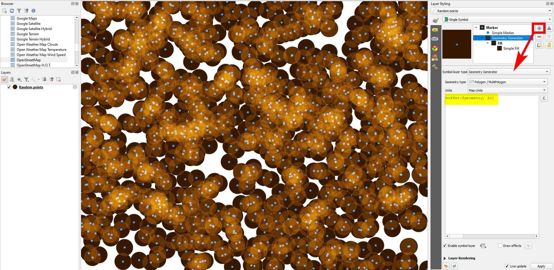
Take a point layer. Create a buffer around the points with Geometry generator and the expression buffer($geometry, 20) and change the radius (20) until some, but not all buffers overlap.
Style the buffer with a dark color (not black - I used a dark orange). Go to Layer rendering / Blending Mode / Feature and select Screen. Where the buffers overlap, the light "shines through" and the color gets lighter: the more buffers overlap, the lighter the color is.
Increase the radius in step 1 and you get more overlaps - decrease it for less overlaps. Be aware: if the radius is in screen units (like Millimeters, Points, Pixels), then the heatmaps looks different for different zoom levels: zooming out, you get more overlaps. For a constant rendering when zooming, use Meters at Scale, Map Units or Inches.
This is basically the principle of the heatmap: you set a radius around a point layer and depending an how many overlaps you have in a particular area, the color changes (we imitated that using Blending Mode). Normally, you have a color ramp: it starts at color A (0%), reaches color B at x% and so on... and ends at color N (100%).
Meaning of the gradient stops' relative positions on colour ramp
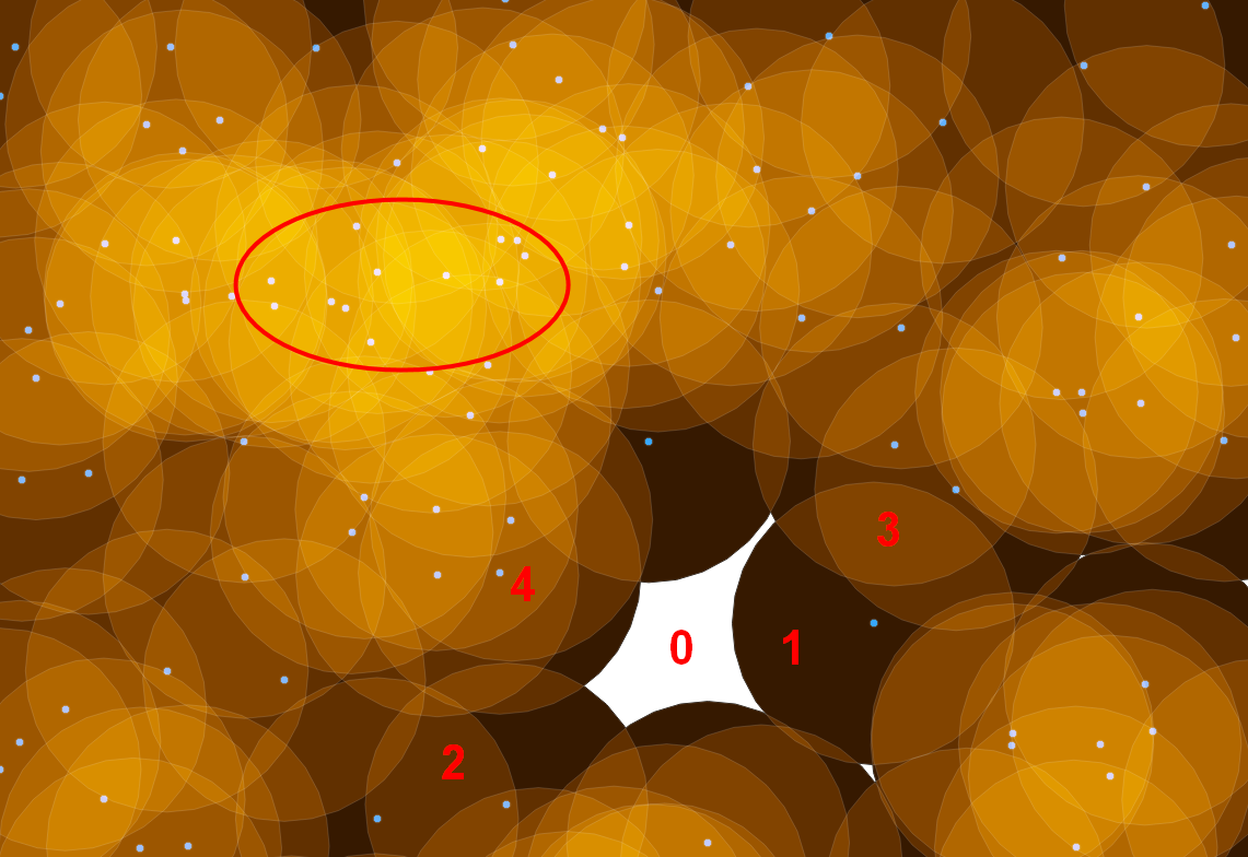
Now consider: how many overlaps do you have? There will be places where there is no buffer at all: 0% = color A. The place where the most buffers overlap is 100%: color N. Let's suppose: nowhere there are more than 12 buffers overlapping: so a spot where 12 buffers overlapt gets assigned color N (100%). A place with 6 overlaps gets assigend the color defined at 50%, 3 overlaps: color at 25%, 9 overlaps: color at 75%.
Creating buffers around a point layer (blue), styling them with blending mode to imitate the principle of heatmaps:

Zoomed in: places with 0, 1, 2, 3 etc. overlaps and the area with many buffers overlapping (red ellipse). The more overlaps, the brighter the color. Here we have (if we consider max, overlap = 12 / did not count it): 0 overlaps = 0% = white; 12 overlaps = 100% = yellow; 3 overlaps = 25 % = orange; 1 overlap = 8.3% = dark brown etc.:

Diferent visualizations of the same data with changing settings
Remark: All the following five screenshots show the same extent and same point data as above, but with differnt settings for the heatmap. This shows how dramatically the visualization changes, using the very same data. So you should get an idea of what you do to be able to visualize the data in a correct way.
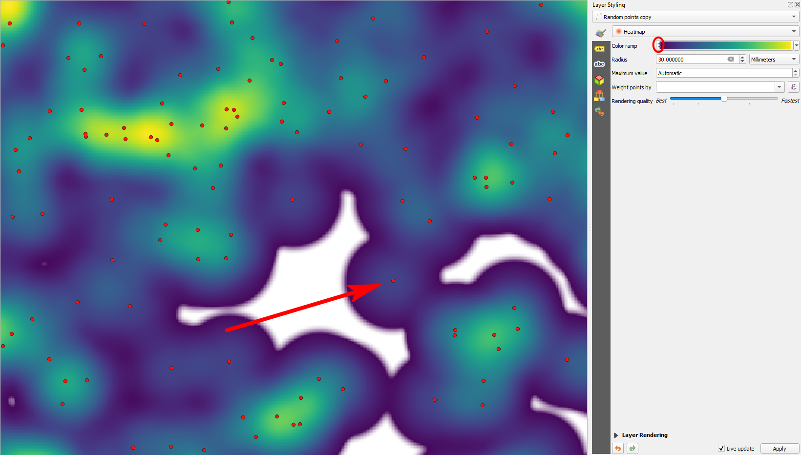
Same points and extent rendered with heatmap and the same radius as the last screenshot, using Viridis color ramp. As you see, the more overlaps you have, to more the color shifts to the right of the color ramp. The leftmost value (0%) is set to transparent (red ellipse) - this gives the white space. Where only one point is present (red arrrow), you see that differing from our imitation, even inside just one "buffer", the color changes from the center to the margins - so not just the number of overlaps, but also the distance from the point counts for the color. This makes smooth colors possible - above, we have sharp borders at the outer boundary of the buffers:

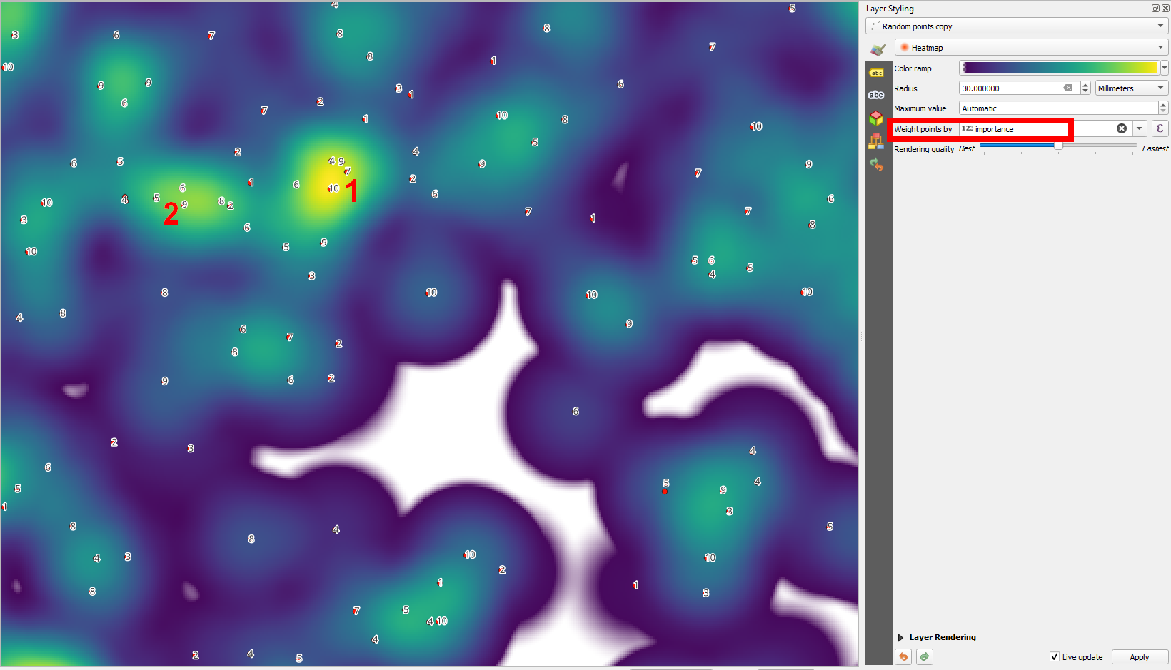
Weight points by: Adding an attribute field. Apart from points density (buffer oerlap) and distance from the points, now also an attribute values (here: importance) contributes to the rendering of the heatmpap. Points in zone 1 (labeled in red) have higher importance values then points in zone 2 - thus zone 1 is yellow (100%), zone 2 is just green (like ca. 80/90%), whereas above, no. 2 was yellow because points there are denser and we did not wieght points:

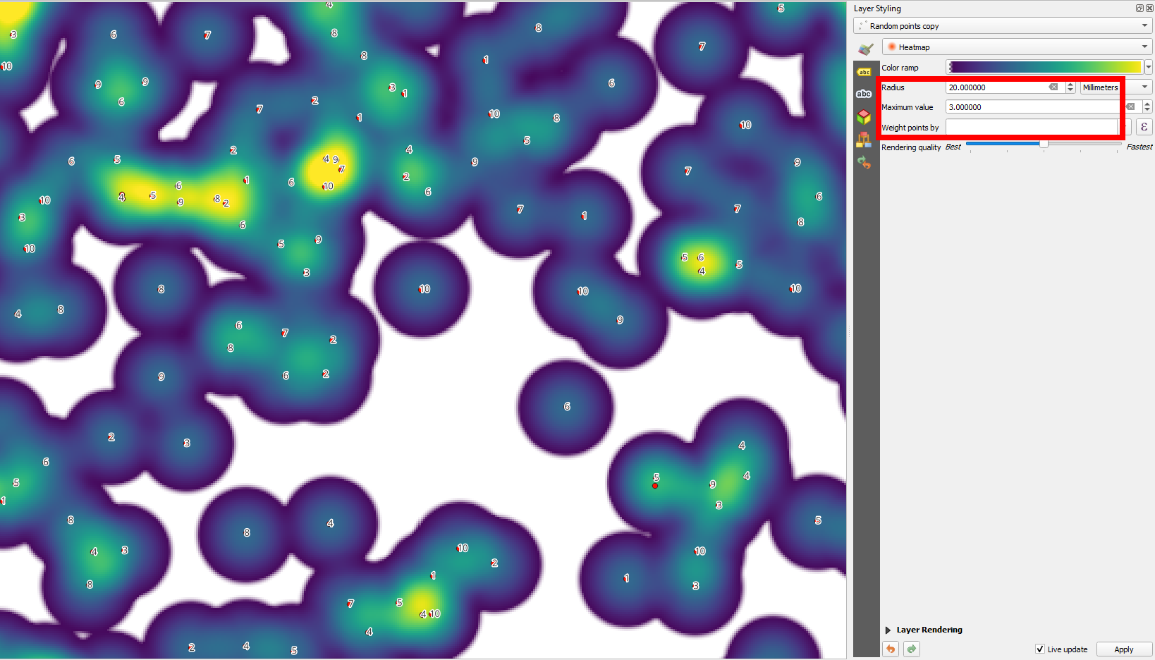
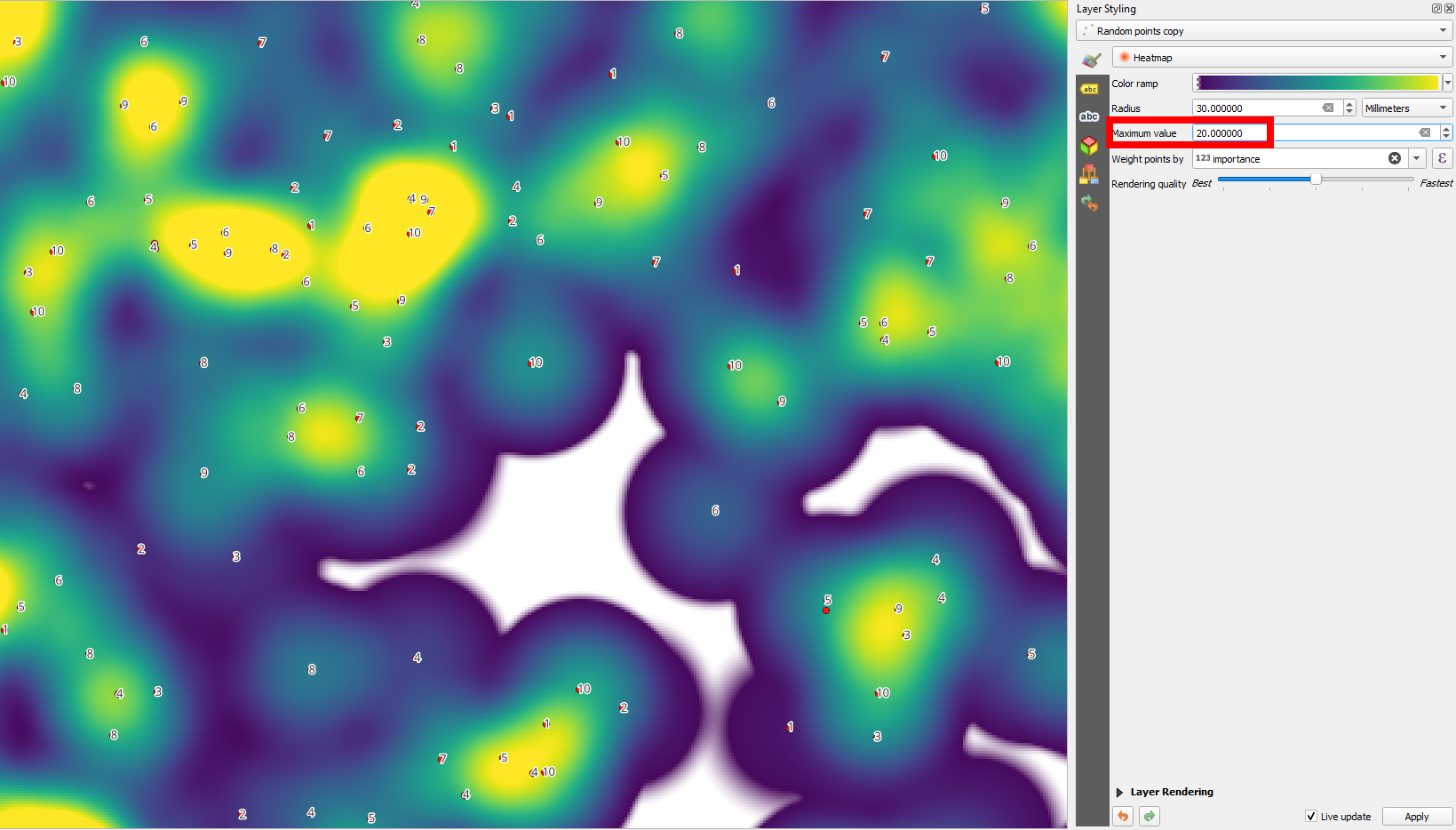
Adding another criteria to the distribution of colors of the heatmap: set a Maximum value. The maximum value in this heatmap is at ca. 35: that means: the highest value is 35, all others are lower. If Maximum value is set to 35, you get the image from above, with just one single area (where the maximum is reached) is yellow. When you now reduce the Maximum value to 20, the range of 0%-100% is reduced from min.=0/max=35 to min=0/max=20. Now, all values of 20 and higher are considered to be 100% and are rendered in yellow:

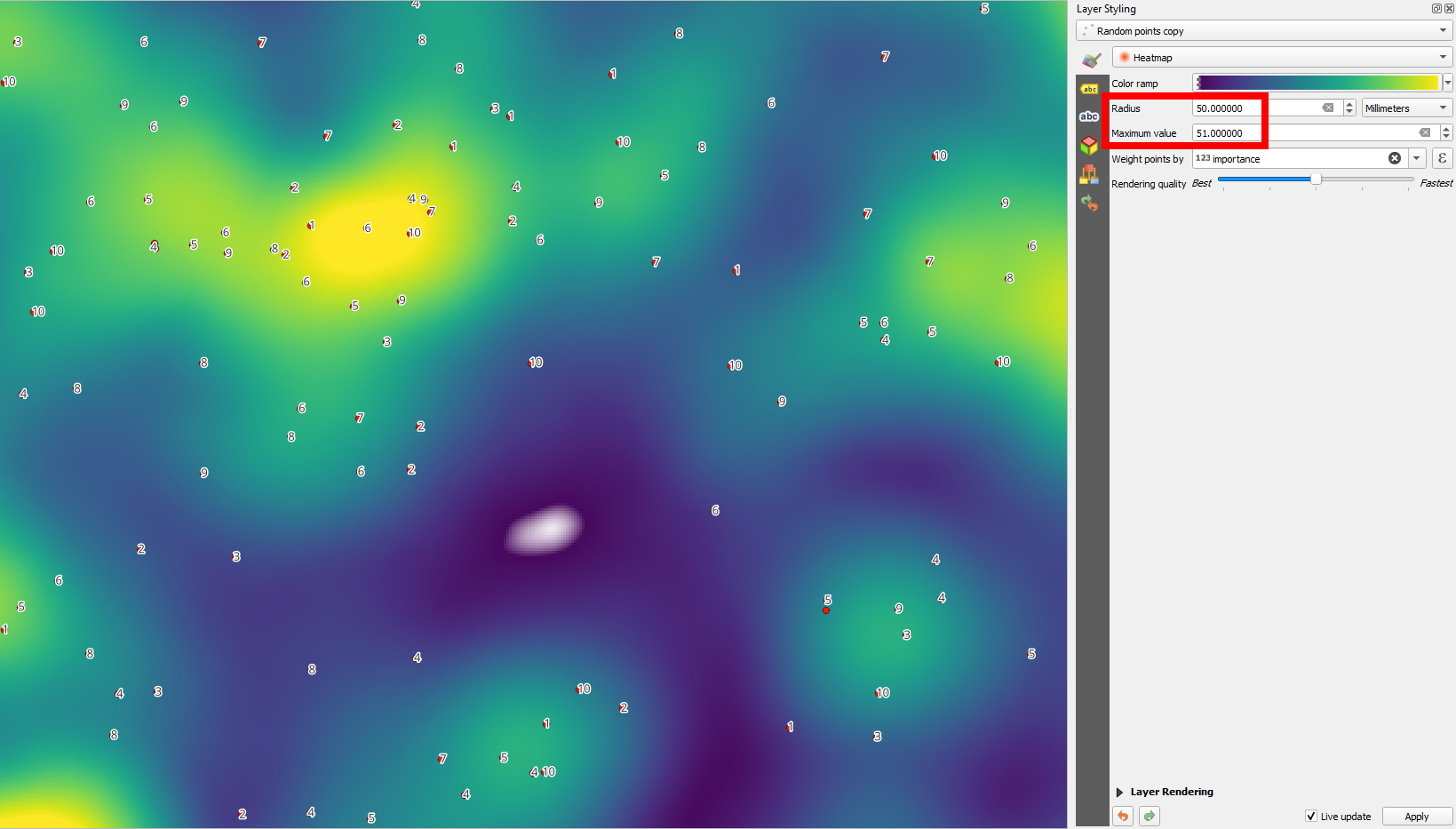
Playing around with radius and Max. value, the heatmap changes dramatically. Increasing radius (larger "reach" or coverage of the points, larger buffer radius) means that local extreme values are softened and not visible any more, the heatmap gets more blurred/diffuse with less abrupt changes over smaller distances, but interpolation over larger distances. Great to find overall patterns/extremes:

A small radius better shows local clustering of points - the "reach" of the points is less, you can discern more abrupt changes over smaller distances - great to find local extremes and patterns:
