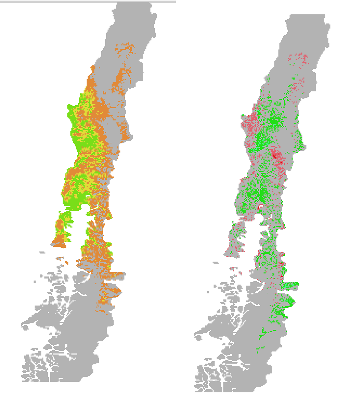
I have two habitat suitability maps for one species. One current map and one map for 2050 under climate change. Based on these two maps I created a change in habitat suitability map (by subtracting the maps).
Left picture current habitat suitability (grey=unsuitable (value 0), yellow=low suitability (value1), orange=medium suitability (value 2), red=high suitability (value3)), right picture: change map (grey=unchanged (value 0), red=loss (value -1, -2, -3), green=gain (value1, 2, 3))
note: the 2050 habitat suitability map is not displayed here.
Here is what I want: Unchanged areas that were unsuitable in the current map and are unsuitable in the 2050 map should be grey (just like it is right now in the change map). However, unchanged areas that were low suitable in the current map and are low suitable in the 2050 map should be yellow and not grey as well. Same counts for unchanged medium/high suitable. For example the grey areas in the left center of the change map should be yellow (or in other words get a different value).

