You are using the ui.Chart.image.seriesByRegion() function, which wants to receive an ImageCollection and plot a time series using temporal information in the ImageCollection's metadata. However, you are passing a single Image: ndbi. One way to diagnose this is to include more print() statements in your code.
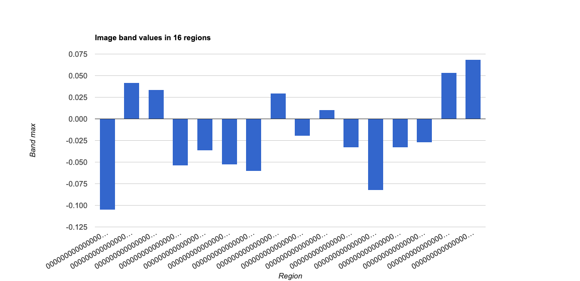
If you want to make a bar chart comparing max ndbi across your regions, use ui.Chart.Image.byRegion() instead, and set the chart type to ColumnChart.
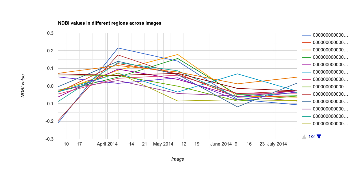
Conversely, if you want to plot variation among your regions across time, you need to take a few steps back and generate an ImageCollection of ndbi values from your Landsat data (rather than an Image of ndbi created from one reduced median Landsat Image).
Please also note that because you didn't include the definition of table in your code, I used a stand-in table, counties from Maine. Also, I use a 1000m scale argument in the plots to save computer effort.
// A stand-in feature collection; Maine counties
var table = ee.FeatureCollection("TIGER/2018/Counties").filter(ee.Filter.eq("STATEFP","23"));
print("table",table);
Map.addLayer(table, {}, "counties");

// Access the ImageCollection and select time window of interest
var L8 = ee.ImageCollection('LANDSAT/LC08/C01/T1_32DAY_TOA')
  .filterDate('2014-03-01', '2014-07-30');
print("L8",L8);
// Generates a single "median winter" image
var L8_MedianWinter = L8.median();
print("L8_MedianWinter",L8_MedianWinter);
// Generates a single NDBI image based on median winter
var ndbi = L8_MedianWinter.normalizedDifference(['B6', 'B5']).rename('NDBI');
print("ndbi",ndbi);

// A function to calculate NDBI and retain image properties
var calcNDBI = function(i){
  var L8_roi = i.clip(table);
  var ndbi = L8_roi.normalizedDifference(['B6', 'B5']).rename('NDBI');
  return(ndbi.copyProperties(i, i.propertyNames()));
};
// Map the function to the Landsat ImageCollection
var ndbi_timeseries = L8
  .map(calcNDBI);
print("ndbi_timeseries",ndbi_timeseries);

// Define viz parameters
var ndbiParams = {
  min: -1,
  max: 1,
  palette: ['cyan', 'red']
};
Map.addLayer(ndbi.clip(table), ndbiParams, 'ndbi');


// A Bar chart from the reduced ndbi image
var ndbi16Regions = ui.Chart.image.byRegion({
  image:ndbi,
  regions:table,
  reducer: ee.Reducer.max(),
  scale: 1000
}).setChartType('ColumnChart'); // chart comparison across regions
print(ndbi16Regions);

// A line chart with ndbi time series by region
var ndbi16Trends = ui.Chart.image.seriesByRegion({
  imageCollection: ndbi_timeseries,
  regions: table,
  reducer: ee.Reducer.max(),
  band: "NDBI",
  scale: 1000,
}); // chart comparison across time
print(ndbi16Trends);
Bar chart (ui.Chart.image.byRegion()):

Line chart (ui.Chart.image.seriesByRegion()):


