7

I have a dojox bar chart on my app, that is populated from a QueryTask everytime the extent changes.
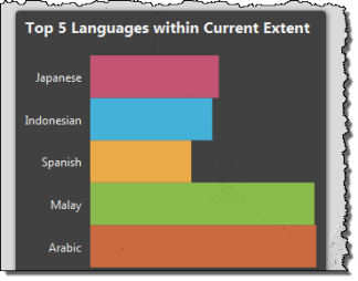
enter image description here

I am making use of the Tufte theme (the only one that has a transparent background), and overriding the bar colours/outlines when i populate the chart:

chart1.setTheme(dojox.charting.themes.Tufte);
    chart1.addSeries("Languages", [
        { y: pctArabic, fill: "#C23A00", stroke: null, tooltip: ctArabic + " in Arabic },
        { y: pctMalay, fill: "#6BAE11", stroke: null, tooltip: ctMalay + " in Malay" },
        ....
    ]);
    chart1.render();

I have also been using the Esri sample as a reference, and have successfuly added a popup to my map which shows some totals per suburb in a dojox piechart:
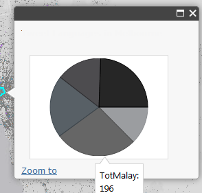
enter image description here

My codes is identical to the sample, bar the fields have been swapped out.

template = new esri.dijit.PopupTemplate({
          title: "Tweet Languages in {SA2_NAME}",
          mediaInfos: [
            {
              type: "piechart",
              value: { 
                fields: [ 
                  "TotArabic", "TotMalay",
                 ....
                ],
                theme: "Tufte"
              }
            }
          ]
        });

My problem:

I need some control over styling the chart within the popup.

How do I force the pie segments to be specific colours, as per my bar chart example?

When I look at the API reference for Popup, mediainfos does not look like it has this level of control over the chart?

How do I override the tooltips with an alias like I did with my bar chart example?

I will also need to style the popup to have a similar dark grey background to my chart background, but I believe that won't be related to the chart, and should be achievable via styling the popup with CSS.

2 Answers 2

4
+50

I would personally create the chart myself rather than trying to use the ESRI popup class and then add it to a simple info window.

Here is a link to a fiddle which gives the basic idea. I'd based upon ESRI's sample that you sited. I haven't shown how to populate your own data in to the series, it just uses mock data. Let me know if you are not sure how to do this:

http://jsfiddle.net/9gGrv/30/

You may find the nightly test build useful

2
  • Thanks for your reply. I am going though your fiddle and let you know soon.. thanks a lot once again : )
    – Sunil
    Commented Jul 23, 2013 at 7:10
  • 1
    Many thanks for this. I updated your example to demonstrate how to read the values from the feature layer - see jsfiddle.net/slead/9gGrv/58 Commented May 6, 2016 at 5:25
1

It looks like you are going to have to create your own theme. This blog post talks about how that is done: http://dojotoolkit.org/documentation/tutorials/1.6/charting/

3
  • Thanks for your reply. I tried this but its not coming on the map. I will share the code on JSFiddle and if you have similar code implemented in ArcGIS JSAPI then please share your code thanks a lot..
    – Sunil
    Commented Jul 23, 2013 at 4:48
  • Did you post your jsfiddle?
    – CLJ
    Commented Jul 24, 2013 at 17:27
  • my jsfiddle.net/Ym3Xm/7 & I think mediainfos does not support advance utilities
    – Sunil
    Commented Jul 25, 2013 at 13:14

Your Answer

By clicking “Post Your Answer”, you agree to our terms of service and acknowledge you have read our privacy policy.

Not the answer you're looking for? Browse other questions tagged or ask your own question.