Telecom cell site plan and optimization using QGIS
Create Points or Site Locations:
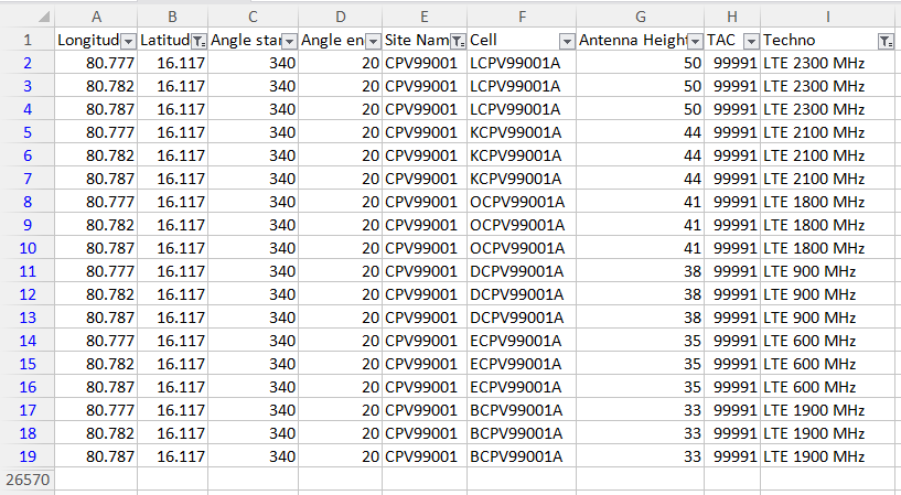
- Create database in CSV (make sure antenna sizes are sorted in descending order: highest first to lowest last, such that masking through overlay of cells could be avoided)
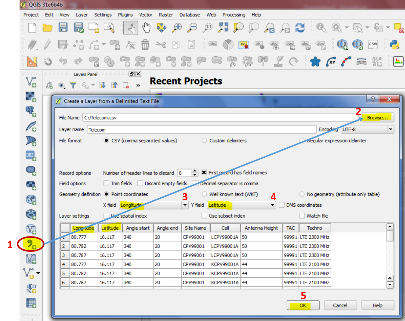
 2. Import to QGIS using "Add Delimited Text Layer"

- Choose X and Y fields and pick Datum
Create Site Sectors:
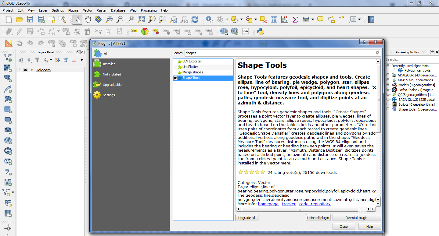
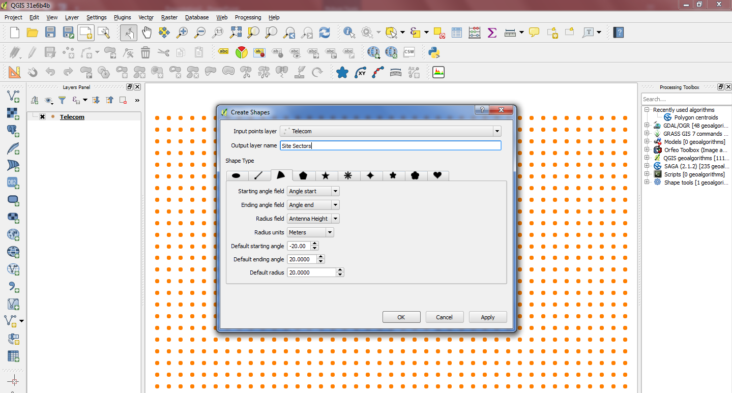
Please utilize the Plugin "Shape Tools" to create site Sectors

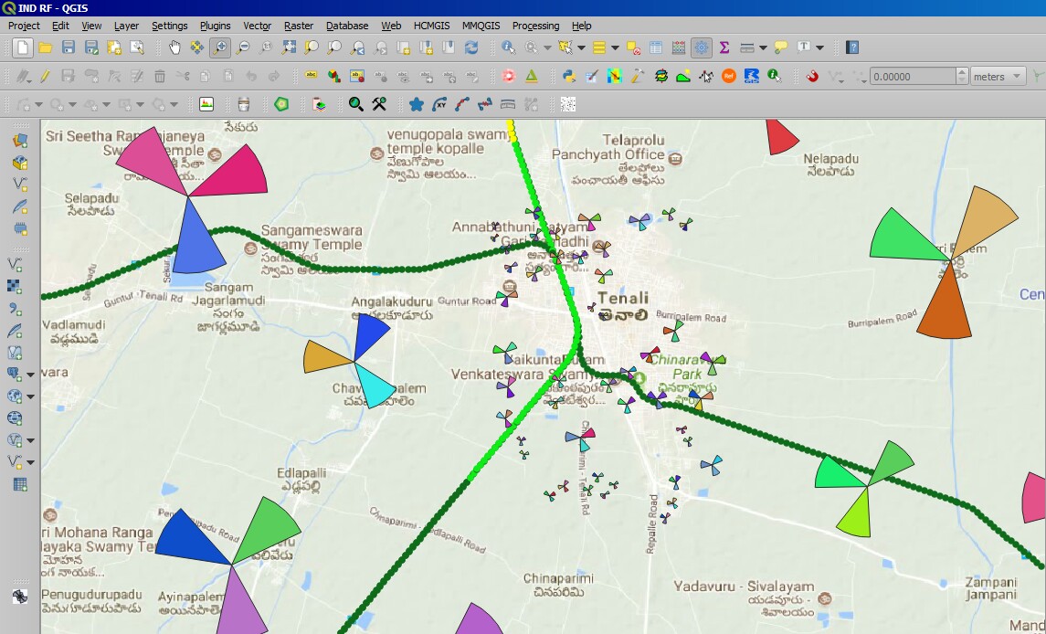
Make Sector from "Azimuth":
In this scenario it requires 2 additionally defined columns to form a sector, it could be derived from actual "Azimuth" of the sector.
Per se, an offset of -/+ 20 degrees to the actual orientation would make sector BW 40 degrees from node, or as maybe required based on user requirements.
Starting angle field: 1st derived column with - 20 deg. angle: Pick corresponding column here
Ending angle field: 2nd derived column with +20 deg. angle: Pick corresponding column here
Radius field: Antenna size or Sector size should be derived in separate column as usual and input should be given to Radius under "Shape Tools"


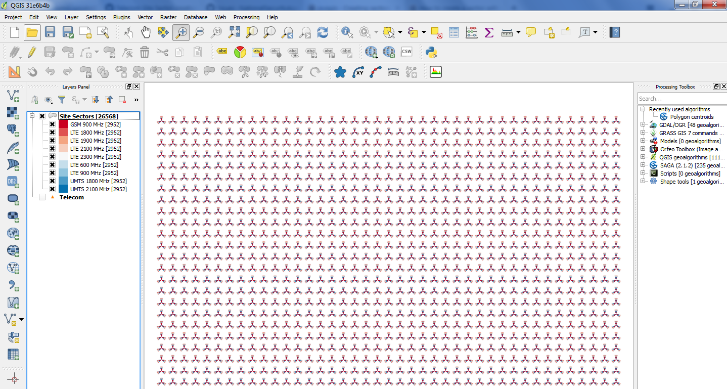
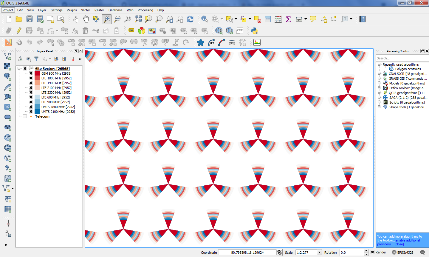
- Layer properties--> Style --> Control feature rendering order --> Expression --> Antenna size --> pick Descending under (Asc / Description) to have the sector overlay rendering order size large in bottom and size small on top for visibility onwards making map canvas in case CSV data or table data is not arranged earlier
https://twitter.com/vamsi_uppala/status/984504617215049728
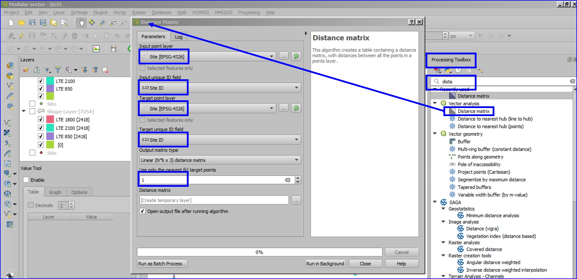
Distance Matrix: Using this inbuilt algorithm distance between source site to its nearest neighbor could be identified to derive sector size of the site based on site density / frequency in an given geography, such that sector overlapping could be avoided while retaining appropriate visibility at all zoom levels (per se 1/3rd of distance calculated using the algorithm was used in below example. In case of multi technology / layer network, technology / layer wise magnitudes or sizes could be used to give visualization theme).
This process would facilitate better representation network with all proximities while working with KPIs or Neighbor analysis.

Note: Unique Site list are to be processed since tool would generate null distances if cells from same site are processed to extract distance to nearest neighbor.
For faster processing NNJoin plugin could be utilized as an substitute for the nearest neighbour (conversation of distance in map units (degrees) to meters or km (metric) could be needed).


Create Neighbors:
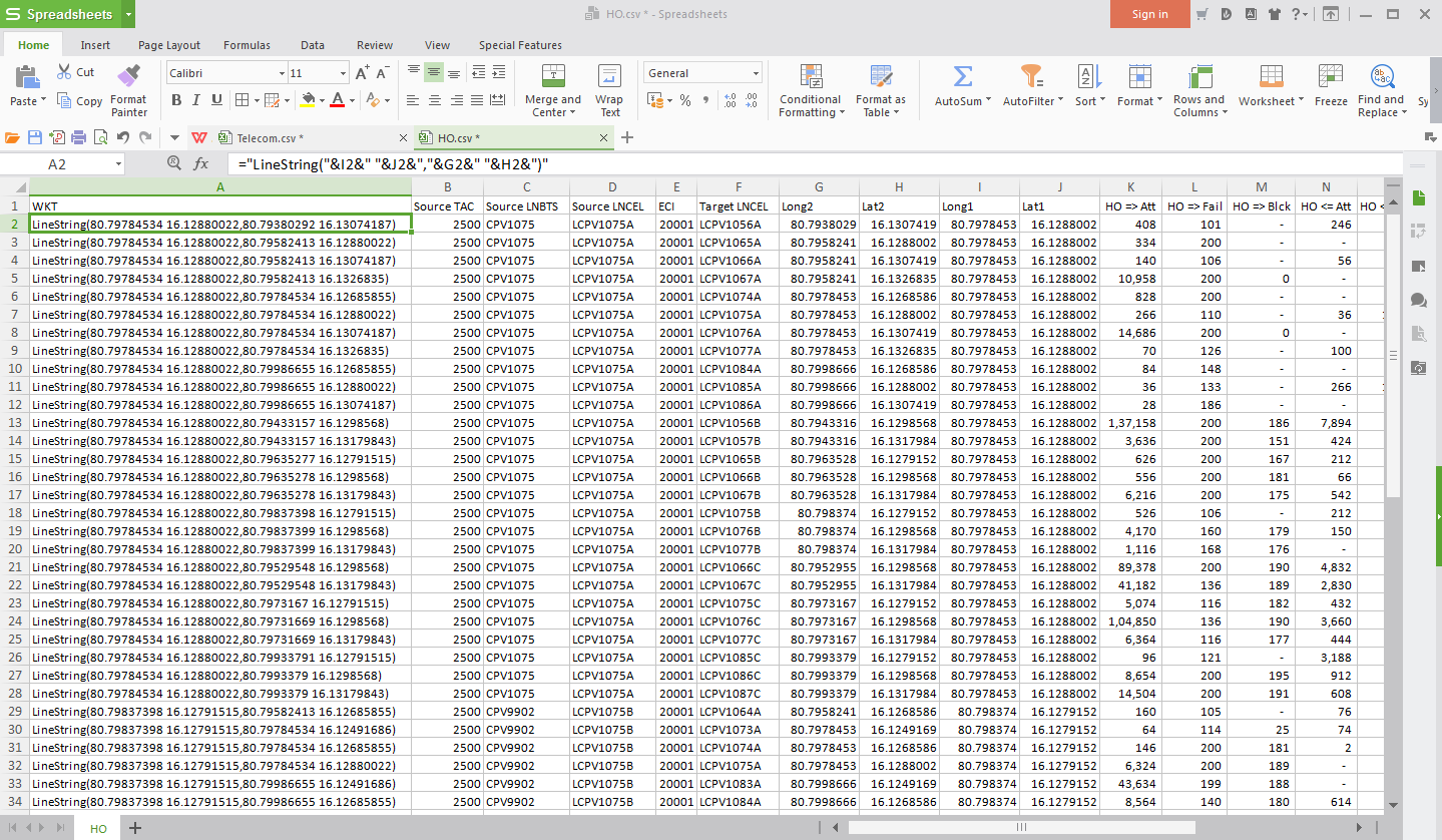
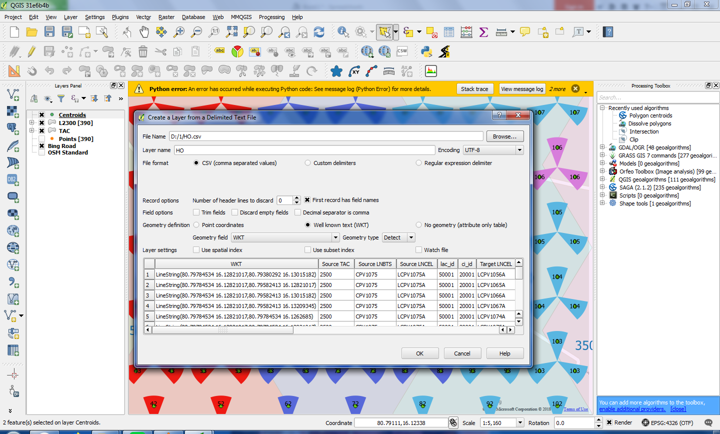
Make WKT format comprising of Line start and end points of neighbor markup
Start point is Source Site's coordinated (Lat1 Long2) and end point is target site's coordinates (Lat2 Long2).
Make a new column with formation of LineString(Long1 Lat1,Long2 Lat2), or it could be later derived with the help of Field Calculator via Layer Properties.
 Utilizing Sector centroids would be better for appropriate rendering and easy identification considering multi-techno sites.
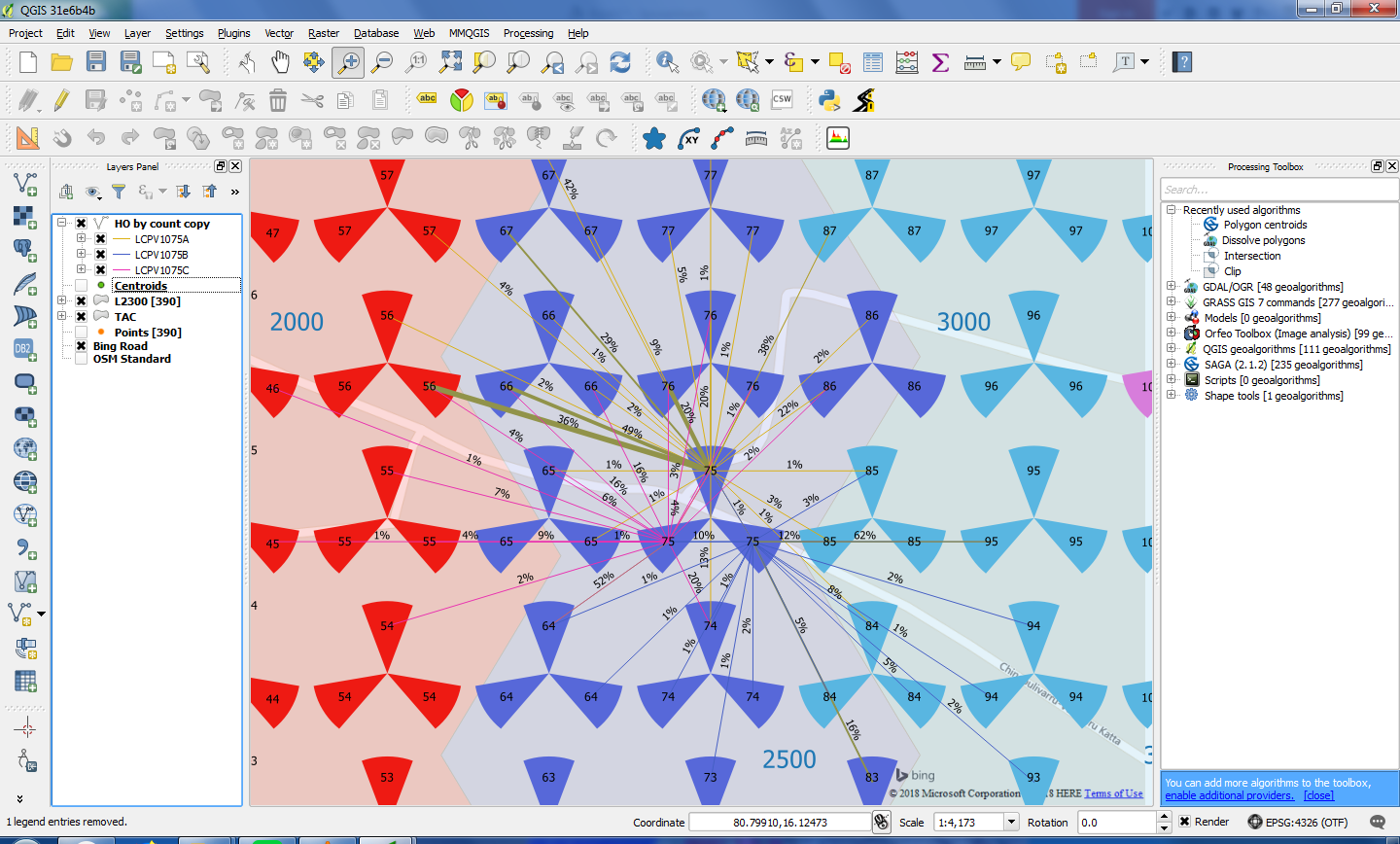
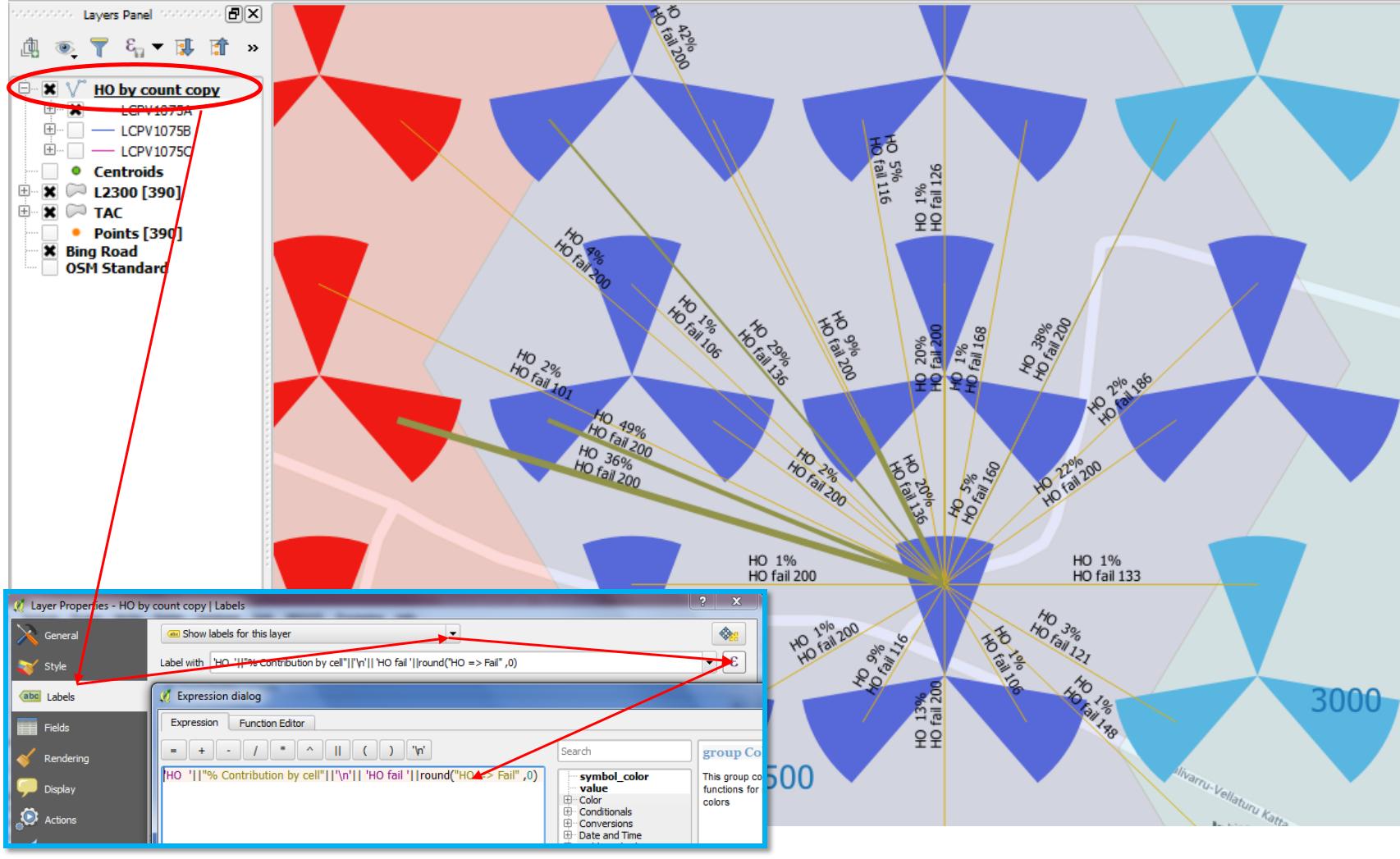
Neighbor relations can be patched with network stats such as "Handover Count / Late HO / Early HO / HO Fail etc." to derive a thematic for line thickness or colour for easy identification. This excise could use "Graduated" under "Style" menu.


 This process of creating nbrs with HO stats is almost instantaneous for a size which was given a try with HO relations over 800,000 and cells count of ~40,000.
Neighbor Creation from Distance Matrix algorithm:
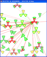
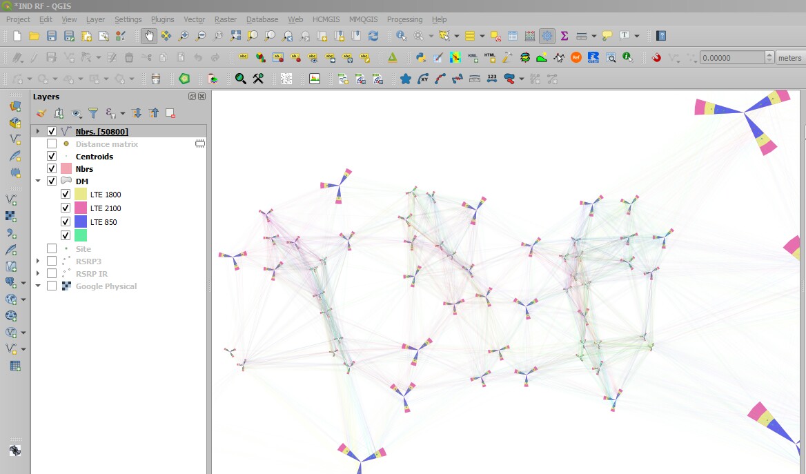
Neighbor derived through Distance Matrix algorithm and representation on map by source site, however this is representation of nearest neighbor assuming omini presence, which could be used in case of site level neighbor addition like LNADJW and LNADJG where SON would define the relations from this defined profile (neighbour from interesting point of two directional points are yet to be evaluated to suit wireless scenario):

Below formula could be used in Geometry generator to represent the relations on the fly (Layer Properties->Single symbol->Marker->Simple marker->Symbol layer type->Geometry generator->Geometry type->LineString/MultiLineString):
make_line(centroid(geometry(get_feature('NetworkSiteDatabase','Site',"InputID"))),centroid(geometry(get_feature('NetworkSiteDatabase','Site',"InputID"))))
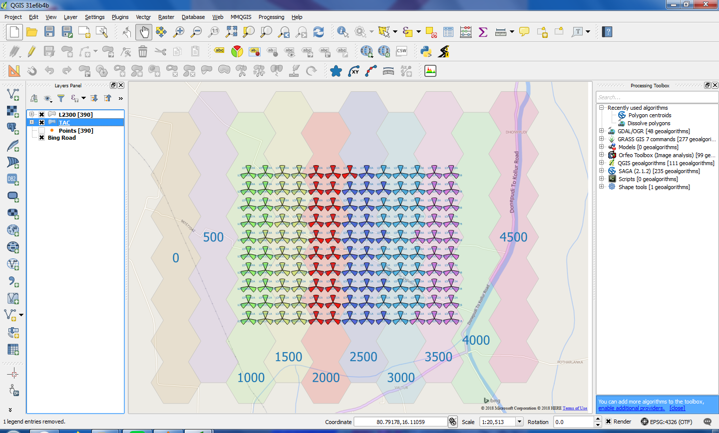
Making TAC, LAC boundaries are easy on QGIS (100,00 sites find this done with in 1 min):
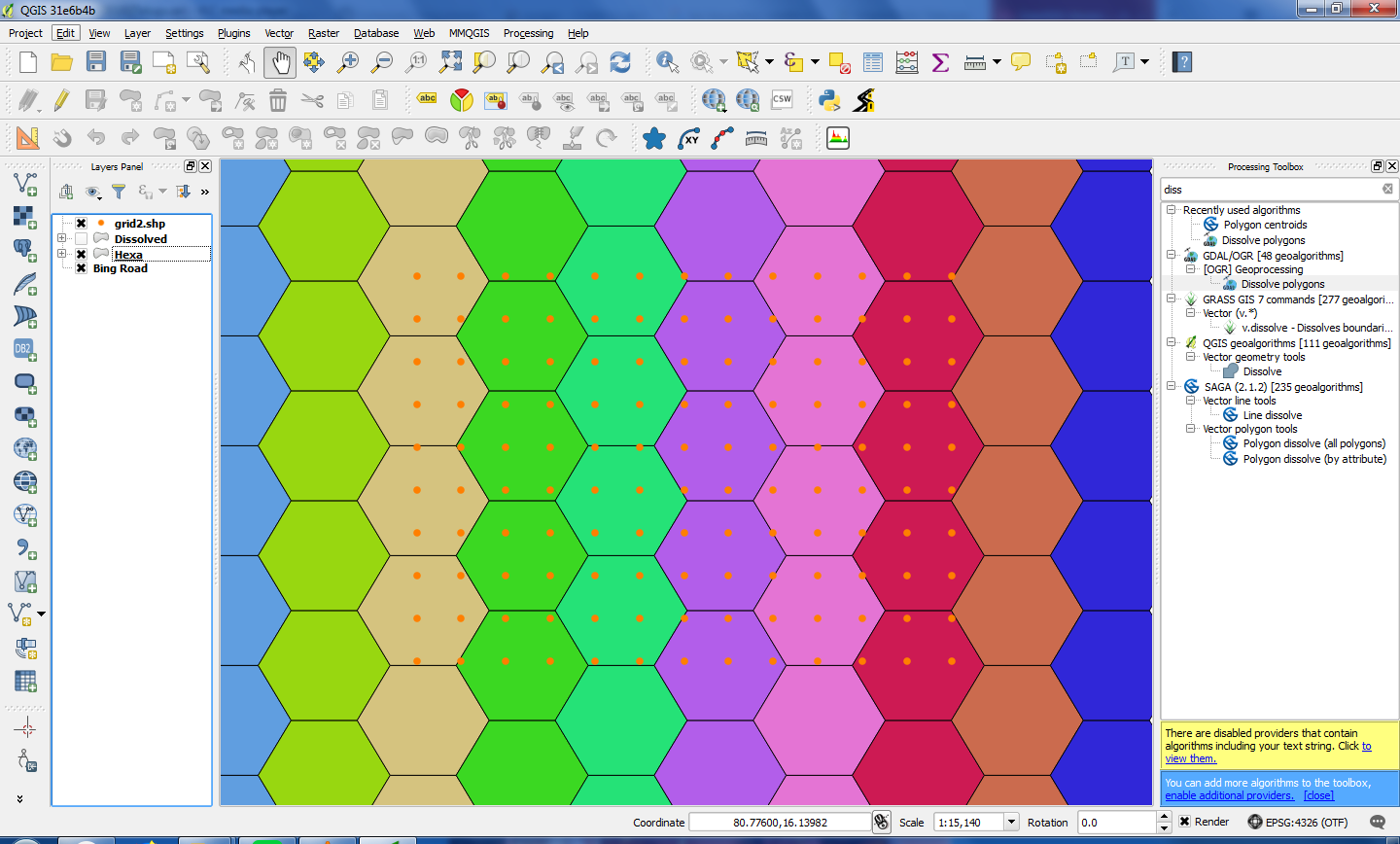
 1. Make "Voronoi Polygons" from points
- Use "Dissolve Boundaries" algorithm under "Process Toolbox" Grass to merge individual cell boundaries to gross TAC, LAC, BSC or Cluster boundaries etc.

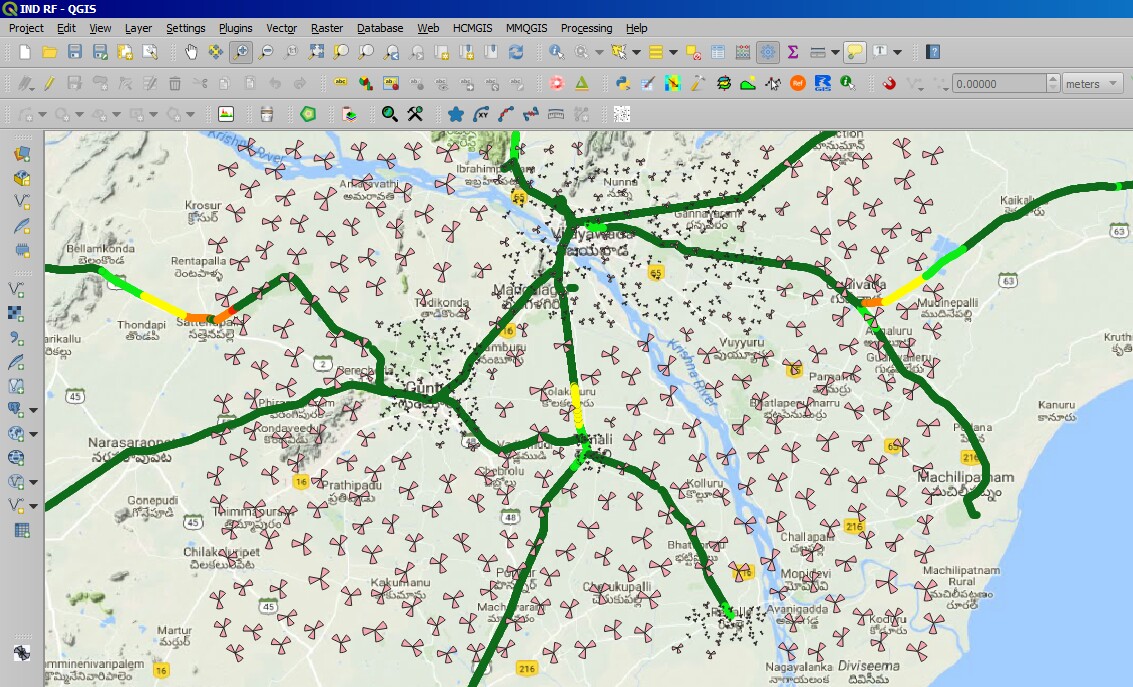
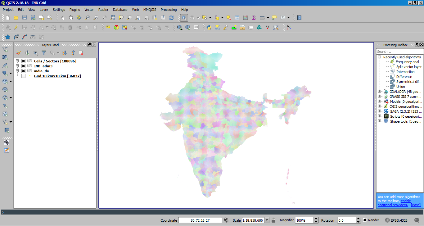
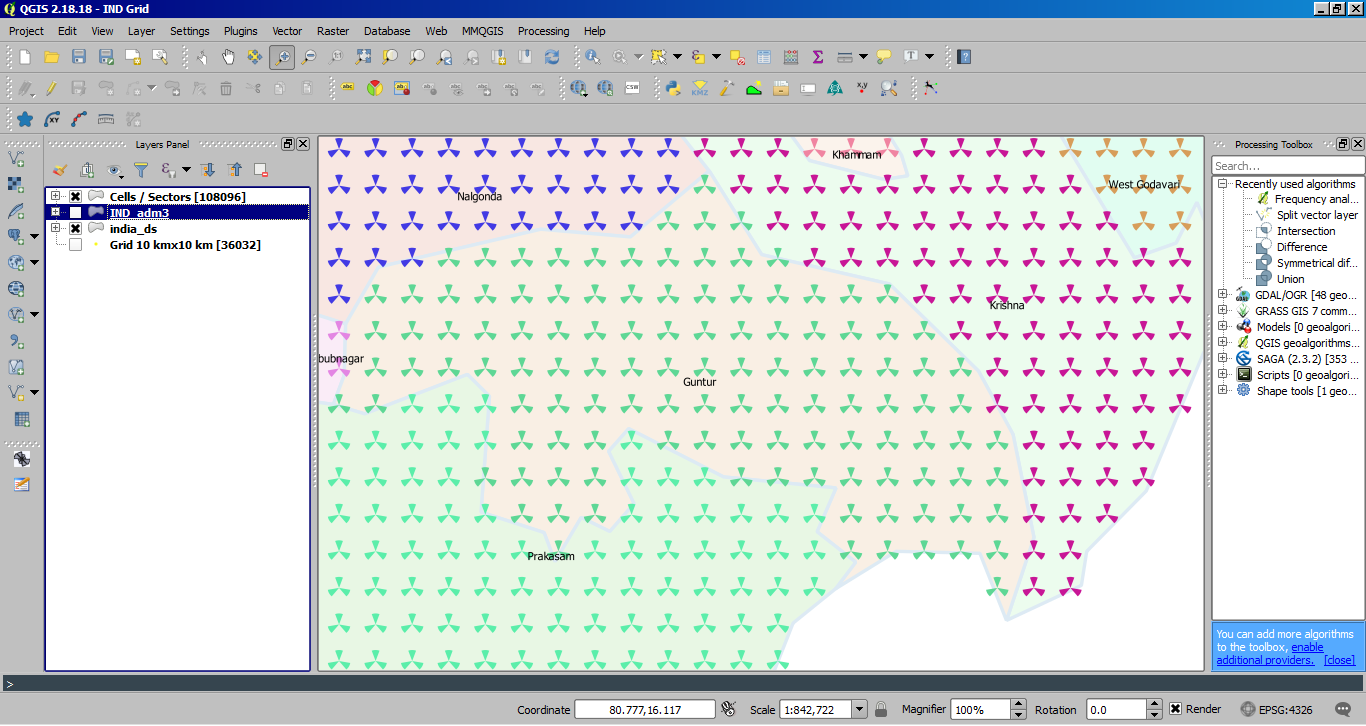
A sample work flow is shown below taking 10 km x 10 km grid distance to place cell sites for Indian geography, which is resulted in 36,032 sites with 108,096 cells. And each district is depicted unique TAC boundary for easy understanding and then the output is as follows:
This is a rough representation of planning and mostly suits day to day capacity and coverage expansions by network operators unless they have very stringent approach methods where constraints are followed for dimensioning viz. Radio propagation models, Terrain, Clutter, Capacity and Service promises (Cell edge throughput, Avg. throughput, Coverage and type of services etc.)


KPI interlacing onto Sectors:
CSV or Excel could be used with additional Cell, Site, relation level KPIs.
or
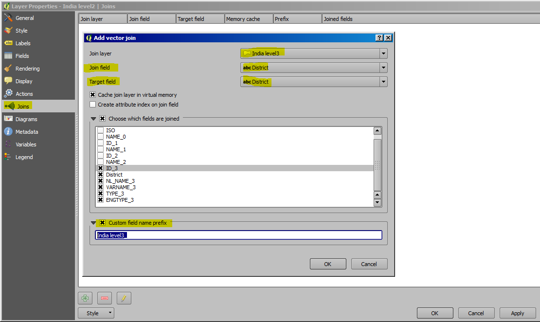
Use "Join Button" on "Layer Properties" popup window as VLOOKUP function to pullover data from regular KPI reports and represent on map as thematic using common field ex. Cell / Segment name in case of cell level KPI or relation when in case of Handover related etc.

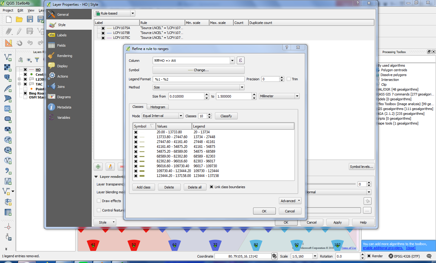
And arrange thematic accordingly: Use "Rulebased" with "Graduated" in case to generate with multiple conditions at one go.
Use "TimeManager" plugin to check KPI plots to identify its dynamics by plying hourly, daily time interval timelapse through selected canvas.
Useful plugins:
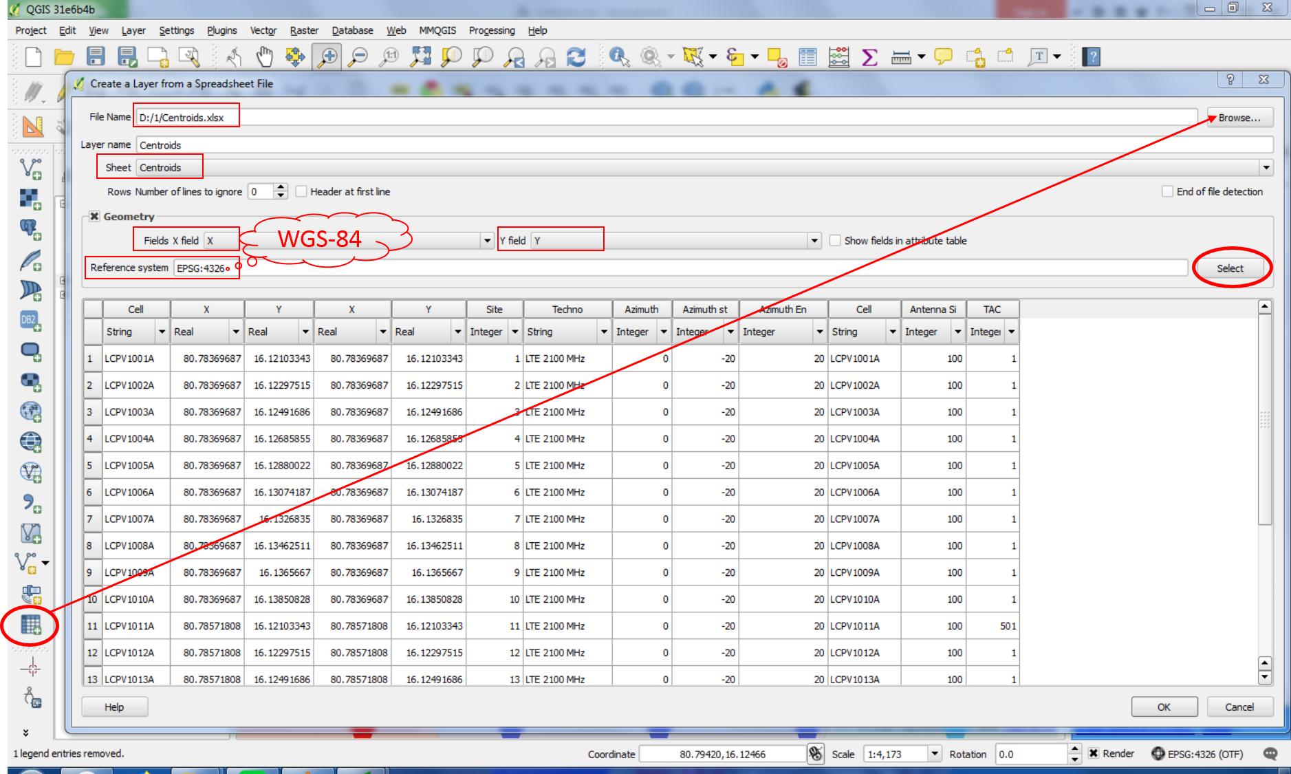
"SpreadSheet"
- Import direct Excel worksheet onto QGIS
- Classification of column data (Integer, Decimal, String, etc.)
- File data could be plotted at import with corresponding geo-data (Lat Long for points; WKT for HO Lines or Polygons, if any) on choosing datum
- KPI reports could be easily taken onto mapping through this process

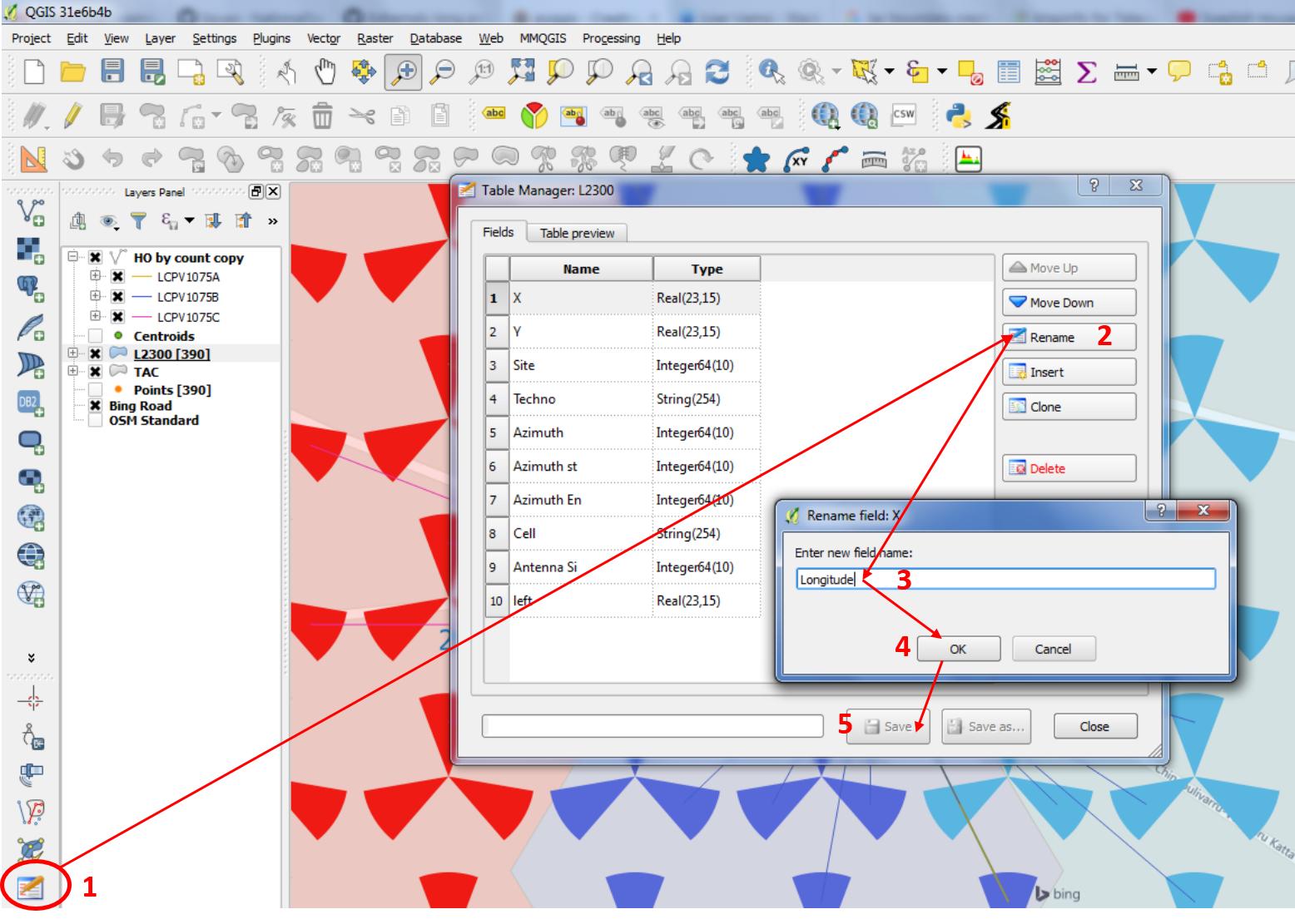
"TableManager" For editing column headers on the go

"OpenLayer" and "QuickMapservices": For Map overlays ex. Google Map, Bing Map, OSM, Aster elevation data etc.
Timing Advance Plot:
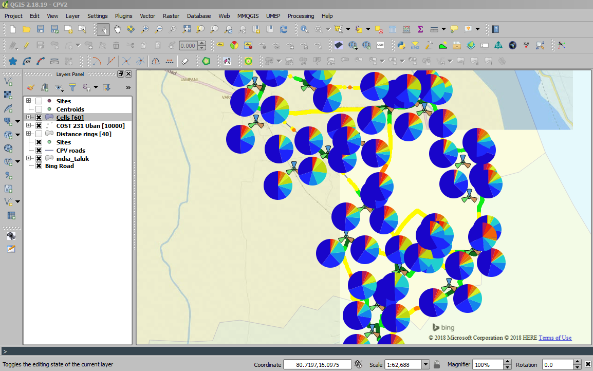
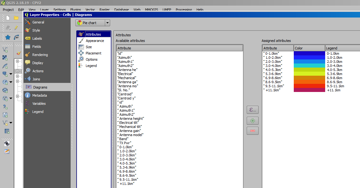
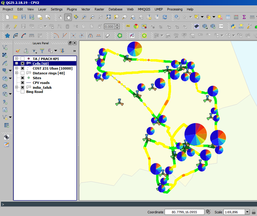
Use "Diagrams" option under "Layer Properties" popup and create "pie" chart or "bar" chart to visualize the site signal reachability by TA / PRACH samples.

Applying diagrammatic thematic for TA and representing all samples in learner method:

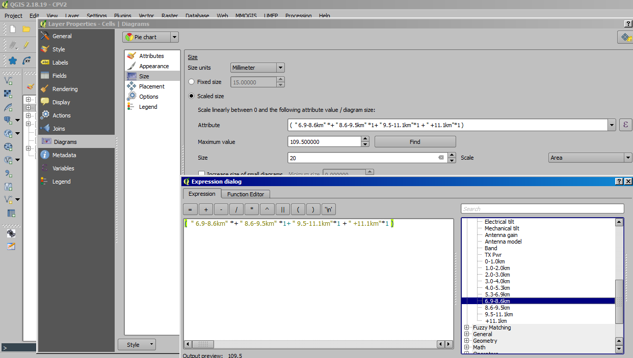
TA or PRACH thematic on applying variable magnitude or Scaled size method by aggregating overshooting TA samples>6.9 km:

TA aggregation through field calculator (in this case data was multiplied by 1 to convert to integer and made summation):

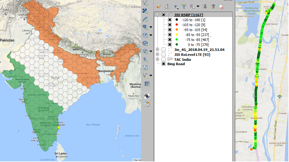
Sample drive test plot is shown below:

QConsolidate: For sharing complete project files with team etc. while retaining all project's properties.
Other tips:
Take HO relations from collocated site sector of 4G (since it is being SON) and replicate same set of collocated site Sectors (on 2G <-> 2G or 3G <-> 2G or or 3G<->2G or 23G -> 4G, this could be scaled up to OSS level on monthly or bi-monthly basis, and limited to top performing HO count and max allowed relations count.
Similar to above could be utilized for neighbors of 3G<-3G> onto 3G<->2G, where site misses 4G proximity.
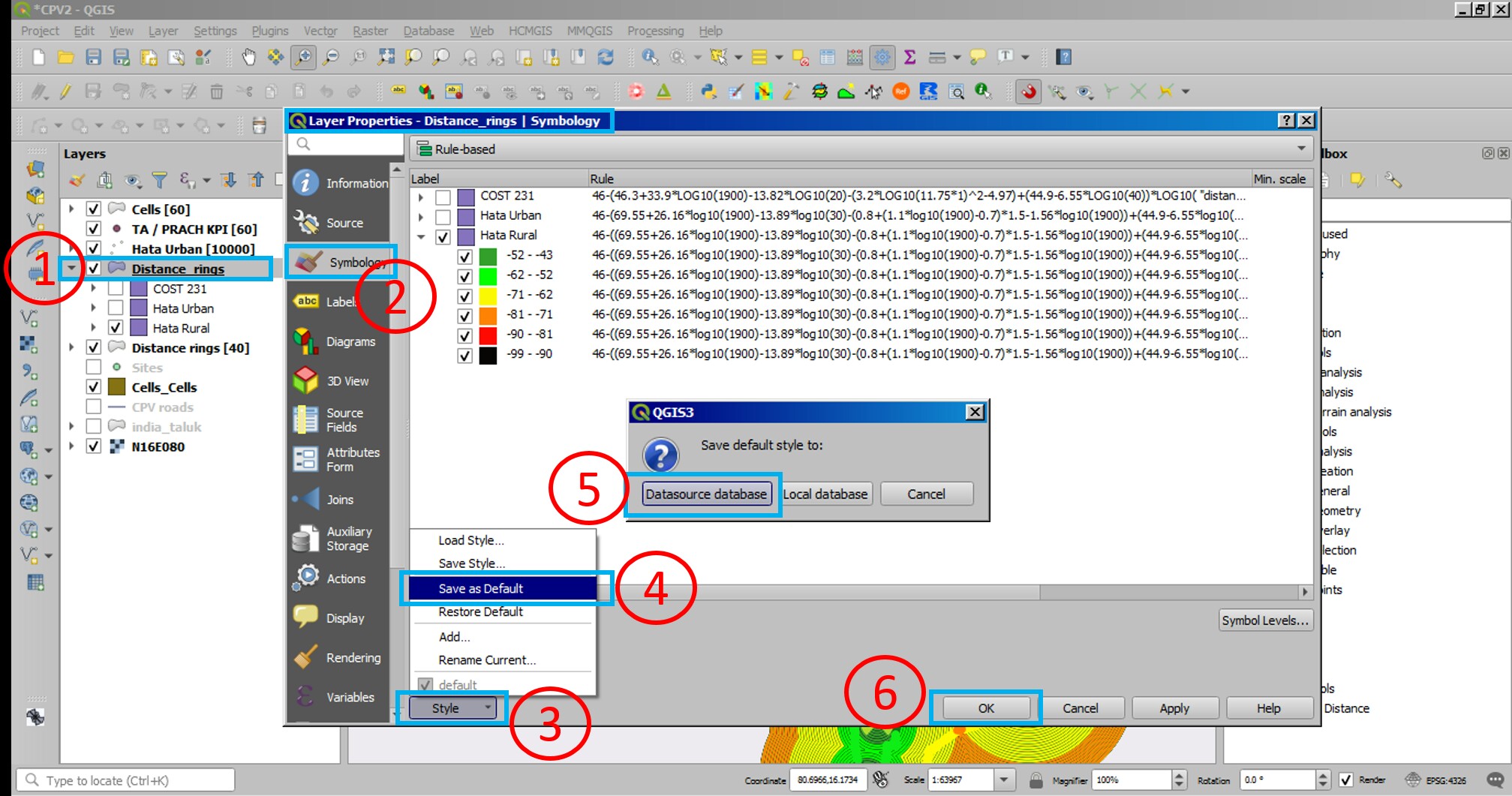
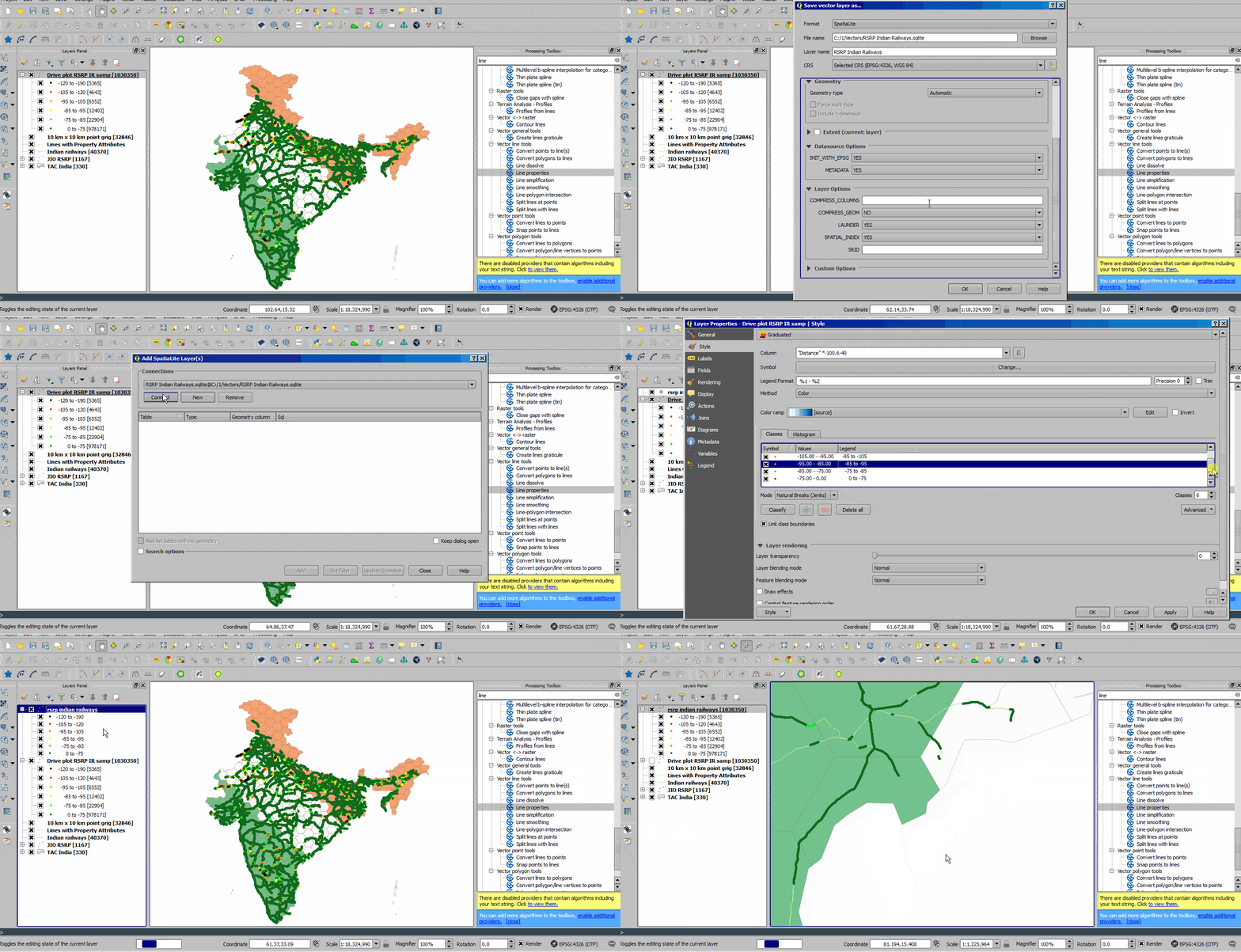
Saving Layer style to Spatlite database:

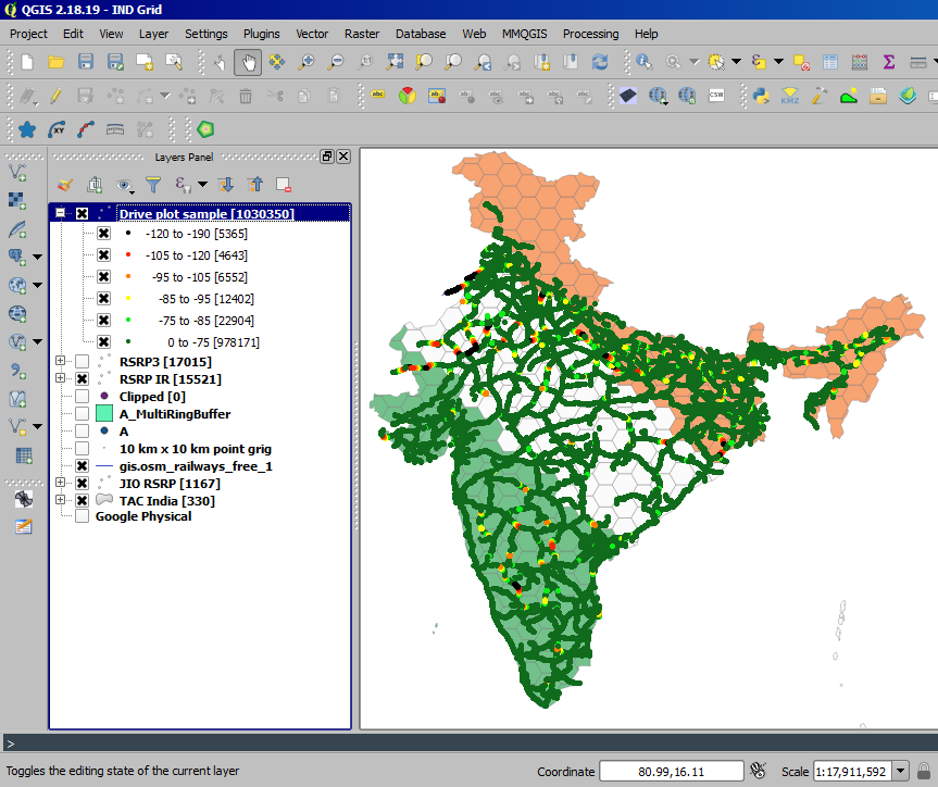
Drive test plot thematic could be handled easily and process could be scaled up to typical cluster with file sizes over 200 MB or more. Pre to Post drive route matching could be done with much ease by buffering either of the plot to GPS error or bin distances (whichever is high per se ~20 m) such that Pre or Post plot could be clipped out and bin comparison could be done appropriately and hence benchmarking. QGIS has on-the-go layer styling while on processes (Copy/Past) of thematic properties which are saved in different active layer or saved on local m/c (user accessible and editable by Text editor like NotePad++, Submlime etc.), and thematics are also shareable between team etc.

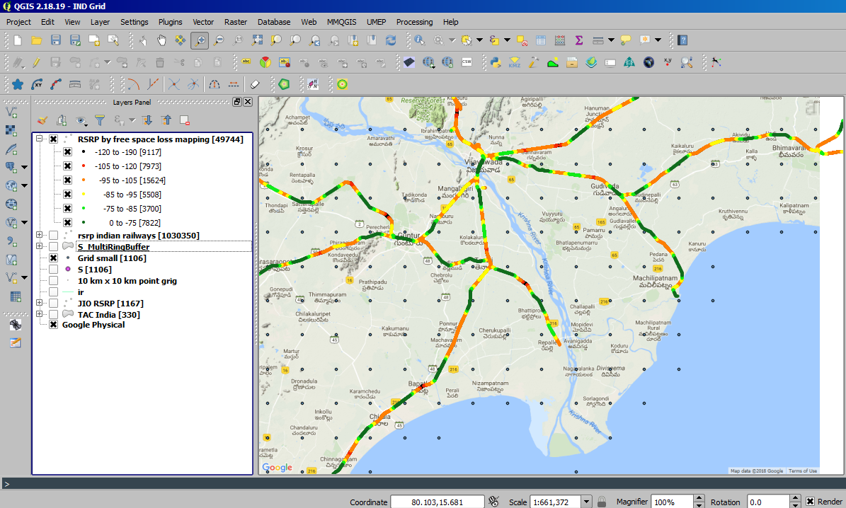
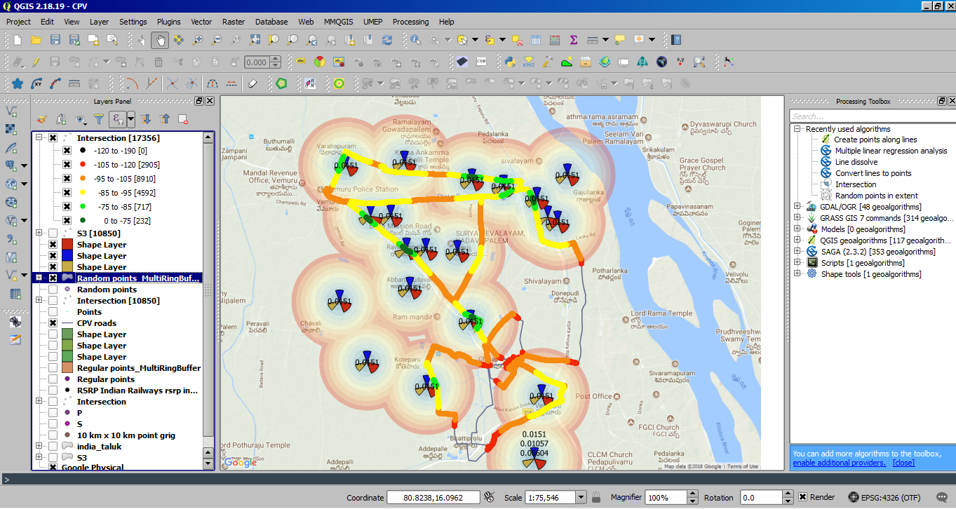
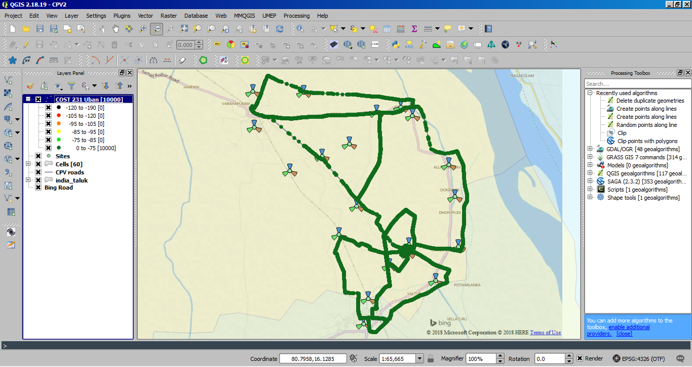
Sample RSRP thro' simple Pathloss calculations on omini directional radiation pattern (Bin / Point map with 100 m interval has been created along Indian railways line vector), individual distance (multi-ring buffer) could be utilized to represent the coverage prediction plot (Constraints omitted: Antenna tilts, Elevations, Reflections, Absorption, and many others):

Representation of drive plot from regular coverage contours:
- Draw regular distance "multi-ring buffer" from chosen site location (lat long) to make variable distance rings around the given point, dissolving the distance buffers would facilitate representation better
- Generate points along line vectors
- Clip points vector over multi-distance ring buffer to pick corresponding distances to the site
- Use appropriate RF model formula to calculate free space pathloss and represent bin
- Use viewshed approach to involve Ground Elevation in prediction (*Currently under exploration)
- Use Antenna Tilts, Antenna pattern (*Currently under exploration)
- Use Clutter absorption model (*Currently under exploration)

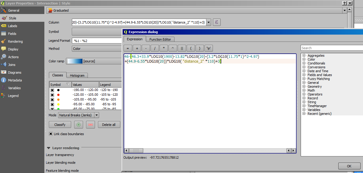
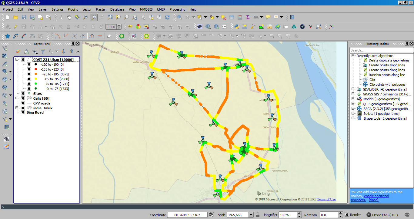
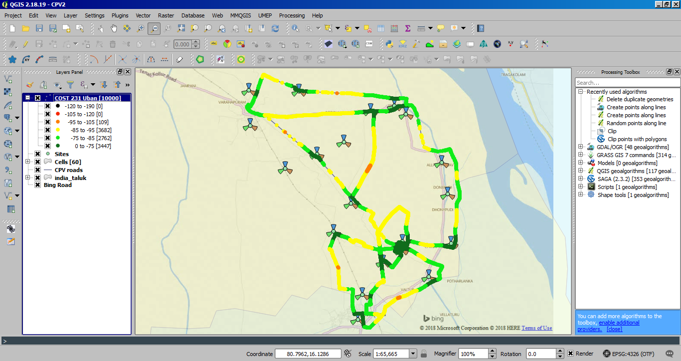
Apply COST 231 (Urban RF propagation model) in association with distance calculated through MultiRingBuffer from site centroid. However this process could be further refined to plot directional antenna radiation pattern in association with interpolation of bins for desired pixelation.

Field calculator could be utilized to check coverage thematic of route map (made points along line) to make iteration checks on different Frequencies and other constants.

Cost 231 Urban RF model: Formula in field calculator: TX Power-(46.3+33.9*LOG10(Freq. Band in MHz)-13.82*LOG10(20)-(3.2*LOG10(11.75*1)^2-4.97)+(44.9-6.55*LOG10(BTS TX antenna Ht.))*LOG10("distance in km")+3)

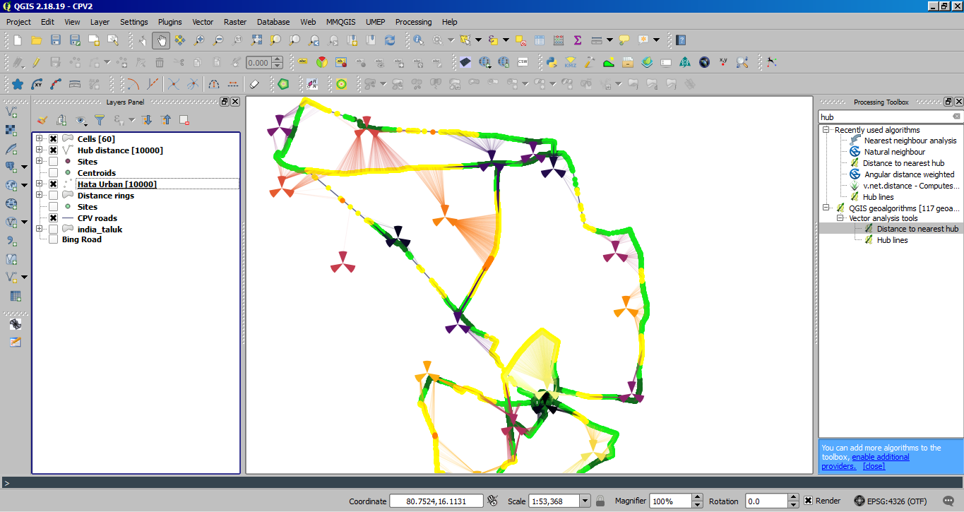
Hata Urban RF model: Formula used in field calculator TX Power -(69.55+26.16*log10(1900)-13.89*log10(BTS TX antenna Ht.)-(0.8+(1.1*log10(1900)-0.7)*1.5-1.56*log10(Freq. Band in MHz))+(44.9-6.55*log10(BTS TX antenna Ht.))*log10("distance in km")):

Hata Rural RF model: Formula used: TX Power-((69.55+26.16*log10(Freq. Band in MHz)-13.89*log10(BTS TX antenna Ht.)-(0.8+(1.1*log10(Freq. Band in MHz)-0.7)*1.5-1.56*log10(Freq. Band in MHz))+(44.9-6.55*log10(BTS TX antenna Ht.))log10("distance in km"))-4.78(log10(Freq. Band in MHz))^2+18.33*log10(Freq. Band in MHz)-40.94)

Serving cell representation using hublines (only ideal condition FSL):

https://github.com/NationalSecurityAgency/qgis-shapetools-plugin/issues/9
