3

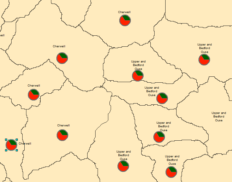
I used pie charts in my map, but they don't appear in the desired position. Instead, they all appear in the exact middle of polygons.

The charts were created via symbology -> charts -> pie option

I need to put area names to the middle of the polygons and the pies above them, or adjust the positions of both of the text and pies. But I can't seem to figure out how to move the charts, not even with Editor.

2
  • Welcome to GIS SE! As a new user please take the tour to learn about our focused Q&A format. Can you please describe your process of adding the pie charts to your map? Please edit your question to include this info.
    – Midavalo
    Commented Apr 10, 2017 at 17:25
  • I could provide a screenshot if needed. However, I think that my description of the problem provides enough information. The process of creating the pie charts is simple enough, via symbology in ArcMap. Commented Apr 10, 2017 at 18:59

1 Answer 1

5

I not sure there is an automated way of doing this. You can use the maplex engine to ensure your labels are centred but then they clash with the pie symbol.

A solution is to create your pies exactly as you want them at the scale of the map you want to draw at then right click on the data frame and choose Convert features to graphics. You then turn off the pie symbol so just make your polygons what ever they are and you are left with all the pies as graphics on your map. It is then up to you to move them.

Below is an example:

Example of moved pie chart graphics

Be aware when you convert to graphic arcmap adds the original features to the exclusion list in the layer properties > Display > Feature Exclusion section. You just need to remove them to enable their display.

5
  • Thanks for a helpful answer. For some reason, in my layer, the chart pies lose all the numeric data they had when I converted them to graphics. As seen in this image: before converting: !charts_Most after: !charts_converted At least I saved the project before converting. I don't really know why this solution didn't work Commented Apr 11, 2017 at 7:42
  • It just occurred to me why don't you create your pie charts in the centre and turn the labels into annotations which you can then move, so your text can be anywhere, just not the centre?
    – Hornbydd
    Commented Apr 11, 2017 at 8:40
  • I need to move the pies, some of the polygons are too small so the text won't fit in them if I don't move the chart pies. If I align text under the pie (that's required for the map, the text should be under the chart pie. It's some assessment we were given), the text will cross the border of polygon which we aren't supposed to do. Commented Apr 11, 2017 at 8:52
  • In that case I would have dropped the text size for the annotation to ensure it fitted. With annotations you can do that individual labels can have different sizes. To be frank if you are squeezing that amount of detail onto a map will anyone even notice that a few labels in restricted areas are slightly smaller?
    – Hornbydd
    Commented Apr 11, 2017 at 8:57
  • It'd might happen that they wouldn't notice, but I wouldn't count on that. It's not the most important detail of the map of course, but we need to follow multiple rules when creating the map, some of them are a bit difficult to follow as you can see. Commented Apr 11, 2017 at 9:00

Your Answer

By clicking “Post Your Answer”, you agree to our terms of service and acknowledge you have read our privacy policy.

Not the answer you're looking for? Browse other questions tagged or ask your own question.