I am very new to ArcGIS Pro and I have loaded a SHP file with polygons and associated 'scores'. I would like to create a heat map based on these values e.g. a value of 1 would colour the polygon red, a value of 5 would colour it orange and a value of 10 would colour it green.
4 Answers
It's pretty simple in ArcGIS Pro once you know where to go to do it.
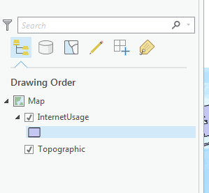
First- select your layer in the Contents tab on the left
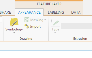
Then, go the Feature Layer Tab along the top and click on the drop down menu for Symbology. In there, select "Symbolize your layer by quantities" -> "Graduated Colors"
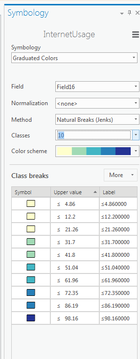
Then from there, go to the Symbology tab on the left, and you can edit the field, normalization, classification method, number of classes, color scheme, etc.
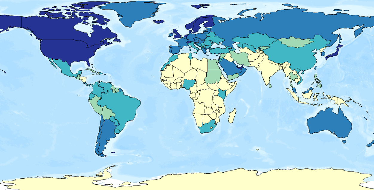
And there's your map
You can perform a two step process where:
- you convert your polygons to points (make sure you tick keep centriods in polygons option to make sure the centriods are always located within the polygons)
- use either Kernel Density or the Hot Spot analysis function (Getis-Ord Gi*) which is nice as it gives you a statistical significance value to report.
FYI, Pro 1.2 allows a real, dynamic heat map for points. Click your layer in the contents panel, select the appearances tab, click the symbology drop down and the option to heat map it should be there.
Two Tools let you make heat maps in ArcGIS : Point Density and Kernel Density. None take polygons as an input.
But you can get the same result with the Symbology of the polygon layer (Categories or Quantities).


