16

Some common problems with displaying routes created from street data, such as bus routes, include:

  1. Routes may overlap themselves, such as when a route takes the same road in opposite directions
  2. Routes may overlap other routes that take the same street.
  3. Routes are often overly detailed, or "noisy", owing to their derivation from street data.
  4. Indicating a route's direction unambiguously without overloading it with arrows can be a challenge.

What are some techniques for dealing with these issues in order to create a practical and usable route map, such as this Manhattan bus routes map? Do you know of any such public transport maps that were produced by automatic techniques rather than manual illustration/digitization?

Specifically I am using ArcGIS 10, but solutions involving other software are welcome as well.

One technique I have had some success with for dealing with 1) is using ArcMap's cartographic line symbols with a negative offset -- assuming the lines are oriented in the direction of travel, this will offset the lines such that the right and left-hand sides are distinct and oriented as you would expect (at least for right-hand traffic countries, for left-hand traffic countries one would use a positive offset). However the result tends to be a bit wonky around turns, interchanges and and U-turns, and is inflexible when dealing with multiple routes.

Another possibility that I am not very familiar with but which seems promising is cartographic representations -- however, I have not had much luck in finding examples of using representations for transportation maps and whether it might fit the bill.

0

3 Answers 3

10

I have not used ArcGIS Schematics for more than some quick demos quite a few years ago, but there is a blog posting on Create route maps with the ArcGIS Schematics extension that may provide a solution.

0
4

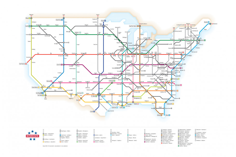
I don't think I would recommend this at the start (more as a last resort for simplicity), but I have seen many subway maps actually manipulate the lines to be more orderly. Here is an example from the visual.ly blog depicting U.S. highways. I am pretty sure there are many more floating around though.

Visual.ly highway map
(source: netdna-cdn.com)

This mainly addresses your point #3, but it helps to partially solve the other problems as well. When the lines are less tortuous it is easier to develop symbology to distinguish between the lines and over-plotting is easier to solve by off-setting symbols.

In terms of time to make they look like alot of work though. Also it is painful to suggest distorting geography to make a nice looking map, but there are some nice examples floating around. I will try to find some more examples and post them back here.

0
2

Here are a few resources I've found about automatically generating maps for transit and other data:

  • Stott et al. "Automatic Metro Map Layout Using Multicriteria Optimization" - Abstract:

    "This paper describes an automatic mechanism for drawing metro maps. We apply multicriteria optimization to find effective placement of stations with a good line layout and to label the map unambiguously. A number of metrics are defined, which are used in a weighted sum to find a fitness value for a layout of the map. A hill climbing optimizer is used to reduce the fitness value, and find improved map layouts. To avoid local minima, we apply clustering techniques to the map — the hill climber moves both stations and clusters when finding improved layouts. We show the method applied to a number of metro maps, and describe an empirical study that provides some quantitative evidence that automatically-drawn metro maps can help users to find routes more efficiently than either published maps or undistorted maps. Moreover, we found that, in these cases, study subjects indicate a preference for automatically-drawn maps over the alternatives."

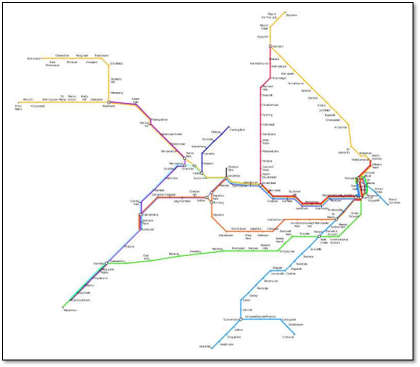
    Below is autogenerated map of Sydney transit from Stott's thesis:

Stott - Generated Sydney map

  • This blog post by Chris Mueller providers a high level summary of Stott et al.

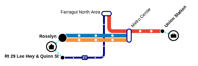
  • Transitive.js - A tool for generating dynamic stylized transit maps that are easy to understand from transit data. Read more in this blog post. Here's the output of Transitive:

Output of Transitive.js

  • Wolff - "Graph Drawing and Cartography" - Summary of book chapter:

    In this chapter, we give an overview of the main types of geometric networks that are being visualized in an automated fashion, using node-link diagrams. For each network type, we consider the application-dependent aesthetic constraints. We group the network types according to the graph class to which they belong: paths (simplified, schematized and generalized in Section 23.2), matchings (used in boundary labeling in Section 23.3), trees (as in flow maps; see Section 23.4), (near-) plane graphs (such as street or metro maps; see Section 23.5), and other graphs (such as timetable graphs, the Internet multicast backbone, or social networks; see Section 23.6).

  • Unfolding - a library to create interactive maps and geovisualizations. To my understanding, though, this only visualizes preexisting data, and doesn't do any generalization for routes.

Not the answer you're looking for? Browse other questions tagged or ask your own question.