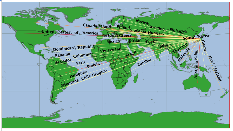
I am attempting to map the flow of remittances into Japan using the FlowMapper plugin in QGIS. When I use the Style--> Advanced--> Size Scale field--> magnitude command, the lines become so thick and varied that they are impossible to distinguish from one another (in fact my map becomes one giant block of "lines"). Does anyone have any advice on how to fix this other than manually changing the size of lines classified under equal intervals?
Is there a way to label the flow lines by country of origin so that the text is in and oriented with the flow line, not located on top (that is, once I'm able to get the flow lines to their desired thickness)?
How do I make the lines curved so they are more aesthetically pleasing?
